GIMP/Print version
Introduction
Hello and welcome to the GIMP book!
GIMP (GNU Image Manipulation Program) is an open-source image editing program, licensed under the GNU General Public Licence. It can be used for editing electronic bitmap images like photographs. Whilst GIMP can edit vector graphics such as SVGs, other programs such as Inkscape or Adobe Illustrator are far more capable. GIMP, as a fully functioning image editor, rivals other industry standard software such as Adobe Photoshop and Corel Paint Shop Pro in terms of features such as multiple layers, the ability to resize and re-shape images, cropping, colour manipulation, and so on.
The project was started in 1995, and its first public release (0.54) was in January of 1996. Now, 21 years after its first release, GIMP is used by a variety of people ranging from professional graphic artists, to computer hobbyists of all ages who don't want to put down $700 (price as of 2006) for a copy of the newest Photoshop.
Since its original release for Unix and GNU/Linux operating systems, GIMP has been ported to many major operating systems and platforms, including Microsoft Windows and Mac OS X. GIMP uses the GIMP Toolkit (GTK), an advanced widget library created during the development of GIMP. If you download GIMP for any platform, the installer will supply a bundled version of GTK. Older versions of GIMP may require a separate install of GTK. Although GTK comes standard in most modern Linux distributions that ship with GNOME or GIMP pre-installed, it does not come standard with Windows nor Mac OS X, if you plan to install an older version of GIMP on an older version of Windows or OS X.
Many image editing tutorials are available on the web. Some of the available tutorials can be used interchangeably, since the image-editing functionality provided by the GIMP and Photoshop or Paint Shop Pro are similar (images can be cropped, resized, colours altered, pixels erased, pixels added etc.). A moderately advanced GIMP user can follow Photoshop tutorials as if they were written for GIMP and vice-versa, except when the tutorial uses a feature that one of the programs does not support. However, following a Photoshop tutorial, using GIMP (or any other image editor, in reality) as written can be difficult, or nigh-impossible. Unfortunately, the GIMP lacks some features that are commonly used in Photoshop, such as adjustment layers (which, for example, may affect the brightness or contrast of an image without permanently modifying it) and colorspaces other than RGB and grayscale (CMYK is essentially a necessity if you're wanting to print something). In most situations, luckily, these features do little more than just make your workflow a tad easier, thus there might just be a different way to achieve the same results.
The current look of GIMP consists of two main windows - the image window and a toolbox. Also by default there's another utility window. The image window is always under the utility windows, but can easily go over by using the Tab key. In GIMP 2.8, a single-window option is included which docks the utilities onto the screen.
Note that if you want to start using the GIMP right away, right clicking an image window will open a menu that gives access to most of the GIMP's editing tools and features. Obviously, all commands can also be accessed via the toolbar at the top of the window of the image you're currently working on.
You can find out a lot more about GIMP on its website https://www.gimp.org.
The Toolbox

GIMP has a "toolbox" to quickly perform basic tasks. Toolbox is customizable, this means that you can add / remove any tool you want. To select tools for doing something, go to the "Tools" menu, and select any tool you want. To put the tool on the panel go to "Edit > Preferences > Toolbox".
But it can only be edited in a linear way, that is, while sorting it in the "options" there's no way to see where tools will finally appear on the grid. Even though the program's layout updates instantly. They push each other around. There's no way to align tools to right or other corners, or each other.
If the user later shifts the width of the toolbox' panel (to optimize space on screen), the grid gets misaligned, so there's a way to accommodate only 1 layout. If leaving a not evenly divisible quantity of tools, the lowest-right corner can't be utilized.
For that matter, it may be useful to make a screenshot of the toolbox with having activated all the needed tools, and lay out the grid in an easy raster program like Paint or GIMP itself, to make the surface look the needed way. Then start moving them in Preferences accordingly. Remember that tools go from the up-left corner, rightwise then down.
By default not all tools are shown - for example GEGL operation and colour tools are omitted. All tools can also be accessed by opening the "Tools" menu. To switch the window to toolbox, you can use Ctrl + B. Shortcuts written here are the default values - you can change them any time in "Edit > Keyboard Shortcuts" or "Edit > Preferences > Keyboard Shortcuts".
More sophisticated tools are not in the toolbox, but next to the Tools, in the Filters menu.
Tools
These tools are available by default in toolbox.
| Icon | Name | Shortcut | Description |
|---|---|---|---|
| Selection tools | |||
| Rectangle | R | Select square or rectangular regions (axis-aligned). | |
| Ellipse | E | Select circular or horizontal / vertical elliptic regions. Notice that there's no ellipse drawing tool as such, only selecting. | |
| Free (Lasso) | F | Free-form selecting. | |
| Fuzzy (Magic Wand) | U | Select by colour in continuous regions. | |
| By Colour | Shift + O | Select by colour without any limit to continuous regions. | |
| Scissors | I | Create paths to select shapes. | |
| Foreground | (none) | Select a region containing foreground objects. | |
| Brush tools | |||
| Bucket Fill | Shift + B | Fills areas with a colour or pattern. | |
| Blend (Gradient) | L | Fill an area with a gradient. | |
| Pencil | N | Draw exact pixel-edged lines; that is, not anti-aliased. | |
| Paintbrush | P | Paints soft- or fuzzy-edged lines; that is, the pixels are anti-aliased and/or feathered. | |
| Eraser | Shift + E | Erase pixels from a layer. | |
| Airbrush | A | Paint tool with a softer pressure. | |
| Ink | K | Paint anti-aliased with a simulation of a nib. | |
| Clone | C | Copy pixels from one part of an image to another. | |
| Heal | H | Heal image irregularities. | |
| Perspective Clone | (none) | Clone from an image source after applying perspective transformation. | |
| Convolve (Blur/Sharpen) | Shift + U | Blur or sharpen an image. | |
| Smudge | S | Mix adjacent pixels; with a direction. | |
| Dodge/Burn | Shift + D | Lighten or darken an image's shadows, mid tones or highlights. | |
| Transform tools | |||
| Move | M | Move selections and layers. | |
| Align | Q | Align or arrange layers and/or other objects. | |
| Crop | Shift + C | Crop or clip all the image. | |
| Rotate | Shift + R | Rotate the active layer, selection or path. | |
| Scale | Shift + T | Scale the active layer, selection or path. | |
| Shear | Shift + S | Tilt part of the image to some direction. | |
| Perspective | Shift + P | Imitate 3-dimensional shift of an image. | |
| Flip | Shift + F | Flip selections and layers. | |
| Other tools | |||
| Path | B | Allows selecting and modifying paths. | |
| Colour Picker | O | Select the colour from anywhere in open images for further drawing. | |
| Magnify (Zoom) | Z | Alter the zoom level in the program. | |
| Measure | Shift + M | Shows distances and angles. | |
| Text | T | Place text layers into your image. | |
There are also some other tools, hidden by default. These tools are accessed from the "Tools" menu, or by showing them in toolbox.
| Icon | Name | Shortcut | Description |
|---|---|---|---|
| Colour tools | |||
| Colour Balance | (none) | Modifies the colour balance of current selection or layer. | |
| Hue-Saturation | (none) | Adjusts hue, saturation and lightness. | |
| Colourize | (none) | Renders into a grey scale seen through coloured glass. | |
| Brightness-Contrast | (none) | Adjusts brightness and contrast. This brightness is alike to the Color/Hue/Saturation's Lightness, but from other algorithmic point of view. | |
| Threshold | (none) | Transforms the current layer or selection into black and white. | |
| Levels | (none) | Changes the intensity range of the active layer or selection in every channel. | |
| Curves | (none) | Changes the colour, brightness, contrast or transparency by means of diagrams. | |
| Posterize | (none) | Reduces the number of colours. | |
| Desaturate | (none) | Converts all colour to shades of grey. | |
| Other tools | |||
| GEGL operation | (none) | Executes a GEGL operation. | |
Tool options

By default, activating any tool will have the effect of showing its options under the toolbox. Each tool has its own set of settings and any changes to them are kept through the current session. There are also four buttons under any options.
 Save options to... - save options of the current tool
 Restore options from... - restore options from saved file
 Delete saved options... - delete saved options
 Reset to default values - reset them to standard.
You can hide them by clicking on the arrow next to the tool name and deselecting Show Button Bar. You can also access these from the same menu under Tool Options Menu.
Colour, Indicator and Active Image area

Below the toolbox can be placed these three areas. This is set in "Edit > Preferences > Toolbox" and any of the three can be placed there.
Colour area
Shows current foreground and background colour. Clicking on either will bring the colour editor dialogue.
Clicking on the symbol in the lower left corner resets the colour to their defaults. The D key has the same effect.
Clicking on the symbol in the upper right corner swaps the foreground and background colours. The X key has the same effect.
Indicator area
Shows currently selected brush, pattern or gradient. Clicking on any of these allows to change it.
Active Image area
Displays a thumbnail of the active image. Clicking on it will bring the Images dialogue up, allowing you to select an image.
Gradient
The Basics

![]() Shortcut: L
Shortcut: L
The GIMP Blend tool enables you to make gradients. For instance, a gradient may be a paint fill or stroke which smoothly blends from red to green. A gradient may have sudden changes as well. And a gradient may be applied to selections or opacities.
On the right side of the gradient dialog box, are the default settings:
- Mode - you can select mode here (more information in the Modes article)
- Opacity - set whether gradient will be transparent or fully visible
- Gradient - type of gradient
- Offset - effects how far along the start colour in the gradient begins
- Shape - shape of gradient
- Repeat - way of repeating
- Dithering - helps reduce banding by dithering the gradient.
- Adaptive supersampling - try to refine the gradient in high contrast areas. Choose how much difference is required before supersampling activates, and how hard GIMP tries to get good quality samples.
Opacity
This bar controls the transparency of the gradient. Any value between 0.0 and 100.0 is possible with 100 being fully opaque and 0 being fully transparent. The default value is 100.
Gradient
There are hundreds of types of gradients in GIMP. Neons, flags, flares and much more. All of them have their own effect, but only few use selected colours. Here's short description of them:
- FG to BG (HSV anti-clockwise) - using HSV palette, moves counter-clockwise
- FG to BG (HSV clockwise hue) - using HSV palette, moves clockwise
- FG to BG (RGB) - using RGB palette
- FG to Transparent - moves from foreground colour to transparent.
Next to it you can see a flip option (![]() ). It reverses the gradient direction. For example, Red to Green would flip to Green to Red.
). It reverses the gradient direction. For example, Red to Green would flip to Green to Red.
Offset
Gradient offset ranges from a default of 0, up to 100 percent. When offset is 0, the gradient begins at the start of the blending line. When offset is 50, the gradient begins at the halfway point in the blending line. Any earlier points are rendered with the same colour as the leftmost colour in the gradient. Setting offset to 100.0, which makes the gradient a solid (non-gradient) colour.
Shape
There are eleven gradient shapes, clicking and dragging inside a selection makes the gradient follow its boundary.
- Linear - Smoothly blends from left to right
- Bi-linear - Smoothly blends to the left and right from the middle
- Radial - Linearly blends outward along radius - pseudo-spherical appearance
- Square - Linearly blends into a square from center to corner
- Conical (symmetrical) - blends linearly with angle in a circular arc
- Conical (asymmetrical) - blends linearly with arc, until reaching the starting radius
- Shaped (angular) - formerly shapeburst, produces an angular beveled gradient
- Shaped (spherical) - fills selection with a bulging beveled gradient
- Shaped (dimpled) - fills selection with a puckered beveled gradient
- Spiral (clockwise) - clockwise spiral blend centered at click, with varying amount of twist
- Spiral (counterclockwise) - counterclockwise spiral
Repeat

There are three options for repeating:
- None - no repeat
- Sawtooth wave - once passing the end of the gradient, begins again at the start
- Triangular wave - once passing the end of the gradient, blends backwards until the start, and then begins blending forward again..
You can use Repeat with these shapes: Linear, Bi-linear, Radial, Square, Conical (sym), Conical (asym).
Dithering
Dithering reduces banding patterns in the gradient. If your gradient includes deliberately banded areas, turn dithering off in order to preserve them. If the result must be very precise, consider turning dithering off also (dithering trades spatial resolution for colour resolution, which is only good if you have spatial resolution to spare.)
Adaptive Supersampling
Adaptive supersampling identifies areas that seem to have high contrast and tries to improve the precision of the rendering only at these points. The general effect is that areas of high contrast are smoothed out; One easy way to see this is comparing the appearance of a 'sawtooth wave' repeated gradient with and without supersampling enabled. The options in this section allow you to control
- How much contrast is considered 'high contrast'
- How much GIMP will try to improve the sample quality before accepting the result (this comes into action when the additional samples' relationship to each other is also considered as high contrast)
See supersampling for a detailed explanation
See also
Move Tool
The Basics
![]() Shortcut: M
Shortcut: M
Move tool is used for moving anything on the image, including layers, selections and paths.
- Move - defines what will be moved
- Tool Toggle - toggle between the two available modes (for each option)
You can toggle between the two options with Shift (temporarily).
Move
You can choose what you want to move, as mentioned before it's either layer, selection or path.
Layers
To move a layer, select this option. If the layers are grouped (chain symbol), all layers in the group will be moved.
When this mode is selected, under tool toggle you'll see two options, "Pick a layer or guide" and "Move the active layer". The first one will move the layer that you select and the second one will always move the active layer.
Selections
The move tool allows you to move the selection outline. It has no options in Tool Toggle.
Paths
You can also move paths with this tool. Note that path tool has its own tool for moving. To use move tool, make the path visible in the path dialogue.
Crop Tool
The Basics
![]() Shift + C
Shift + C
The Crop tool can be used to crop or clip the image, working on all layers of the image (both visible and invisible). It can be used for removal of borders, or unwanted areas of the image to centre the focus on the work.
To crop the image to selected size, double-click inside the box, or press Enter. The crop box can be resized by dragging at the edges and corners. To move it, click and drag on the crosshairs at the centre.
- Current layer only - works only on the current layer
- Allow growing - allows to expand beyond borders
- Expand from centre - expands selection, using starting point as the centre, instead for the corner
- Fixed - allows you to modify the actual shape of rectangle
- Position - placement of the selection to crop
- Size - size of the selection to crop
- Highlight - highlights the actual selection, by darkening everything that surrounds it
- Guides - select the types of guides shown within of selection
- Auto Shrink - shrinks the selection to the nearest rectangular shape available on the image layer
- Shrink Merged - if this option is enabled, then Auto Shrink will use the pixel information from the visible display of the image, rather than from the active layer
Current layer only
Crop tool will only work on the currently selected layer, instead of working on all existing.
Allow growing
Allows Crop tool to expand beyond borders of the image/layer, and crops along with the outside area.
Other options
All other options work as described in Rectangle Selection article. See sections #Expand from centre to #Shrink merged
Selection Tools
The Basics
There are 7 selection tools. Each has its own properties, but all have something in common. All of these common options will be described here, while their variations on the tools pages. The tools are:

The paths tool can be considered as a selection tool, but it doesn't share any options. It can be used as a tool for creating complex selections, especially ones that follow natural curves. To convert a path to a selection you can use Select > From Path (Shift+V).
There is also a quick mask mode, used for creating and editing selections using the paintbrush or any other drawing tools. It can be found under Select > Toggle Quick Mask (Shift+Q).
The common options are:
- Modes - determines the way of creating the selection, whether it will be combined with existing one and such
- Anitaliasing - causes the boundary of the selection to be drawn smoother
- Feather edges - causes the boundary of the selection to be blurred
Modes
Modes determine whether the selection will be added, subtracted or intersected from existing one, or either replace it. Functions performed by these button can be duplicated using modifier keys, as described later. Many people find this very useful.
 Replace - default mode, replaces the existing selection
 Add - adds a new selection to the existing one
 Subtract - removes the new selection from already existing region
 Intersect - makes a new selection from the region when both the new and old one overlap
Antialiasing
This option only affects few of selection tools. It causes the boundary of the selection to be drawn more smoothly.
Feather Edges
Feather Edges blurs the boundary, by selecting the boundary pixels only partially. This allows the selection to smoothly blend with the background.
Key modifiers (defaults)
The behaviour of selection tools can be modified by holding down Ctrl, Alt and Shift.
- Ctrl - has two options depending on what you are doing
- while creating a selection toggles Expand from centre option
- while doing nothing, this key switches to Subtract mode, as long as you hold it
- Alt - allows movement of the current selection (only its frame, not content). If the image is moved instead, try Shift + Alt
- Shift - similarly to Ctrl, it has two options depending on what you are doing
- before starting a selection, this key will switch to Add mode, as long as you hold it
- after starting a selection, it will depend on the tool you are using - for example for Rectangle Selection, it will create a square selection
- Ctrl + Shift - depending on which tool is used, different thing will happen. A common option however is switching to Intersect mode
- Ctrl + Alt + Click-and-drag and Shift + Alt + Click-and-drag - allows movement of the current selection (its content)
- Space bar - transforms the tool to Navigation cross as long as you press the bar, allowing you to pan around the image, instead of using scrollbars. In Preferences > Image Windows you can toggle the Space bar to the Move tool.
- Ctrl - has two options depending on what you are doing
Rectangle Selection
The Basics

![]() Shortcut: R
Shortcut: R
The rectangle selection tool is a simple but useful tool. It allows you to create rectangular selections.
- Modes - determines the way of creating the selection, whether it'll be combined with existing one and such
- Antialiasing - causes the boundary of the selection to be drawn smoother
- Feather edge - causes the boundary of the selection to be blurred
- Rounded corners - rounds the corners of the selection
- Expand from centre - expands selection, using starting point as the centre, instead for the corner
- Fixed - allows you to modify the actual shape of rectangle
- Position - placement of the selection
- Size - size of the selection
- Highlight - highlights the actual selection, by darkening everything that surrounds it
- Guides - select the types of guides shown within of selection
- Auto Shrink - shrinks the selection to the nearest rectangular shape available on the image layer
- Shrink merged - if this option is enabled, then Auto Shrink will use the pixel information from the visible display of the image, rather than from the active layer
Modes, Antialiasing and Feather Edges
- See Selection Tools#Modes for information about Modes
- See Selection Tools#Antialiasing for information Antialiasing
- See Selection Tools#Feather Edges for information about Feather Edges option
Rounded corners
A slider appears after enabling this option. Use it, to change the radius that is used to round the corners
Expand from centre
After enabling this option, the starting point is used as the centre of the selection instead of using it as a corner. This also causes that the selection is extended from all sides. This option can be enabled with Shift.
Fixed
This option allows you to modify the shape of rectangle in four ways:
- Aspect ratio - allows you to design the selection, while keeping the aspect ratio fixed. By default it is 1:1, which makes a square. There are two little icons next to it (landscape and picture)
- Width - you can fix the width of the selection
- Height - you can fix the height of the selection
- Size - you can fix both, width and height of the selection
Position
The actual placement of the current selection. This will show the placement of upper left corner, or centre, if Expand from centre option is enabled. You can use it to modify
Size
The actual size of the current selection. You can use it to modify the size, as well as resizing it directly on the image.
Highlight
Emphasizes the selected area by a surrounding mask, making the visual selection much easier.
Guides
In here you can set what guides will be shown within the selection, respecting Photo composition rules.
- No guides - no guides are shown
- Centre lines - only the centre lines are visible
- Rule of thirds - guides are shown along the rule of thirds
- Golden sections - guides show up to mark the golden sections
Auto Shrink
After pressing this button, already having a selection, it will shrink to the nearest rectangular shape within the selection. The algorithm for finding the best rectangle, can once do a great work, and sometimes find some strange rectangles.
Shrink merged
If this option is enabled Auto shrink will look on the actually visible image, rather than the active layer.
Ellipse Selection
The Basics

![]() Shortcut: E
Shortcut: E
Ellipse selection is similar to the rectangle one. The only difference is the fact that it has one option less - rounded corners, as it is elliptical selection so for what. As the name suggests it is made for creating elliptical and circle selections, with optional high quality antialiasing.
- Modes - determines the way of creating the selection, whether it'll be combined with existing one and such
- Antialiasing - causes the boundary of the selection to be drawn smoother
- Feather edge - causes the boundary of the selection to be blurred
- Expand from centre - expands selection, using starting point as the centre, instead for the corner
- Fixed - allows you to modify the actual shape of rectangle
- Position - placement of the selection
- Size - size of the selection
- Highlight - highlights the actual selection, by darkening everything that surrounds it
- Guides - select the types of guides shown within of selection
- Auto Shrink - shrinks the selection to the nearest rectangular shape available on the image layer
- Shrink merged - if this option is enabled, then Auto Shrink will use the pixel information from the visible display of the image, rather than from the active layer
Modes, Antialiasing and Feather Edges
- See Selection Tools#Modes for information about Modes
- See Selection Tools#Antialiasing for information Antialiasing
- See Selection Tools#Feather Edges for information about Feather Edges option
All other options
See Rectangle Selection for information about the tool as everything works completely (or almost completely) the same. The only difference is existence of rounded corners option in Rectangle Selection - there is no need for it here.
Free Selection (Lasso)
The Basics

![]() Shortcut: F
Shortcut: F
Free selection tool (also called 'Lasso') let's you create a selection by drawing it free-hand (with the pointer and holding down the left mouse button, of course). It is the only selection tool that has nothing more than the basic options. The selection is finished with a straight line and it is actually possible to create straight lines by clicking (not holding!) on one point and making another one somewhere away from it.
- Modes - determines the way of creating the selection, whether it'll be combined with existing one and such
- Antialiasing - causes the boundary of the selection to be drawn smoother
- Feather edge - causes the boundary of the selection to be blurred
Modes, Antialiasing and Feather Edges
- See Selection Tools#Modes for information about Modes
- See Selection Tools#Antialiasing for information Antialiasing
- See Selection Tools#Feather Edges for information about Feather Edges option
Fuzzy Selection (Magic Wand)
The Basics

![]() Shortcut: U
Shortcut: U
Fuzzy selection (also called 'magic wand') is a tool for selecting areas of image (or layer) with the same/similar colour. It is very important to pick the starting point correctly, or either you will get something completely different from what you want (well, not always, but usually yes). Wand is a good choice for selecting objects with sharp edges. It is also great for touching up selections, or selecting areas within some contour.
- Modes - determines the way of creating the selection, whether it'll be combined with existing one and such
- Antialiasing - causes the boundary of the selection to be drawn smoother
- Feather edge - causes the boundary of the selection to be blurred
- Select transparent areas - gives the ability to select areas completely transparent
- Sample merged - creates a selection from actual image, instead from the active layer
- Threshold - determines the range of colours
- Select by - select, which component shall be used for calculating the similarity
Modes, Antialiasing and Feather Edges
- See Selection Tools#Modes for information about Modes
- See Selection Tools#Antialiasing for information Antialiasing
- See Selection Tools#Feather Edges for information about Feather Edges option
Select transparent areas
After selecting this option, the Free Selection tool will have the ability to select completely transparent areas. If this option is unchecked, transparent areas will never be selected.
Sample merged
This option has any meaning when you have several layers on the image, and the active layer is either semi-transparent or set to another mode than Normal. If it is so, the colours present in the layer, will be different from the ones in the real image.
Threshold
This slider determines the range of colours that will be selected at the moment of creation of the selection. Higher threshold - larger resolution. Note that with higher selection also bigger gaps are possible to be between the selections. After the first button-press (but before releasing it), dragging the pointer downward (or to the right) will increase the size of the selection, while dragging upward (or to the left) will decrease the size of it. Thus the first settings of threshold do not really matter, as you can modify them any time afterwards.
Select by
This option will change the component that The GIMP will use for calculating the selection. The possible components are: Composite. Red, Green, Blue, Hue, Saturation and Value.
Selection by Colour
The Basics

![]() Shortcut: Shift + O
Shortcut: Shift + O
Select by colour works really similar to the Fuzzy Selection tool. The main difference is that when magic wand makes selection with no real gaps, selection by colour takes all the pixels with similar colour, regardless to where they are located.
- Modes - determines the way of creating the selection, whether it'll be combined with existing one and such
- Antialiasing - causes the boundary of the selection to be drawn smoother
- Feather edge - causes the boundary of the selection to be blurred
- Select transparent areas - gives the ability to select areas completely transparent
- Sample merged - creates a selection from actual image, instead from the active layer
- Threshold - determines the range of colours
- Select by - select, which component shall be used for calculating the similarity
Modes, Antialiasing and Feather Edges
- See Selection Tools#Modes for information about Modes
- See Selection Tools#Antialiasing for information Antialiasing
- See Selection Tools#Feather Edges for information about Feather Edges option
All other options
See Fuzzy Selection for information about the tool as everything works completely (or almost completely) the same.
Scissors
The Basics

![]() Shortcut: I
Shortcut: I
Scissors is an interesting selection tool. It has some features of lasso, some features of paths tool and some of its own. It is useful for selecting a region defined by strong colour changes at the edges. To use scissors, you need to create a set of 'control nodes' (also referred to as anchors), at the edges of the region you are willing to select. The tool creates a curve through these nodes, following any high-contrast it can find. Each time you press left mouse button, you create a new anchor that is connected to the last control node by a curve. If you want to finish the selection, just press on the first node you've created. After that you can adjust the selection by modifying the curves or by moving/creating new nodes. When you are satisfied just press anywhere inside of the selection to create it.
- Modes - determines the way of creating the selection, whether it'll be combined with existing one and such
- Antialiasing - causes the boundary of the selection to be drawn smoother
- Feather edge - causes the boundary of the selection to be blurred
- Interactive boundary - the curves will be created instantly after creating a new node
Modes, Antialiasing and Feather Edges
- See Selection Tools#Modes for information about Modes
- See Selection Tools#Antialiasing for information Antialiasing
- See Selection Tools#Feather Edges for information about Feather Edges option
Interactive boundary
When this option is active, the curves between nodes will be really curves. Normally (when the option is disabled) there will be only straight lines until you finish the selection.
Foreground Select
The Basics

![]() Shortcut: none
Shortcut: none
This tool lets you extract foreground from the active layer, using the SIOX method. To create a selection, set roughly foreground you want to extract. Select as little of the background as possible. As soon as you're finished (the selection is closed) the rest of the image goes dark. Now draw the line through the foreground, going through all colours that will be used for extraction. Then after releasing the mouse-button, only the actual foreground is selected. Remember to press Enter after finishing the selection, or you could actually lose it.
- Modes - determines the way of creating the selection, whether it'll be combined with existing one and such
- Antialiasing - causes the boundary of the selection to be drawn smoother
- Feather edge - causes the boundary of the selection to be blurred
- Contiguous - if this option is enabled, only area contiguous to the stroke is selected
- Interactive refinement - settings for the brush
- Smoothing - controls the smoothness of selection
- Preview colour - colour of the selection background
- Colour Sensitivity - set the sensibility for colours of the selection
Modes, Antialiasing and Feather Edges
- See Selection Tools#Modes for information about Modes
- See Selection Tools#Antialiasing for information Antialiasing
- See Selection Tools#Feather Edges for information about Feather Edges option
Contiguous
When this option is enabled, only areas contiguous to the stroke will be selected. When this option is not enabled, all areas of the same colour in the rough selection will be selected.
Interactive refinement
The following options are for controlling the brush of foreground select tool.
Mark foreground/background
Whether foreground or background colour will be used for the stroke. Ctrl is used to toggle between those. Remember! background colour is used for erasing.
Small/Large brush
This slider lets you adapt the size of the brush. Small brush is good for details, while large is good for general foreground selection.
Smoothing
This slider lets you to remove holes in the selection. Also remember - smaller values may create a better border but include these holes in the selection.
Preview colour
Selected colour will be used to mask the image background. Possible options: red, green, blue.
Colour sensitivity
This option uses L*a*b colour model. If your image contains many pixels of the same color in different tones, you can increase the sensibility of the selection for this colour.
Colour Picker
The Basics

![]() Shortcut: O
Shortcut: O
On the right side you can see the settings for the colour picker. Here's a short description of everything there:
- Sample average - set whether to pick average value from pixels within some radius (1 to 300px) of the selected point.
- Sample merged - set whether to merge the colour from all visible layers and pick that (i.e. to pick the colour as seen).
- Pick mode - modes, see below.
- Use info window - set whether you want to see the info window, see below.
Pick Mode

There are four modes in the colour picker tool. Here are their descriptions:
- Pick only - only picks a colour, doing nothing to it (information dialogue must be turned on);
- Set foreground colour - picked colour is used as foreground colour;
- Set background colour - picked colour is used as background colour;
- Add to palette - adds the colour to the palette, especially useful while creating palettes;
Ctrl switches between Set foreground colour and Set background colour, when either of these is active.
Info Window
Shows an info window, with two columns of information - you can choose for both of those these options: pixel, RGB, HSV and CMYK, with pixel and RGB being active by default. Shift toggles it on and off.
Zoom Tool

![]() Shortcut: Z
Shortcut: Z
The zoom tool is used for magnifying a selected part of the image.
The first option is called Auto-resize window. By default it's disabled. By enabling it, it will resize the window according to the size of the magnified area.
Underneath are two other options, for zooming in or out. As mentioned later, you can toggle between those two using a keyboard shortcut.
By selecting an area of the image, you can zoom in/out on that area.
Key Modifiers (defaults)
Ctrl - changes direction of zooming.
Ctrl + Mouse Wheel - spinning the mouse wheel, without clicking, varies the zoom (the zoom tool does not need to be selected for this).
Measure Tool

![]() Shortcut: Shift + M
Shortcut: Shift + M
The measure tool measures length of the visible line, width, height and angle shown in the status-bar.
In the tool options there is a check-box Use info window, if checked a window will show itself when you begin measuring providing you with the same details as before. Use info window is disabled by default.
Key Modifiers (defaults)
Shift - starts a new measure from the point the lasts end, without deleting the old one (useful for measuring angles with respect to features in the image).
Ctrl - puts the tool into straight line mode (angles constrained to 15 degree increments), also (click on the endpoint) creates a horizontal guide.
Alt - creates a vertical guide if the endpoint is clicked.
Ctrl + Alt - allows dragging the measured line, also creates both horizontal and vertical guide (by clicking the endpoint).
Text Tool
The Basics

![]() Shortcut: T
Shortcut: T
The text tool is used for creating and editing text layers. On the right side you can see default settings for text tool. Here's short ( and then long ) description about everything there:
- Font - select the font you want to use
- Size - set the size (height) of the font
- Hinting - modifies the characters to produce clear letters in small font sizes
- Force auto-hinter - tries to automatically compute information for better representation of the character font
- Antialiasing - renders the text smoother
- Colour - the colour of the text
- Justify - set the justification of the text
- Indent - controls the indent spacing from left margin
- Line spacing - controls the spacing between the lines of text
- Character spacing - controls the spacing between the characters
- Text along Path - puts the text along path
- Path from Text - creates selection path from selected text
Font
There's only one way to select a font in the GIMP -- by using the font selector in this tool
Size
To set the size of the font just enter a value in the box, or use the arrows. You can choose from a few units, by default in pixels, size of 18.
Hinting
Using the indices of adjustment, modifies the characters, to make them look clear in small sizes.
Auto-hinter
Auto-hinter, tries to automatically compute information to make a better representation of the character font.
Antialiasing
- See Antialiasing for more information
Renders the text with smoother edges and curves. This option can improve the visual appearance of the rendered text.
Colour
Colour of the text, default is black. The colour of the text when writing, won't change instantly. You need to rewrite the text in that colour, or select the text and change it then.
Justify
Justifies the text according to the selected option. The options are:
- Left justified
- Right justified
- Centered
- Filled
Indent
Controls the actual spacing from left margin. By default set to 0.0
Line spacing
Spacing between lines. By default set to 0.0, although the spacing is not in fact 0 pixels then. The value can go under 0.
Character spacing
Spacing between characters. By default set to 0.0, behaves the same as line spacing settings.
Text along Path
You need to create a path first. The path becomes visible when using this option. The text is bent along the path, representing letters with their outline. Each of them is a component of the new path. All path options should apply to this path.
Path from Text
Creates selection, using the text. Every letter is surrounded with paths, so you can modify the shape of it, by moving the nodes.
Text editor

This dialogue is opened when you click with the text tool on the image window. The text you enter directly appears on the image. If the option "Show Layer Boundary" is checked in the view menu, the layer will be surrounded with black and yellow dashes. You can easily move the text with the Move tool, but you need to click on the text - it's not selected. As soon as you start writing, the layer appears in the layer dialogue. After that you can easily resume the text, if you are still editing the image, or if it is an .xcf file. To add more text to the image, click on a non-text layer, and a new text editor appears.
So there are these five options there:
- Open - loads the text from a file
- Clear - clears the text area
- LTR - the text will be entered from left to right
- RTL - the text will be entered from right to left
- Use selected font - whether it will use the font from options dialogue
Open
Using this option, you can directly load the text from a file.
Clear
Clicking this icon, will cause erasing all text from the text area.
LTR and RTL
LTR - the text will be entered from left to right, as with most Western and Eastern languages
RTL - the text will be entered from right to left, as with all Arabic and some Eastern languages
Use selected font
By default the font from the options dialogue is not used. Check this option if you want to use it.
Editing an Image
Image Operations
Image operations not offered in the toolbox are accessed by right-clicking on the image. Since Gimp 2.0, there is also an option to display this menu at the top of the screen. (This option is now default)
Right-click on the image to access the menus. For example, Right-click, File, Save is used to save the image in a variety of formats - for example PNG and JPEG formats are recommended for use on Wikipedia. To decrease a JPEG's filesize, adjust the Quality slider when you save. If doing this it may be helpful to tick the Show preview in Image Window checkbox, the file size will be calculated and the loss of quality can be inspected.
Often, it's useful to get info on an image you're editing. To do this, right-click on the image to bring up the menu, and then choose Image > Image Properties, or hit Alt-Enter. The first three properties are very important for printing: Pixel Dimensions, Print Size, and Resolution.

Image > Canvas size is used to adjust the size of image dimensions, but does not attempt to scale the image.
Image > Scale image is used to change the size of the image, for example to create thumbnail images.
To remove a section of image, just select it (using one of the select tools) and press Control-K ("kill", same as using Edit > Clear). This will either erase the selection to the background colour, or to transparency if the image supports it.
Colours and Transparency
GIMP can understand a number of different colour formats with a varying degree of support. It supports three so called modes: RGB, grayscale, and indexed.
To change the mode of the image, choose in the menu from <Image> Image > Mode > ....
Colour Modes
GIMP supports the following color modes:
- True Colour (RGB): This has the best support in GIMP. It is made up from 3 channels of 256 tonal variants, making a total of 16.7 million colours - 256 * 256 * 256.
Supported formats: XCF, PNG, TGA, TIFF, SGI, BMP.
- Grayscale: The grayscale mode uses one channel to display a gray image. GIMP supports grayscale well and is usable for most tools that don't specifically require colour information.
Supported formats: XCF, PNG, TGA, TIFF, SGI.
- Indexed: In this mode, the image consist of pixels picked from a palette of up to 256 colours.
When you convert an image into this mode, or when you are reducing the color depth of an image, dithering options give you control over how colours are scattered. For the best quality results (especially with pictures that have gradual tonal variance) use Floyd-Steinberg dithering: it will give a grainy texture to the picture, but reduce visible banding between different colours. On the other hand, reduced or no dithering will result in smaller files when saved as GIF or PNG (or BMP with the Run-Length Encoded option set).
Supported formats: XCF, PNG, GIF, BMP.
- Monochrome: Two colours, often black and white. GIMP sees this as an indexed image with only 2 colours.
Supported formats: XCF, PNG, GIF, BMP.
Menu items for color modes:
- Image > Mode > RGB
- Image > Mode > Grayscale
- Image > Mode > Indexed
Alpha Channel
Regardless of the mode, images can have an optional alpha channel for transparency. An image with an alpha channel can have transparent and semitransparent pixels, the degree of transparency of each pixel ranging from 0 to 255. Using transparency enabled by alpha channel, you can create a picture by stacking several layers on top of each other, save images for the web, or create images for 3D graphics that have holes or semi-opaque areas.
Formats that fully support alpha channel: XCF, PNG, TIFF, TGA, SGI. Formats that only support alpha channel as fully opaque or fully transparent: GIF, XPM.
Only Internet Explorer versions later than version 7 support transparency. Internet Explorer 6 and earlier do not.
Menu items for alpha channel:
- Layer > Transparency > Add Alpha Channel
- Layer > Transparency > Remove Alpha Channel
- Layer > Transparency > Add to Selection
Colour Filter/Tools
Image, Mode, Decompose will split a colour image into a set of greyscale images, based on various colour models. Image, Mode, Compose does the opposite, combining greyscale images into colour ones. Striking effects may be obtained by recombining channels in a different model or order than they were decomposed in.
A number of colour adjustments can be found under Image, Colours, and colour effects under Image, Filters, Colours
Saving the Image
This shows a typical image editing window in the GIMP (this is version 1.2, more recent versions will have a set of menus at the top of the image window) Right-click, File, Save is used to save the image. A filetype can be selected (png, jpeg, etc.) from the dropdown list, but the default action is to use whatever extension was typed (specifying "image.jpg" causes it to save a JPEG file)
After the filename is specified, there is an additional dialog box specific to each filetype. For example, a JPEG image will ask you for the compression level, and it can be useful to adjust this until the image is a reasonable filesize.
Image formats Supported by GIMP
as of GIMP 2.2.13
| File Format | Extension(s) | Description |
|---|---|---|
| XCF | .xcf/ .xcf.gz/.gz/.xcfgz/ .xcf.bz2/.bz2/.xcfbz2/ .gbr/.gih/.pat |
GIMP's native format which will preserve all image data, including layer, the current selection, channels, transparency, paths and guides, but it doesn't save undo history. XCF images take up a lot of space, and are not supported by most image viewers, which is why XCF is only good for saving images for future editing (not for image exchange). There is also an option to compress the XCF by using either gzip (using xcf.gz/gz/xcfgz extension) or bzip2 (using xcf.bz2/bz2/xcfbz2 extension) compression. GIMP's other native formats include GIMP Brush (.gbr), GIMP Animated Brush (.gih), and GIMP Pattern (.pat). |
| BMP | .bmp/.dib | Bitmap is an uncompressed image format, which is the internal image format for Windows and OS/2 Graphic Subsystem. |
| GIF | .gif | Graphic Interchange Format is often used for screenshots and computer graphics. It is lossless if the image has under 256 color or otherwise it become lossy. It allows transparent mask, which means a pixel can only be fully transparent or fully opaque, and not partially transparent. |
| HTML | .htm/.html | Hypertext Markup Language. GIMP will save in HTML as a HTML page that contains a table containing the image. |
| ICO | .ico | Icon Image File Format is Windows' image format for icons. |
| JPEG | .jpg/.jpeg/.jpe | Joint Photographic Experts Group is typically used for photographs. It uses lossy compression that results in a loss of detail, commonly called artifacts. The artifacts are usually most noticeable on images that have sharp edges, while less noticeable on photographs, which have many smooth gradients. |
| PNG | .png | Portable Network Graphic is often used for screenshots and computer graphics. It uses lossless compression. It allows full alpha transparency. |
| PNM | .pnm/.ppm/.pbm/ .pgm/.pam | Portable Pixmap. PNM (Portable Any Map, a shorthand for ppm, pbm, and pgm format), PPM (Portable Pixel Map), .pbm (Portable Bit Map), .pgm (Portable Gray Map) and .pam (Portable Arbitrary Map). |
| PS and EPS | .ps/.eps | Postscript Document and Encapsulated Postscript |
| PSD | .psd | Photoshop Document, the native format of another popular graphic editing software, Adobe Photoshop. |
| TGA | .tga | Truevision Graphics Adapter, Targa's native image format. |
| TIFF | .tif/.tiff | Tagged Image File Format |
| XBM | .xbm | X Bitmap 2-bit, Monochrome Bitmap for X Window System |
| XPM | .xpm | X Pixelmap Color Bitmap for X Window System |
Other less popular image format also supported by GIMP:
| Extension(s) | Description |
|---|---|
| .pix/.matte/.mask/.alpha/.als | Alias/Wafefront Pix Image |
| .fli/.flc | Autodesk FLIC Animation |
| .c/.h | C/C Header Sourcefile Format |
| .dcm/.dicom | Digital Imaging and Communications in Medicine Image |
| .fit/.fits | Flexible Image Transport System |
| .cel | KISS Cel |
| .sgi/.rgb/.bw/.icon | Silicon Graphic IRIS Image |
| .im1/.im8/.im24/im32/.ras/.rs | SUN Rasterfile Image |
| .pcx/.pcc | ZSoft PCX Image |
| .xwd | X Windows Dump |
Other file formats that GIMP can only read, but not write:
| Extension(s) | Description |
|---|---|
| .g3 | G3 Fax Image |
| .wmf/.apm | Microsoft WMF File |
| .psp/.tub | Paintshop Pro |
| Printable Document File | |
| .svg | Scalable Vector Graphic |
| .fit/.fits | Flexible Image Transport System |
GIF images
The Unisys patent has now expired and in recent versions of the GIMP you should be able to save compressed GIF images using GIMP.
If your version will not save GIF files and it is updated, you may want to update the corresponding image libraries for GIF.
Saving as JPEG
When saving as a JPEG, you should let the image itself dictate the quality rather than reusing settings. The same settings for one image may produce significant loss on another.
Basic Settings
Quality: the overall quality of the output JPEG. The lower this value is the more compression you'll attain, at a cost to visual quality. Generally you'll want the lowest quality with no significantly noticeable loss. Start at the default and adjust to the best compromise for the image.
You shouldn't usually go above 95, as the size grows significantly for no noticeable quality gain. Likewise, you shouldn't go below ~25 as banding may occur.
The “Show Preview in image Window” option creates a new layer with how the image will look with the current settings. It updates in real-time as you change the settings. You can zoom or hide as usual to get a better look at the quality.
Advanced Settings
These can be uncollapsed by selecting the box next to “Advanced Settings” and are saved for the current session, along with most other saving settings.
Lossy
These settings alter the actual image to help with compression. Changing these will change the overall subjective quality of the image.
Smoothing:
Setting the smoothing option to a non-zero value will smooth out the image slightly. This reduces fuzzy artifacts from compression, and helps with the compression. A setting of 0.10-0.15 removes a good portion of the artifacts without smearing edges.
Subsampling:
Gimp allows three subsampling modes.
Subsampling discards more colour information (which is harder to discern) compared to luminance.
Subsampling improves image compression at a cost to image quality, sometimes a significantly noticeable loss (such as on red), or no noticeable difference at all. Subsampling on an image where it shouldn't be used will smear the detail, most noticeably on sharp edges. If you notice significant loss with the default, you can turn it off by selecting "4:4:4", which is technically no subsampling.
DCT Method:
The 'Floating' DCT method produces slightly better results than the 'Integer' method with a slight cost to speed. 'Fast Integer' should only be used where speed is imperative.
(DCT) Discrete_cosine_transform Discrete Cosine Transform is generally a mathematical method that helps reduce the amount of unnecessary detail and aids in lossy compression methods.
Lossless
The following settings are lossless, meaning they don't affect the image's quality.
Optimize:
Optimize the images table for a gain in compression. Unless speed is a concern, there's no reason to turn it off.
Comment:
Add a comment to the image.
Save EXIF Data:
Preserve EXIF metadata about the image, such as when and where it was taken. For images with no EXIF data, this option will be grayed out.
Save Thumbnail:
Save a thumbnail of the image into the JPEG file itself. (Most software that use thumbnails can generate thumbnails on their own, in which case saving your own is unnecessary and would add several kilobytes to the image size.)
Progressive:
Change how the image loads. A standard JPEG loads in rows from top to bottom, which may create an unsightly blank region on a user's screen while loading. In contrast, a progressive JPEG covers its entire area from the start, but in a rough form that becomes more refined as the JPEG loads. Progressive encoding also helps with the image compression.
Leaving this option unchecked will result in Standard encoding.
Restart Markers:
Restart markers are useful when data corruption can occur; the image will only be corrupt up until the next marker. Setting this higher increases the frequency of restart markers at a cost to filesize.
Without restart makers, if any corruption occurs, the entire file can be compromised.
Layers
Layers in the GIMP are a powerful tool allowing you to do many things. A good way to think of them is as layers of glass stacked up. Layers can be transparent, translucent or opaque.
The Layer Dialog
Go to Windows > Dockable Dialogs > Layers to open the layers dialogue. This dialogue is useful when editing with layers.
Starting
Open up the layers dialogue, and add as many layers as you like to the image. Note that any image editing or filters will only apply to your currently selected layers.
Transparency
The Opacity slider controls the transparency or opaqueness of a specific layer. This will not affect the internal alpha channel of the layer.
Layer Mask
A layer mask is a grayscale layer that controls the local transparency of a layer. This is useful for non-destructively deleting part of a layer, or only making part of a layer visible.
Using a Layer Mask to selectively edit an image
A layer mask is a very useful tool if you only want to edit part of an image. First duplicate the layer that you want to edit. Then make your changes to the bottom layer. Now add a black layer mask to the unchanged layer. Then use the white paint brush on the layer mask, to restore parts of the original version. A black area in a layer mask will have zero opacity, while a white (RGB 255,255,255) area will be completely opaque.
Channels
Channels are very similar to layers, however, each layer corresponds with a particular level in the color model of the image (RGB, HSV or CMYK). Channels can be selected in any combination, and are shaded gray if currently active. You can also view and edit the channels separately, making changes to a single color while viewing the full-color image in your image window. Choosing what channels to display is done the same way as choosing what layers to display. Simply click the box next to it, and an eye will appear, indicating that the channel is displayed. Keep in mind, a channel can still be edited even if it is not displayed. This can lead to problems if you don't catch it early, and may require undoing a large number of edits to fix.
At the time of this writing, GIMP only supports the RGB (Red, Blue, Green) and the HSV (Hue, Saturation, Value) representation of the color model. CMYK isn't natively supported by GIMP, but a plug in giving some functionality is available at the website below.
http://www.blackfiveservices.co.uk/separate.shtml
The GIMP also supports the adding of custom channels allowing for even more advanced editing.
Decompose
The Decompose tool will decompose a colour image into a series of grey scale layers. This allows you to edit the image in many different colour models.
Decompose
Go to Colours > Components > Decompose. This will bring up the Decompose Dialog.
The Decompose window looks like this:

Select the colour model that you wish to use from the drop down menu that matches the colour model you wish to split to.
Recompose
When done editing your image, select Colours > Components > Recompose, to recompose the image back into an RGB Image. When saving to the XCF format, the layers will be preserved.
Levels Tool

The levels tool is an easy and powerful tool for adjusting the tones of an image. It allows more precise control of contrast than the Brightness-Contrast tool, but doesn't give the user the complete control of Curves.
Input Levels
Input levels control the contrast of the picture. The end points control the black points, and the white points. The eyedropper buttons next to the black and white input level markers allow black and white points to be selected in the image. The middle pointer can be used to selected the gamma correction value for the image.
This tool can be used to simulate setting a white point. For images such as Image:PSF B-70002.png, setting a white point is critical in extracting useful images such as Image:Backstroke (PSF).png.
Curves Tool

Curves is a powerful tool found in The Gimp, it can be used for many things, such as fixing a colour cast.
To use the curves tool, go to <Image> Tools > Colour Tools > Curves and you should see a window similar to this:
You can adjust the "Value" channel, which will brighten/darken the image depending on whether you drag the line up or down. Down will darken, up will lighten.
You can also adjust the Red, Blue, Green, and Alpha channels.
If your picture has a green colour cast, open up Curves, switch to the green channel, then move the line toward the bottom a little bit, until the cast is gone.
You can also switch the curve style, from smooth to jagged.
Gaussian Blur
The Gaussian Blur filter blurs an image or selection.

The radius affects the strength of the blur. Besides for creating a fuzzy image, the Gaussian Blur has a few other uses. If you are working on an image with edges which one deems to be overly rough, one could use a blur radius of 1 to soften the image slightly, yet less dramatically than using a larger radius or the standard Blur filter. It is also very useful for a variety of image effects, such as shadows.

IIR vs. RLE
The filter supports two methods of Gaussian Blur: IIR and RLE. They both produce the same results, but each one can be faster in some cases.
IIR (Infinite Impulse Response) works best for large radius values or for images which are not computer generated, such as photographs.
RLE (run-length encoding) works best for computer-generated images or those with large areas of constant intensity, such as logos.
Selective Gaussian Blur
The Selective Gaussian Blur filter will selectively apply a Gaussian Blur to areas of a picture with less detail, leaving the areas with detail untouched. This can be used for cleaning up noise in a picture.
Pixelize
Pixelize filter is for pixelizing the image, as the name suggests. The only thing you can set there is size of those "pixels". Default value is 10x10.
Unsharp Mask
The Unsharp Mask filter performs a better job than the standard Sharpen filter by applying the sharpening selectively to a blurred version. Unsharp Mask tends to leave noisy sections of the image untouched.
Sharpening is a very desirable effect on blurry images or those which have been rescaled. Things are naturally sharp in your vision.
Note that the Unsharp Mask, like all other sharpening methods, will produce an aura around the edges if set too high.
Sharpening Basics


Unsharp mask increases the apparent sharpness of image by increases the contrast around edges. Dark patches near lighter areas get darker, and light patches near dark areas get lighter.
Filter Settings
Radius: The radius of the blur before the filtering. Where a value very low (0.1) will get similar effects as the standard sharpening filter, setting this higher removes noise and increases the contrast of the sharpening. Setting the blur radius too high, however, will have an effect similar to the Posterize tool.
Amount: The amount of sharpening to apply to the image. A useful value other than the default is 0.35, where it's usually not enough to produce a significant aura on edges.
Threshold: Helpful when the picture you are working with is very noisy. To avoid sharpening of noise in the image you can set the threshold level higher.
Fractal Explorer

Fractal explorer should be located in your scripts menu at the top of your image window. If you don't have this entry on your copy of GIMP, you might find it under: Filters > Render > Fractal Explorer. Alternatively, This tool may not be installed in your copy of The GIMP, but can be acquired by either installing the newest version, or installing the script separately.
The Fractal Explorer window allow you to render a fractal from a list. You can change the perspective, zoom, colors, and color depth to customize your fractal from the original defaults.
By itself, it can be used to create some very impressive designs, but combined with other tools and filters, very complex patterns can be made.
Assemble Images
To assemble two (or more) images, simply create a new, transparent image of the required size, then open the images you want to add as layers and arrange them as desired.
Result and example images
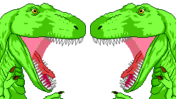
In this tutorial, we will create an image that look like this:

We use http://commons.wikimedia.org/wiki/File:Dinosaur_comic_left.png and Image Source II as sources for the image, so the tutorial will assume that they can be opened by GIMP.
Creating the canvas

First, we create an empty image where we can arrange the other images as needed. For this purpose we use the File > New... menu entry. Since the original images are both 124×139 pixels big, we make the new image 248×139 pixels large. Since we don't want to assume anything about the images' colors, we choose to fill the new image with transparency only.
Your image window should now look more or less as displayed on the right.
Importing the images
To import the images, simply open them as layers (File > Open as Layers...). You should now have the opened images as layers somewhere on the main canvas, possibly hiding under each other. In any case, the layers dialog should show them all.
Of course you could also add image data with Copy&Paste. First copy whatever you want and then paste it with Edit > Paste As > New Layer.
-
 File > Open as Layers...
 -
 Only one dinosaur head is visible, the other one is hidden below.
 -
 All the needed images are shown in the layers dialog.


.png)
Arrange layers
Now the only thing left to do is to arrange the layers as needed. For this we use the move tool to move them around until they fit nicely. The result should look more or less as the image below:

Finished! Now you just need to save the image.
Body Shifting
This is more or less how magazines are manipulating their images so that the models look "perfect" in their eyes and other areas. A nice example of this in Adobe Photoshop is available at [1]. I strongly recommend using the latest version of The GIMP.
Load an image that you want to manipulate. Go in <Image> Filters > Distorts > IWarp (for Adobe Photoshop and Photoshop Elements users, this is the equivalent of the "Liquify" filter).
You manipulate the image in the preview. In the "Deform Mode" section, choose "Move", this will deform the image in the direction of the movement of the mouse. For the purpose of body shifting, "Remove", "Grow" and "Shrink" are the other interesting buttons. They do what it says on the tin. Adjust "Deform radius" and "Deform amount" to your likings, depending how subtle your edits have to be. Also the "Swirl" options produce interesting results. If you want to start over (e.g. you messed your image up) click on "Reset".
Create a Brushed Metal Effect
This article will describe you how to create a brushed metal effect.

Step 1

First, we fill the canvas using the hurl filter (Filters > Noise > Hurl). Set Randomization (%) to 100.
This will do the same thing as the Scatter RGB filter (Filters > Noise > Scatter RGB) with all channels (Red, Green, and Blue) set to 1.0, However, Scatter RGB has slightly more options, and if you turn off Independent RGB in the settings dialogue, may allow you to skip the desaturation step.
Step 2
Then, apply a motion blur to the image (Filters > Blur > Motion Blur...) with an angle of 0 and a length of about 50. Change the angle to 180 and repeat the effect. Why? Notice how the right edge of the final image isn't nice and brushed looking? Doing it in both directions will smooth this out. You may have to adjust the length setting so as not to "overblur".


Alternatively, you can use the Gaussian Blur filter (Filters > Blur > Gaussian Blur). Just click the chain icon and turn the vertical value down and adjust the horizontal value until you are satisfied. This effect will not leave a side of the image left unblurred and may have an even more satisfying final result with proper adjustment.
Step 3
This is the shortest step. Now we only need to desaturate the image. Go to Colours > Desaturate and press Lightness, although Luminosity may sometimes look better.

Apply cropping / tiling / brightness / lighting filters to suit. Cropping may not be necessary if you've used the Gaussian Blur approach as opposed to the Motion Blur approach.
Create a Balloon
Step I
First, create a square image, and fill it with the colour of the balloon. Next, use the text tool to add any writing. This should be centred, and take up no more than about one-third of the space in each dimension. Merge the text layer with the colour layer.

Step II
Use "Map to Object" (<Image> Filters > Map > Map Object) to create a sphere. Ensure a transparent background is selected. By default, the sphere won't take up the whole of the image, so tweak this with the Orientation controls.

Step III
To get the shape of a balloon, use Curve Bend (<Image> Filters > Distorts > Curve Bend). Select to work on the lower curve, as a smooth. Add one control point in the lower half of the grid, centred horizontally.

Step IV
The resulting image won't fit the current size, so select <Image> Image > Fit Canvas to Layers.

Create a Stone Texture
This tutorial describes the creation of stone textures.
- 1: We start with Solid Noise (<Image> Filters > Render > Clouds > Solid Noise). Remember to tick the Tileable check box.
You can modify this a bit, but its effect may appear negative in the final result. You will see a rather smooth texture.

If you plan to make your image seamless, perhaps for usage in a 3D application, you might want to do a Gaussian Blur (<Image> Filters > Blur > Gaussian Blur) at 100 to make the texture more neutral.
 -->
-->
- 2: Now you have to add some stony grit on it. This can be done with Scatter RGB (<Image> Filters > Noise > Scatter RGB) with Independent RGB off and the values very low (Recommended around 0.05 per channel)
- 3: Create a New Layer using the New Layer button
 on the layer window (If you don't have one, in The Gimp's main window, go to <Toolbox> File > Dialogs > Create New Doc > Layers, Channels, and Paths.) and do the Plasma filter (<Image> Filter > Render > Clouds > Plasma). Try to get a good balance of black and white. Don't forget to set the Mode in the layer window to "Value" (not "Normal").

Moving the turbulence up just a little can also help if your aiming to make the texture seamless.

- 4: Now you have to use Lighting Effects (<Image> Filters > Light Effects > Lighting Effects), go to the bump map tab and choose the layer with the rendered Plasma. Place the light source as desired. Let the plug-in do the rest.

If you need to make your texture seamless, you probably want to do a Bump map instead, which has the same lighting for all pixels.

Add Speech Bubbles to a Comic Strip
This tutorial will show you how to add text and speech bubbles to pre-made art in The GIMP v2.0 or later.
Getting started
Make a copy
This step isn't strictly necessary, but it's a good idea that could save you from repeating steps if something goes horribly wrong. It's a very good idea if you're working on the only copy of your source image.
(Better yet, don't work on the only copy of your source image.)

When you open an image in The GIMP, it automatically becomes the background layer. Anything added to the image will be added as a higher layer, sitting above the background layer. You can combine layers by clicking Layers > Merge Down, and you'll probably want to at some stage, so you can work on multiple added items at the same time.
Right-click the Background' layer and select Duplicate. That way, if you accidentally merge the wrong layer down onto a lower one, or perform an operation that seems like a good idea but isn't (and can't be rolled back), you haven't overwritten the only copy of the art you have.
Add a filter
You'll most likely be adding text in black. If the background is dark as well, the text will be almost invisible and difficult to work with. You can make it easier to view dark text on a dark background by adding a semi-opaque layer between them in a light colour. To do this:
Click Layers > New Layer and select a transparent background.


To add the filter, select the Fill tool and select white as the colour to use. Reduce the opacity to 50% and click anywhere on the new layer. You'll see the image turn milky, because you're now viewing the background image through a semi-transparent white layer. Any text you lay down on top of this will be easy to see, and after you've added the speech bubbles around it, the filter can be removed, leaving the background looking like it did to begin with.


Text
Adding the text
To select the Text tool, press T. Select the colour, font and size you prefer. Use anti-alias should be ticked. Jagged edges on your text will make it harder to read, especially if the image is resized. Centre-aligned text is often best, too.


Positioning
After the text box is closed, the text tool automatically changes to the Move tool. At this point, if you try to move the text, you'll see it slide out of the box and vanish completely off the edges of the layer. Since you probably do want to move the text, to get it positioned just right, you'll want to expand the layer to the full size of the image. To do this:
Click Layer > Layer to Image Size.

Now you can select your text with the Rectangular selection tool. As soon as the mouse is released, the selection tool changes to the Move tool and you can simply drag your text to where it needs to be.
Combining styles
The GIMP text tool applies a single style to an entire block of text, so an example of what you can't do is bold or italicise individual words. (In other words, the previous sentence would be impossible.) To mix styles, add all the text of one style in a single layer, taking care to leave the space for the other styled text, then add a second text layer written in the second style, positioning it over the first.

Bubbles
Background
Once you have all the necessary text on the screen and in the right position, you can create the bubbles. First, add a new layer, below the text layer. This part of the process will involve painting out a section of the current layer, so if it's the same layer your text is on, you'll lose it.

Next, change to the Elliptical selection tool. Once again, make sure to anti-alias. Draw an oval around the text, making sure to leave enough white space so the text isn't crowded. This will become the bubble.

To add a stalk pointing to a character, change to the Path tool. (The GIMP's Path tool mirrors the Photoshop Bézier Curve tool.) This allows you to mark out an area to be added to the selection you made with the Ellipse tool.

First, click and release the mouse on a starting point just inside the oval. Next, click where you want the point of the stalk to be. If you want a straight line, release and continue to the next step. If you prefer a curve, hold the mouse button down and drag the pointer away from the second point. The line will deform into a curve. It'll take a bit of experimentation to get it exactly where you want it, but it's a nice effect.

Click back into the oval to complete the other side of the stalk. Now you have an oval around the text, and on top of that, a stalk.
Move back to the dialogues window again, and click the Paths tab. Right-click the uppermost path on the stack and select Add to selection.

Now the entire speech bubble including the stalk will have the blinking dashed line around it.

At this stage, you can experiment a little bit to add some variety among the different speech bubble shapes you have. For instance, the script-fu menu's selection options offers the distress selection tool, which will make the outline a bit more random.
Finally, select an appropriate background colour (white is the classic) and then the Fill tool again. (Make sure you raise the opacity back to 100% unless you prefer the speech bubble to be semi-transparent on top of your background image.) Click inside the selection and it will fill with the selected background colour out to the edges. Your text should now be invisible behind the background colour. Don't try working with the text or any other task yet, because you still need the speech bubble selected.
Border
Now that you have the speech bubble filled, you can add a black (or any other colour) border to it. To do this, first select a foreground colour and then:
Click Edit > Stroke selection....

The default line thickness is 6 pixels, which is probably too thick. 1px or 2px should be plenty. Click to confirm, and a border in the selected foreground colour will appear around the speech bubble.
In order to create a smoother border, first click Select > To Path. Then, click Edit > Stroke Path.... Proceed as stated in the previous paragraph.
Cleaning up
Text in bubble
Now that you have speech bubbles, you want the text in them. To accomplish this, go back to the layers window. There's probably a whole range of layers by now, since each block of text and each speech bubble you created added one (or more) new layer. Use the mouse to drag the speech bubble layers below the text layers and you'll see the words appear in the bubbles.
Removing the filter
Using the mouse on the layers window, select the semi-opaque layer you created. Right-click and select Delete. You'll see the background image snap back to its original colours behind your speech bubbles.

Saving your work
If you want to keep the different elements of the image on the separate layers, you'll need to save the image as a .xcf file, which is The GIMP's native file format. To save it in a format you can view in a browser or slideshow program, select the appropriate extension when you save the image and confirm that the file should be exported, (losing the separation between layers in the process).
General practices
We naturally start reading at the top left-hand corner of a box and proceed towards the bottom right. The first words spoken should be higher and further towards the left unless you have some other way in addition to speech bubble stalks of making it clear which character is speaking.
Dark text on a light background is easiest to read. Text and background should never have the same brightness even if they're different colours, since it makes it harder for the eye to distinguish between them. and in general the text should have the 'richer' colour (e.g. red, blue, green) and the background should be a 'washed-out' colour (e.g. white, grey, pale blue).
Start big. It's easy to scale large images down, small images scaled up will tend to be pixelated and won't look as good.
Don't crowd your images with too much talk. Text should give way to art rather than vice versa.
Adding thought bubbles
So far a very effective way of adding speech to your work has been showcased. Now it's time to get thinking!
Tailoring the text to your preferences
A quick note on tool-usage that seems to pass people by:

You must open the Tool Option dialogue and use it as above to get the best out of GIMP. In this case the text editor is selected, but you also need it to use all GIMP tools effectively. It is important in the next section.
Creating the Bubble
Now what you must do is select the tool options as in the screenshot above. This is essential if you want to follow the rest of this tutorial as you will be using it a lot to make sure everything is working correctly. In this instance the Text tool is selected so you can work on all the options such as the font and text size as well as the text justification. This is essential.
Now you need to type in your text as for the speech bubble tutorial. So far all is the same. Note: I have used the same sort of filter as in the earlier tutorial.

Time to add the selections for the bubble. As before select the elliptical marquee tool.

However, this time you need to select the option in the screenshot above from the Tool Options dialogue. This will allow you to draw the several ellipses necessary to create a thought bubble without cancelling the selection each time you click away from it.
After this just fill and stroke as for speech bubbles, move stuff around to your satisfaction, remember to delete the filter and - one thought bubble!

Blending Exposures
Digital Cameras are limited in their abilities to capture scenes with a large dynamic range. They are especially prone to blown out highlights, losing all detail in bright areas. This How to will demonstrate a method for capturing pictures and then processing them with the gimp to create a picture with more dynamic range that a normal picture. This will involve taking the picture and then combining them back into one picture using the gimp.
Auto Exposure Bracketing
We will use Auto Exposure Bracketing to create 3 differently exposed pictures. The first picture will be a normal exposure, the second one will be an underexposure containing the highlights, and the third one will be an overexposed picture containing the shadows.
You will need a tripod or another stable surface. It is very important that the camera does not move a single nanometre during the 3 exposures. Compose the frame in the viewfinder, then activate auto exposure bracketing. Then take the 3 pictures without moving the camera in between shots, preferable with a remote to avoid pressing the shutter button.
The results should look like this:


Editing With The Gimp
Open the middle exposure picture. From the File menu, select Open as Layers (default shortcut Ctrl+Alt+O) and shift-click to select both the dark and the bright exposure variants of the picture. This will add two layers, which you might want to rename to "light" and "dark" for example.
My images aren't perfectly aligned. Not sure why, maybe it has something to do with my tripod being on soft ground. Show only the underexposed and regular layer, and set the underexposed layer to partial transparency. Then zoom to 800% and move the underexposed layer until it is aligned with the regular exposure. Tap the arrow keys to move the layer one pixel at a time. You can try temporarily setting the mode of the dark layer to Divide or Difference; this will give strong contrast at unaligned edges (a high opacity will make the effect stronger). Repeat on the overexposed layer.

Now duplicate the background layer.

Now use the threshold tool on the duplicated layer to make the overexposed areas pure white
(<Image> Tools>Color Tools>Threshold...).

Add a layer mask to the underexposed layer. Cut the threshold that you just created and paste it onto the layer mask. (The layer mask is the rectangle in the layer dialogue to the right of the layer thumbnail.) With only the underexposed layer and regular layer, it should look like this:

The image looks rough at this point. To fix this select the layer mask and apply a Gaussian blur to it. I used a radius of 50px. The needed strength of the Gaussian blur will depend on the image so experiment with this value. This will ease the transition between the 2 images. It should now look like this:

Repeat with the overexposed image. The final image should look like this:

Installing Plugins
Adding additional functionally or automation to any application can be extremely useful. Take, for example, the DDS plugin. The DDS plugin is a now stable and reliable plugin to load DDS files, supporting the OpenGL S3TC extension. Of course, GIMP plugins are not limited to file loading. There exists a GIMP plugin for using the CMYK color model!
If you want to run Photoshop plugins in GIMP, Microsoft Windows and Linux users may use the PSPI plugin. http://www.gimp.org/~tml/gimp/win32/pspi.html
Extracting plugin packages
Almost every plugin you download will come in a package. You need to extract this package.
ZIP files can be extracted easily in Windows and GNU/Linux with the utilities included with your OS. Windows includes ZIP support by default. Most (if not all) GNU/Linux distributions include Info-ZIP, which can be used to decompress ZIP files, along with a GUI frontend, such as File Roller for GNOME and Ark for KDE.
RAR files are compressed using a proprietary format. WinRAR is the original tool for RAR, available for many platforms, WinRAR has a trial period BUT the trial period never ends so you can have the software forever for free. There are alternatives. The free software (as in freedom) unrar can unpack RAR files that do not use RAR 3.0 or later. If RAR 3.0 is needed, taking a newer CVS snapshot may work, which has been done for the unrar-free Debian and Ubuntu packages. The 7-Zip program includes support for RAR 3.0, but the RAR component is proprietary.
TAR.GZ and TAR.BZ2 files are compressed archives originating from GNU/Linux. It is a double extension. The "GZ" or "BZ2" section refers to the fact the compression method is gzip or bzip2. gzip and bzip2 can only compress single files, however, so a program like tar is used to merge the files/folders into one file, hence the "TAR" section of the name. On GNU/Linux, the original tools can be used, usually "tar -xvzf file.tar.gz" (TAR.GZ) or "tar -xvjf file.tar.bz2" (TAR.BZ2). On Windows, the free 7-Zip can be used.
7z files can be done in Windows with 7-Zip, and in GNU/Linux, if the p7zip utility is installed, Ark and File Roller will work, along with the p7zip command directly.
If you find any other file types, a quick search on the internet will help. On the Windows platform, 7-Zip is a piece of software that will extract most file formats, while on GNU/Linux, most free are bundled with the OS and others usually can be found in your package manager.
Copying the plugin to the GIMP plugin directory
Open up the folder containing the plugin. Now, copy the files to the clipboard (Select the files, right click one and press copy)
Windows
On Windows, go to the folder GIMP is installed in (usually somewhere in Program Files). Once in the GIMP main folder navigate to lib\gimp\*version*\ where as *version* represents the version of Gimp. Then double click the "plug-ins" folder. Not all plugins will run in Windows if the OS is 64bit.
To install a script (ends in ".scm") navigate to share\gimp\*version*\. Then double click the "scripts" folder, and paste.
Linux
On Linux, you might need to read the manual at the official site first under the section:
"1.3. Installing New Plugins" http://docs.gimp.org/en/gimp-scripting.html#gimp-plugins-install
Plugins may be stored in different locations depending upon your distribution.
Locally installing plugins are easiest because they will usually be stored in a hidden folder under $HOME/.gimp-*.* (where you should replace $HOME with path to your home catalogue and gimp-*.* with the version you use (for example 2.6). In this case, however, the plugins you install will only be available to the user who installed them, which may not be what you want.
If you want to install plugins globally, you might have to look around a bit more. Some boxes will have plugins stored at /opt/gnome/lib/gimp/2.0/plug-ins/ (change lib to lib64 if you've got a 64bit OS), others /usr/lib/gimp/2.0/plug-ins/ (change lib to lib64 if you've got a 64bit OS. Running "$whereis gimp" (or "which gimp") in a terminal might help. For example, if the output was /some/place/bin/gimp, then you could check the /some/place/lib (or lib64 if you've got a 64bit OS). In Ubuntu, plugins are located at /usr/share/gimp/2.0/ for both 32 and 64bit. Note that you have to be root to access these files.
Ubuntu Linux
Steps to install GIMP scripts / plugins
- Download the relevant GIMP script from the GIMP plug-in registry.
- Each GIMP script is available in two formats namely – Script-Fu (.scm) and Python script (.py). You can choose to download either one of them but not both. If you are downloading the Script Fu file, then it should be saved in GIMP scripts folder. If you are downloading the Python file, it should be saved in the GIMP plug-ins folder. Let’s assume we have downloaded the python script for the sake of this example.
- Save the downloaded python script into the GIMP plug-ins folder. In Ubuntu, it is in the directory /usr/lib/gimp/2.0/plug-ins/
How did I find the correct directory, you ask? I opened a terminal and ran the following command :
$ dpkg -L gimp | grep plug-ins
Of course, there is another way of finding the GIMP plug-ins folder which is, start GIMP and open “GIMP Preferences” dialog. In this dialog, click on “Folders > Plug-ins” and you will find the directory where GIMP installs all its plug-ins.
Now you copy the downloaded script (gimp-script.py) into this folder as follows :
$ sudo cp gimp-script.py /usr/lib/gimp/2.0/plug-ins/.
- Next open the terminal and set the execute bit for the python script file as follows :
$ sudo chmod +x /usr/lib/gimp/2.0/plug-ins/gimp-script.py
- Lastly, if you have GIMP already running, restart it so that it is aware of all the new scripts you have installed.
Mac
System-wide script-fu scripts are stored in /Applications/GIMP.app/Contents/Resources/share/gimp/2.0/scripts/. Executable and python plugins are located in /Applications/GIMP.app/Contents/Resources/lib/gimp/2.0/plug-ins/
User-private plugins are stored under $HOME/Library/Application Support/GIMP/2.8/plug-ins/.
NOTE: Check "Preferences > Folders" to confirm your plug-ins directory. On some systems, it may be set to "Library/Application Support/GIMP/2.8/plug-ins/" which is wrong. Fix this by adding a new path and restarting.
Testing the plugin
To test the plugin, simply open the GIMP and try the plugin. If this plugin makes a certain image type supported, try opening a file of that type. If the plugin is a filter, test it.
Troubleshooting
If the plugin appears to not be working, be sure that its for your OS and it is for your version of GIMP.
Also, Scheme ( Script-Fu ) plugins (*.scm) and python plugins go in their own respective folder, up one level from the regular plugins directory. Python plugins also require gimp-python.
The Script-Fu directory is something like /usr/share/gimp/2.0/scripts/.
Remove Coherent Noise
Interference or other regular patterns overlaid on an image can be introduced by a variety of sources, including:
- Electromagnetic interference in the environment of the device collecting the image;
- Noise in a transmitted image such as a television still due to analogue transmission interference or degradation of media;
- The texture of the paper that the image was printed on, particularly if it was printed in a cheap magazine or newspaper.
Attempting to remove these by ordinary image space techniques such as replicating the pattern and subtracting it would be extremely difficult and unlikely to be completely successful. Sometimes interference can be hidden by downscaling or blurring, but this is rarely a satisfactory solution. Sometimes convolutions can be used, but this is an advanced technique.
Since regular patterns have a very small bandwidth in the image's spectrum, a simple and effective technique for dealing with these problems is to identify the interfering features in the power spectrum image produced by Fourier analysis, eliminate them, and convert back to image space.
In order to fully understand what you are doing here, you should know the basic principles of Fourier analysis; anyway, following this step-by-step how-to will let you removing any unwanted regular pattern over the picture you want.
Installing all the necessary software
This guide is Linux-oriented, mainly on Ubuntu Linux. Since Gimp is multi-platform, this section could be generalized to any OS. Please do it if you know how to do it
First we have to install all the necessary software. All you need is available for free on Internet.
On Linux, you have to download and install:
- Gimp (obviously!) www.gimp.org
- The gimptool utility: it should be within Gimp. Several Linux distributions put it in a different package. On Debian and Ubuntu it is called libgimp2.0-dev
- fftw, a library to calculate the Fast Fourier Transform of any signal. You can get it from www.fftw.org. It is available on Ubuntu and Debian repositories as fftw3 and fftw3-dev
- the Fourier Gimp plug-in, you can get it from [2]. There is no package for Debian/Ubuntu, you have to install it from the source.
On Windows, to install the Fourier Gimp plug-in download the "Binaries for Windows" from http://people.via.ecp.fr/~remi/soft/gimp/gimp_plugin_en.php3#fourier and extract its contents into the Gimp plug-ins directory (.gimp-2.x\plug-ins in your user directory or C:\Program Files\GIMP-2.x\lib\gimp\2.0\plug-ins).
An example of coherent noise

On the right, you see the picture of a flower with a coherent noise pattern on it. One might get a picture like this using a scanner. It is evident that the disturbance we want to remove is all over the picture, so it would be very difficult to remove with traditional means, such as blurring, sharpening or cloning. It is regular pattern, so it should be easy to remove in the frequency domain. Unfortunately, removing the coherent noise will cause the removal of some information that is contained in the same frequencies as the pattern. It is very difficult to preserve that information, and it will not be considered in this tutorial.
Edit the image

First open the image with Gimp. If it's coloured, it will be in RGB format and you'll have to manipulate the RGB layers separately. In order to do so, right-click on the image and choose "Image > Mode > Decompose" (see screen-shot on left). Gimp will create another gray-scale image having the RGB as different layers
(With GIMP 2.6.4 "Decompose" can be found at: "Colors > Components > Decompose...".)

Choose RGB and press OK (see screenshot on right). This way you will get the decomposed picture.

Select the window with the new picture, go to the layers window (if you can't see it, go to "File > Dialogs > Layers" and it will appear) and hide all but one layer, by clicking on the eyes. Then select the remaining layer. In the screen-shot on the left, I have isolated the blue layer. Now you can work on one layer without influencing the others. Let us convert it to its spectrum using the FFT plug-in: right-click on the picture and go to "Filters > Generic > FFT Forward" (see again the screen-shot on left). Now you can manipulate the spectrum of the blue layer of the picture. Note: strictly speaking, the Fourier transform of a signal is made of amplitude and phase; Gimp will show you only the amplitude, and that is the only thing you can edit, but it is enough for our purpose.

Looking at the spectrum you should be able to see bright small spots. Those represent the spectrum of the noise you want to remove. Since it was very regular, its power will be very concentrated in the frequency domain. In the picture on the right, you can see the spectrum of the red layer, with two blinking arrows pointing where those spots are. The red layer was chosen just because the spots were more evident (that also means that most of the noise was contained in the red layer). All you have to do now is to delete them. If you were thinking about using the Erase tool, that's not such a good idea, because deleting the information completely will cause a sharp change in the spectrum, thus introducing even more coherent noise. You have to delete them smoothly. One way is to use the Blur tool - since it has an "averaging" effect; if you use it on the bright spots, you will actually decrease its magnitude without deleting them completely. Another possibility is to use the paintbrush tool with a mid-grey colour (808080 in hexadecimal notation). You can not know exactly where the noise ends and where the information you want to keep starts. You might have to experiment a bit to get a good result.

After you have finished deleting the spots, you have to convert it back to the image space domain by performing the inverse FFT. Right-click on the picture and choose "Filters > Generic > FFT Inverse" as shown in the picture on the left. Do the same for all the three layers.

After editing all the layers (remember to perform the inverse FFT on all of them!), you must mix them to get your RGB picture back. Right-click on the picture and choose "Image > Mode > Compose" (see screen-shot on right). Here is your picture!

The result is on the left. There is still some noise, but the picture is much better than the original!
Removal of Unwanted Elements in the Image
H7 Often there is a need to remove unwanted elements in an image, such as the background. There are multiple methods.
Method 1: Magic Wand
An easy method is to use the Magic Wand selection l.
- Firstly, right click on the layer you are working on and add an alpha channel if there is not already one. (Select Layer, Transparency, Add Alpha Channel.)
- Now switch to the Magic Wand tool. Make sure the mode is set to Add to the current selection. (Mode is on Toolbox palette, just below "Fuzzy select".)
- Select all the parts that you want to erase by simply clicking in the area.
- Press Delete.
Method 2: Colour to Alpha
An alternative method is Colour to Alpha. This method works better with logos with fewer than 5 colours.
- Firstly, right click on the layer you are working on and add an alpha channel if required.
- Select <Image> Colours > Colour to Alpha.
- Set the colour after the "From:" label to the colour that you would like to remove.
- Click OK.
- Repeat steps 1-4 for any other colours that you need to remove.
Method 3: Foreground Select
A new method is the Foreground Select tool. This is best when there is only one thing in the foreground which you want to keep.
- Firstly, select the Foreground Select tool.
- Mark out a rough area around the foreground.
- Scribble in the foreground only. Repeat scribbling until the coloured boundary is tightly around the foreground.
- Press ENTER.
- Go to <Image> Select > Invert.
- Press Delete.
Method 4: Use Resynthesizer to remove timestamps
To remove items like timestamps with GIMP, you may use the Resynthesizer plugin[1]. Just install it and try 'Filter' → 'Enhance' → 'Heal Selection'.
Method 5: Divide by a blurred version of the image

This method works best with sharp image content on blurry unwanted backgrounds such as the texture of white paper with some written text.
- Copy the whole image into a new layer. Now two layers with the same image exists.
- Select the top layer with the image and switch the mode from "normal" to "divide". The result is a blank white image.
- Select the top layer. In the menu select Filter -> Blur -> Gausian Blur...
- Adjust the parameters for optimal effect, then apply the filter.
- Go to layer -> merge down to combine the layers back to one single layer
Caption a Picture
This effect will create a text caption with an outline effect. Firstly, use the text tool to write your caption. A contrasting caption would typically be black text with a white border; the border will be coloured later, so use black text.
On the text layer, use
- <Image> Layer > Discard Text Information
- <Image> Layer > Layer to Image Size
- <Image> Layer > Mask > Add Layer Mask
Choose "Transfer layer's alpha channel" as initial mask

Duplicate the text layer ( in Layers dialogue or <Image> Layer > Duplicate Layer)
Select the lower layer's content, and fill it in white.
Switch to the layer's mask, and use <Image> Filters > Generic > Erode, this should expand the lower layer and give the text a border. This may need to be repeated several times ( Ctrl+F )
Different fills and gradients can be applied to the two layers for a range of effects. Additionally, if a layer's mask is copied into a new, hidden layer, this can be used to apply a bump map via <Image> Filters > Map > Bump Map.
A method that may be easier to follow is documented here with step-by-step photos.
Add a Shine to Buttons
What the Effect Looks Like
The effect will produce something like this:

Design the Button

For this button I selected all, then did Image>Select>Rounded Rectangle, with a radius of 50. I filled it with red, then I selected the border and filled with a darker red.
Add a New Layer for the Shine
Create a new layer (call it shine or something similar), then select the whole region of your button (If you created it on a new layer you can right click on the layer and select “Alpha to Selection”), next shrink the selection (Image>Select>Shrink), how much you want to shrink it depends on the size of the image, for mine I used 6px, then fill the selection with white.

Now, you have a big ugly white spot in your image, how will that be turned into a shine? First, turn the layer transparency down to about 80%, this is found in the layers dialogue
![]()
Turn the Ugly Spot into a Shine
First, add a layer mask, and select fill with black. (Full transparency).

Then go to the gradient tool and select linear white to black gradient, (make sure you are editing the layer mask-- it should have a white border around it in the layers dialogue), draw a gradient from wherever you want the shine to start (Top-left corner in the example) to about the middle, feel free to experiment.

ADD
Once you are done you may add another layer for drawing on, or put text on, for the example I added the text “ADD”.

External Tutorials
Many other people have written high quality tutorials. This page will collect links to some of those.
Tutorial sites:
- http://www.gimptalk.com/
- http://www.gimpusers.com/
- http://web.archive.org/web/20080206133322/http://gug.sunsite.dk/
- http://blog.patdavid.net/p/getting-around-in-gimp.html
- http://gimp-master.moy.su/
Single tutorials:
- Adding film grain to images
- Colorizing black and white sketches
- Creating Simple animations
- Creating icons
- Creating a detailed sketch out of a photo
- Creating minimalistic sketch out of a photo
- Smart sharpening of images with edge sharpening - Sharpens images without the noise
- Blending exposures - Allows for the best parts of two similar images to be integrated
- Recovering highlights - Fixes photos that are washed out in certain areas
- Adding a dreamy feel to a photo
- Sepia toning - Like black and white, but with a different tone and feel
- Contrast masks - Can enhance the feel of photos and give them a nice tone
- Camera noise removal - Removes noise from digital photos
- Selective colorization - Colorize parts of an image, leave the rest black and white
- Converting images from color to black and white - Detailed tutorial
- Batch image processing - Automatically process a bunch of images in the same way
- Creating a stone texture
- Create iText - Create shiny, Mac-like text
- Create chrome text
- Create fractal backgrounds
- Create the Web 2.0 wet-floor-effect
- Creating a "Neutral density filter" - (Fix dark lighting)
- Change the focus - Blur the background to accentuate objects the foreground
- Make photos look as if they were vignetted - Simulates having used a wide angle lens or lens hoods
- Creating a website layout with GIMP
- Creating lightening particle-like effects
- ↑ Resynthesizer Homepage, in Debian Linux, Resynthesizer is included in the gimp-plugin-registry package.