HyperText Markup Language/Print version
This is a guide to HTML--the markup language of the World Wide Web. This book is about HTML, not about how to make it dynamic, on which see JavaScript.
Introduction
The HyperText Markup Language (HTML) is a simple data format used to create hypertext documents that are portable from one platform to another. The HTML (HyperText Markup Language) is used in most pages of the World Wide Web. HTML files contain both the primary text content and additional formatting markup, i.e. sequences of characters that tell web browsers how to display and handle the main content. The markup can specify which parts of text should be bold, where the headings are, or where tables, table rows, and table cells start and end. Though most commonly displayed by a visual web browser, HTML can also be used by browsers that generate audio of the text, by braille readers that convert pages to a braille format, and by accessory programs such as email clients.
Before we start
To author and test HTML pages, you will need an editor and a web browser. HTML can be edited in any plain text editor. Ideally, use one that highlights HTML markup with colors to make it easier to read. Common plain text editors include Notepad (or Notepad++) for Microsoft® Windows, TextEdit for Mac, and Kate, Gedit, Vim, and Emacs for Linux.
Many others editors exist with a wide range of features. While some offer WYSIWYG (what you see is what you get) functionality, that means hiding the markup itself and having to auto-generate it. WYSIWYG options are rarely as clean or transparent as manually written code. Furthermore WYSIWYG is not nearly as useful for learning compared with real code-based text editors.
To preview your documents, you'll need a web browser. To assure most viewers will see good results, ideally you will test your documents in several browsers. Each browser has slightly different rendering and particular quirks.
The most common browsers include Microsoft Edge, Google Chrome, Mozilla Firefox, Safari, and Opera. To assure that your documents are readable in a text-only environment, you can test with Lynx.
A simple document
Let's start with a simple document. Write this code in your editor (or copy-and-paste it), and save it as "index.html" or "index.htm". The file must be saved with the exact extension, or it will not be rendered correctly.
<!DOCTYPE html>
<html>
  <head>
    <title>Simple document</title>
  </head>
  <body>
    <p>This is some text in a paragraph that will be seen by viewers.</p>
  </body>
</html>
Now open the document in your browser and look at the result. From the above example, we can deduce certain essentials of an HTML document:
- The first line with
<!DOCTYPE html>declares the type of the document. - The HTML document begins with a
<html>tag and ends with its counterpart, the</html>tag. - Within the
<html></html>tags, there are two main pairs of tags,<head></head>and<body></body>. - Within the
<head></head>tags, there are the<title></title>tags which enclose the textual title to be shown in the title bar of the web browser. - Within the
<body></body>is a paragraph marked by a<p></p>tag pair.
General HTML tag code style
- Most tags must be written in pairs between which the effects of the tag will be applied.
- <em>This text is emphasized</em> – This text is emphasized
- This text includes <code>computer code</code> – This text includes
computer code - <em>This text is emphasized and has <code>computer code</code></em> – This text is emphasized and has
computer code
- HTML tag pairs must be aligned to encapsulate other tag pairs, for example:
- <code><em>This text is both code and emphasized</em></code> –
This text is both code and emphasized - A mistake: <em><code>This markup is erroneous</em></code>
- <code><em>This text is both code and emphasized</em></code> –
The <html> Tag
The <html> and </html> tags are used to mark the beginning and end of an HTML document. This tag does not have any effect on the appearance of the document.
This tag is used to make browsers and other programs know that this is an HTML document.
Useful attributes:
- dir attribute
- This attribute specifies in which manner the browser will present text within the entire document. It can have values of either ltr (left to right) or rtl (right to left). By default this is set to ltr. Generally rtl is used for languages like Persian, Chinese, Hebrew, Urdu etc.
Example: <html dir="ltr">
- lang attribute
- The lang attribute generally specifies which language is being used within the document.
Special types of codes are used to specify different languages:
en - English
fa - Farsi
fr - French
de - German
it - Italian
nl - Dutch
el - Greek
es - Spanish
pt - Portuguese
ar - Arabic
he - Hebrew
ru - Russian
zh - Chinese
ja - Japanese
hi - Hindi
Example: <html lang="en">
Head and Body
An HTML file is divided into two basic sections: the head and the body, each demarcated by their respective tags. Thus, the essential structure of an HTML document looks like this :
<!DOCTYPE html>
<html lang="...">
   <head>
        ...
   </head>
   <body>
        ...
   </body>
</html>
The HEAD element
All data in the head section of an HTML document is considered "meta-data", meaning "data about data". The information in this section is not normally displayed directly. Instead elements such as style affect the appearance of other elements in the document. Some items in the head section may be used by programs such as search engines to learn more about the page for reference purposes.
The head element should always contain a title element which sets the title commonly displayed by the web browser in the title bar of the window. Here is an example of the use of the title element:
<head>
   <title>This is the Title</title>
</head>
There can only be one title in the header section.
There may be any number of the following elements inside the head element:
- style
- Used to embed style rules in a document. In most cases, a consistent look across multiple web pages is desired, so style is specified in a separate stylesheet file, linked using the
linkelement. Thus, style is used in the head when the style applies to this page only.
- link
- Used to link the page to various external files, such as a style sheet or the location of the RSS feed for the page. The type of link is set using the
relattribute. Thetypeattribute specifies the MIME type of the document found at the location given by thehrefattribute. This allows the browser to ignore links to MIME types it does not support. Examples:<link rel="stylesheet" type="text/css" href="style.css">
<link rel="alternate" type="application/rss+xml" href="rss.aspx" title="RSS 2.0">
- script
- Used to link to an external Javascript file or to embed Javascript in the page. Linking to an external file is the preferred technique in real web pages though many examples embed the script for simplicity.
- meta
- Used to set additional meta-data properties for the HTML document, such as related keywords, etc. Examples:
<meta charset="utf-8">
<meta name="keywords" content="web, HTML, markup, hypertext">
- object
- Embeds a generic object. This element is not commonly used in the head, but rather in the body section.
There may also be a single base element. This element sets the base URI for resolving relative URIs. It is rarely necessary to use this element.
The TITLE element
The title element contains your document title and identifies its contents in a global context.
The title is typically displayed in the title bar at the top of the browser's window.
It is also displayed on the bookmark list of the browser.
Title is also used to identify your page for search engines.
Example:
<html>
<head>
<title>Some Amazing Web Page</title>
</head>
</html>
The BODY element
Unlike the head element, any plain text placed between the <body> tags will be displayed on the web page by the browser.
What to avoid. The following example is bad practice:
<body text='black' link='red' alink='pink' vlink='blue'
      bgcolor='#DDDDDD' background='wallpaper.gif'>
   ...
</body>
The current standard is HTML5, and text, link, alink, vlink, bgcolor and background attributes have all been long deprecated. You may find them in older files, but they should not be used now. They have been superseded by the CSS rules given below (using these rules is discussed in a later section HyperText Markup Language/CSS). The values from the previous example have been used as examples in these rules.
- text
body { color:black }- bgcolor
body { background-color:#DDDDDD }- background
body { background-image: url(wallpaper.gif) }- link
a:link { color:red }- alink
a:active { color:pink }(an active link is a link that is being clicked or has the keyboard focus)- vlink
a:visited { color:blue }- hover (not an html attribute)
a:hover { color:green }('hover' is the style of a link when the mouse pointer is over it)
Paragraphs and Headings
The bulk of a typical web page often consists of paragraphs structured with the use of headings.
Paragraphs
The p element is used to split text into paragraphs.
  <p>An introductory paragraph.</p>
  <p>Another introductory paragraph.</p>
Headings
There are six levels of headings. The most important heading(s) in a document should be level one. Sub-headings should be level two. Sub-sub-headings should be level three, etc. Do not skip levels. If the default sizes do not suit your document, use CSS to change them. Headings should be used to effectively outline your content. By doing so, users can find information more quickly, and some search engines use headings to help rank page content.
<h1>This is Level 1</h1>
<h3>This is Level 3</h3>
<h5>This is Level 5</h5>
Example
This example will be used in the next section where we see how to change the appearance of a document.
<!DOCTYPE html>
<html lang="en">
  <head>
    <title>Sundial</title>
  </head>
  <body>
    <h1>Sundial</h1>
    <p>From Wikipedia, the free encyclopedia.</p>
    <p>A sundial measures time by the position of the sun. The most commonly seen designs, such as the
       'ordinary' or standard garden sundial, cast a shadow on a flat surface marked with the hours of
       the day. As the position of the sun changes, the time indicated by the shadow changes. However,
       sundials can be designed for any surface where a fixed object casts a predictable shadow.
    </p>
    <p>Most sundial designs indicate apparent solar time. Minor design variations can measure standard
       and daylight saving time, as well.
    </p>
    <h2>History</h2>
    <p>Sundials in the form of obelisks (3500 BC) and shadow clocks (1500 BC) are known from ancient
       Egypt, and were developed further by other cultures, including the Chinese, Greek, and Roman
       cultures. A type of sundial without gnomon is described in the old Old Testament
       (Isaiah 38:2).
    </p>
    <p>The mathematician and astronomer Theodosius of Bithynia (ca. 160 BC-ca. 100 BC) is said to have
       invented a universal sundial that could be used anywhere on Earth. The French astronomer Oronce
       Finé constructed a sundial of ivory in 1524. The Italian astronomer Giovanni Padovani published
       a treatise on the sundial in 1570, in which he included instructions for the manufacture and
       laying out of mural (vertical) and horizontal sundials. Giuseppe Biancani's Constructio
       instrumenti ad horologia solaria discusses how to make a perfect sundial, with accompanying
       illustrations.
    </p>
    <h3>Installation of standard sundials</h3>
    <p>Many ornamental sundials are designed to be used at 45 degrees north. By tilting such a
       sundial, it may be installed so that it will keep time. However, some mass-produced garden
       sundials are inaccurate because of poor design and cannot be corrected. A sundial designed for
       one latitude can be adjusted for use at another latitude by tilting its base so that its style
       or gnomon is parallel to the Earth's axis of rotation, so that it points at the north celestial
       pole in the northern hemisphere, or the south celestial pole in the southern hemisphere.
    </p>
    <p>A local standard time zone is nominally 15 degrees wide, but may be modified to follow
       geographic and political boundaries. A sundial can be rotated around its style or gnomon (which
       must remain pointed at the celestial pole) to adjust to the local time zone. In most cases, a
       rotation in the range of 7.5 degrees east to 23 degrees west suffices.
    </p>
    <p>To correct for daylight saving time, a face needs two sets of numerals or a correction table.
       An informal standard is to have numerals in hot colors for summer, and in cool colors for
       winter. Rotating the sundial will not work well because most sundials do not have equal hour
       angles.
    </p>
    <p>Ordinary sundials do not correct apparent solar time to clock time. There is a 15 minute
       variation through the year, known as the equation of time, because the Earth's orbit is
       slightly elliptical and its axis is tilted relative to the plane of its orbit. A quality
       sundial will include a permanently-mounted table or graph giving this correction for at least
       each month of the year. Some more-complex sundials have curved hour-lines, curved gnomons or
       other arrangements to directly display the clock time.
    </p>
  </body>
</html>
Text Formatting
The Text Formatting elements give logical structure to phrases in your HTML document. This structure is normally presented to the user by changing the appearance of the text.
We have seen in the Introduction to this book how we can emphasize text by using <em></em> tags. Graphical browsers normally present emphasized text in italics. Some Screen readers, utilities which read the page to the user, may speak emphasized words with a different inflection.
A common mistake is to tag an element to get a certain appearance instead of tagging its meaning. This issue becomes clearer when testing in multiple browsers, especially with graphical and text-only browsers as well as screen readers.
You can change the default presentation for any element using Cascading Style Sheets. For example, if you wanted all emphasized text to appear in red normal text you would use the following CSS rule:
em { font-style:normal; color:red; }
In this section, we will explore a few basic ways in which you can markup the logical structure of your document.
Emphasis
HTML has elements for two degrees of emphasis:
- The
emelement for emphasized text, usually rendered in italics. - The
strongelement for strongly emphasized text, usually rendered in bold.
An example of emphasized text:
It is essential not only to guess but actually <em>observe</em> the results.
An example rendering:
An example of strongly emphasized text:
Let us now focus on <strong>structural markup</strong>.
An example rendering:
Preformatted text
Preformatted text is rendered using fixed-width font, and without condensing multiple spaces into one, which results in preserved spacing. Newlines are rendered as newlines, unlike outside preformatted text. HTML markup in the preformatted text is still interpreted by browsers though, meaning that "<em>a</em>" will still be rendered as "a".
To create preformatted text, start it with <pre> and end it with </pre>.
An example:
<pre>
,-----------------------,
| No. | Person          |
|-----------------------|
| 1.  | Bill Newton     |
| 2.  | Magaret Clapton |
'-----------------------'
</pre>
The resulting rendering:
,-----------------------,
| No. | Person          |
|-----------------------|
| 1.  | Bill Newton     |
| 2.  | Magaret Clapton |
'-----------------------'
Omitting the preformatting tags will cause the same text to appear all in one line:
,-----------------------, | No. | Person | |-----------------------| | 1. | Bill Newton | | 2. | Magaret Clapton | '-----------------------'
Special Characters
To insert non-standard characters or characters that hold special meaning in HTML, a character reference is required. For example, to input the ampersand, "&", "&" must be typed. Characters can also be inserted by their ASCII or Unicode number code.
|
|
Abbreviations
Another useful element is abbr. This can be used to provide a definition for an abbreviation, e.g.
<abbr title="HyperText Markup Language">HTML</abbr>
- Will be displayed as: HTML
- When you will hover over HTML, you see HyperText Markup Language
Graphical browsers often show abbreviations with a dotted underline. The title appears as a tooltip. Screen readers may read the title at the user's request.
Note: very old browsers (Internet Explorer version 6 and lower) do not support abbr. Because they support the related element acronym, that element has been commonly used for all abbreviations.
An acronym is a special abbreviation in which letters from several words are pronounced to form a new word (e.g. radar - Radio Detection And Ranging). The letters in HTML are pronounced separately, technically making it a different sort of abbreviation known as an initialism.
Discouraged Formatting
HTML supports various formatting elements whose use is discouraged in favor of the use of cascading style sheets (CSS). Here's a short overview of the discouraged formatting, so that you know what it is when you see it in some web page, and know how to replace it with CSS formatting. Some of the discouraged elements are merely discouraged, others are deprecated in addition.
| Element | Effect | Example | Status | CSS Alternative |
|---|---|---|---|---|
b
|
boldface | bold | font-weight: bold;
| |
i
|
italics | italics | font-style: italic;
| |
u
|
underlined | underlined | deprecated | text-decoration: underline;
|
tt
|
typewriter face | typewriter face | font-family: monospace;
| |
s
|
strikethrough | deprecated | text-decoration: line-through;
| |
strikethrough
|
strikethrough | <strikethrough>strikethrough</strikethrough> | deprecated | text-decoration: line-through;
|
big
|
big font | big | font-size: larger;
| |
small
|
small font | small | font-size: smaller;
| |
font
|
font size | size=1 | deprecated | font-size:(value) |
center
|
center a block | deprecated | text-align: center;
|
Cascading Style Sheets
The use of style elements such as <b> for bold or <i> for italic is straight-forward, but it couples the presentation layer with the content layer. By using Cascading Style Sheets, the HTML author can decouple these two distinctly different parts so that a properly marked-up document may be rendered in various ways while the document itself remains unchanged. For example, if the publisher would like to change cited references in a document to appear as bold text as they were previously italic, they simply need to update the style sheet and not go through each document changing <b> to <i> and vice-versa. Cascading Style Sheets also allow the reader to make these choices, overriding those of the publisher.
Continuing with the above example, let's say that the publisher has correctly marked up all their documents by surround references to cited material (such as the name of a book) in the documents with the <cite> tag:
<cite>The Great Gatsby</cite>
Then to make all cited references bold, one would put something like the following in the style sheet:
cite { font-weight: bold; }
Later someone tells you that references really need to be italic. Before CSS, you would have to hunt through all your documents, changing the <b> and </b> to <i> and </i> (but being careful *not* to change words that are in bold that are not cited references).
But with CSS, it's as simple as changing one line in the style sheet to
cite { font-style: italic; }
Hyperlinks
Hyperlinks are the basis of navigation of the internet. They are used for moving around among sections of the same page, for downloading files, and for jumping to pages on other web servers. Hyperlinks are created with the anchor tag. Let us start with a quick example:
To learn more, see <a href="http://en.wikipedia.org/wiki/Main_Page">Wikipedia</a>.
- Will be displayed as: To learn more, see Wikipedia.
Absolute vs. Relative
Before we get into creating a hyperlink (or "link" for short), we need to discuss the difference between an absolute URL and a relative URL. First, the absolute URL can be used to direct the browser to any location. For example, an absolute URL might be:
https://en.wikibooks.org/
However, when there is a need to create links to multiple objects in the same directory tree as the web page, it is a tiring procedure to repeatedly type out the entire URL of each object being linked to. It also requires substantial work should the webpage move to a new location. This is where Relative URLs come in. They point to a path relative to the current directory of the web page. For example:
home.html
./home.html
../home.html
This is a relative URL pointing to a HTML file called home.html which resides in the same directory (folder) as the current web page containing the link. Likewise:
images/top_banner.jpg
This is another relative URL pointing to a subdirectory called images which contains an image file called "top_banner.jpg".
Linking to a Location within a Page
Sometimes specifying a link to a page isn't enough. You might want to link to a specific place within a document. The book analogue of references of this type would be saying "Third paragraph on page 32" as opposed to just saying "page 32". Let's say that you want a link from document a.html to a specific location in a document b.html. Then you start by giving an id to the a particular paragraph in b.html. This is done by adding <p id="some_name"> (where some_name is a string of your choice) as the paragraph tag in b.html. Now that location can be referenced to with <a href="b.html#some_name"> from document a.html.
Target Links
Now we are ready to create a hyperlink. Here is the basic syntax :
<a href="URL location" target="target">Alias</a>;
In the above syntax, "URL location" is either the absolute or relative path of the object being linked to. "target" is an optional attribute which specifies where the object being linked to is to be opened / displayed. For example :
<a href="https://en.wikibooks.org/" target="_blank">English Wikibooks</a>;
The above example uses an absolute URL of https://en.wikibooks.org/, and specifies a target of "_blank" (which would cause the URL to be opened in a new browser window).
Special Targets
- _blank
- A new blank window is opened to load the linked document into. The location in the address bar (if shown in the new window) gives the hyperlink location of the new resource requested by the user's clicking on the hyperlink.
- _self
- The current frame that contains the document and the link to be clicked on is used to load the linked document; if the link is part of a document that occupies a whole window then the new document is loaded into the whole window, but in the case of a frame, the linked document is loaded into the current frame. The location won't be shown in the address bar unless the linked document was loaded into the main window as opposed to a child frame of a frameset.
- _parent
- The linked document is loaded into the parent frame of the one containing the link to be clicked on; this is only important in nested framesets. If window W contains frameset F consisting of a child frame A and also a child frame B that is itself a frameset FF with "grandchildren" frames C and D (giving us Window W with three visible panes A, C and D), then clicking a hyperlink in the page in frame D with a target=_parent will load the linked document into D's parent frame, that is, into frame B, so replacing frameset FF that was previously defined as the content of frame B. Documents C and D that were the frames of this frameset FF in B will be entirely replaced and this will leave only frame A and the new document from the hyperlink left in frame B, all inside the main frameset F in window W. The location is only shown in the address bar of the window if the parent frame happened to be the window itself.
- _top
- The linked document is loaded into the window, replacing all files currently displayed in the window in whatever frames they may be found in. The location at the top of the window, in the address/location bar is seen to point to the linked document once the hyperlink is clicked.
Hyperlinks on Images
An example:
<a href="http://en.wikipedia.org/wiki/HTML">
<img src="http://commons.wikimedia.org/wiki/Image:Html-source-code2.png"></a>
Example rendering:

As you can see, placing hyperlinks on images is in complete analogy to placing them on text. Instead of putting text inside the a element, you place an image there.
Email Links
To create an email link, use:
<a href="mailto:email@example.com">Email Example.com</a>
.
Images
Let us start with a quick minimum example:
<img src="turtleneck-sweater.jpeg" />
And let us also have a look at more extended example:
<img src="turtleneck-sweater.jpeg" alt="Photograph of a Turtleneck Sweater"
     title="Photograph of a Turtleneck Sweater" />
Images are normally stored in external files. To place an image into an HTML source, use the img tag with the src attribute containing the URL of the image file. To support browsers that cannot render images, you can provide the alt attribute with a textual description of the image. To provide a tooltip to the image, use the title attribute.
The space before the /> in the examples is there on purpose. Some older browsers behave strangely if the space is omitted.
Placement
Per default, images are placed inline to their surroundings. To place the image as a block or float instead, you can use Cascading Style Sheets.

Alternative text and tooltip
The HTML specification requires that all images have an alt attribute. This is commonly known as alt text. Images can be split in to two categories:
- those that add to the content of the page;
- those that are purely decorative, e.g. spacers, fancy borders and bullets.
Decorative images should have empty alt text, i.e. alt="". Images used as bullets may use an asterisk, alt="*".
All other images should have meaningful alt text. Alt text is not a description of the image, use the title attribute for short descriptions. Alt text is something that will be read instead of the image. For example,
<img src="company_logo.png" alt="???"> makes the best widgets in the world.
The alt text should be the company's name not the ever popular 'Our logo', which would give the sentence 'Our logo makes the best widgets in the world.' when read in a text only browser.
The alt attribute stands for alternate which screenreaders for the blind, as well as non-graphic-capable browsers (such as Lynx) may use to better enable its user to understand the purpose of the image.
Fully and accurately using alt text is essential for the following reasons:
- Allows blind and vision impaired users to understand the content of your website.
- Assists robots and search engines in understanding the content of your website.
Tooltips

Some older browsers incorrectly use the alt attribute' tag to produce image tooltips. However, the title attribute should actually be used for this.
Width and height
To have an image appear smaller than it is in the external file, use the attributes width and height. When only one or the other is specified, images will scale to keep the same overall ratio.
Format
Most images for the web will be made using a limited number of formats. Below is a simple list of commonly supported formats.
- jpg / jpeg
- Useful for photographs.
- Near universal support.
- Does not recreate images perfectly, leading to visible issues with many simple logos and illustrations.
- webp
- More efficient alternative to jpg.
- Also supports animation and transparency.
- png
- Useful for images with transparency.
- Good for simple or flat colors, such as cartoons, such as logos.
- svg
- Vector format with infinite resolution.
- Great for logos and simple geometry.
- Not useful for photographs.
- gif
- Supports animated images.
- Very limited in color and resolution support.
- Very inefficient format.
-
 JPG images are ideal for still photographs or detailed paintings.
 -
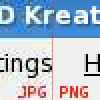 JPG is not ideal for simple graphics. Here a lossy JPG is compared with a lossless PNG.
 -
 Raster graphics (left), compared with SVG (right)
 -
 A comparison between lossless PNG, lossy JPG, and lossy Webp, including filesizes. The lossy formats are much smaller then the lossless PNG. The Webp delivers better visual fidelity then the JPG at about the same file size.


Lists
In HTML, there are three kinds of lists, each appropriate for a different kind of information. An unordered list made with <ul> and </ul> tags is meant for elements that have no order or the order is unimportant (typically shown with bullets). An ordered list created using the <ol> and </ol> tags is typically shown with numbers and is used for elements whose order matters such as a sequence of steps to perform. Finally, there are definitions lists, created with <dl> and </dl> tags.
Ordered Lists
Ordered lists provide a list of items, each of which are preceded by an incremental number starting from 1.
Sample HTML:
  <ol>
    <li>First item</li>
    <li>Second item</li>
    <li>Third item</li>
  </ol>
Example rendering:
- First item
- Second item
- Third item
Unordered Lists
Unordered lists display a list of items, each of which is prefixed by a bullet.
Sample HTML:
  <ul>
    <li>First item</li>
    <li>Second item</li>
    <li>Third item</li>
  </ul>
Example rendering:
- First item
- Second item
- Third item
Definition Lists
Definition lists display a list of bolded terms, followed by the definition on a new line and prefixed by a tab (by default).
Sample HTML:
  <dl>
    <dt>Term 1</dt>
    <dd>Definition of Term 1</dd>
    <dt>Term 2</dt>
    <dd>Definition of Term 2</dd>
  </dl>
Example rendering:
- Term 1
- Definition of Term 1
- Term 2
- Definition of Term 2
If two terms share the same definition they can be grouped together like so:
  <dl>
    <dt>Cascading Style Sheets</dt>
    <dt>CSS</dt>
    <dd>Definition of Cascading Style Sheets (aka CSS)</dd>
    <dt>Term 2</dt>
    <dd>Definition of Term 2</dd>
  </dl>
Example rendering:
- Cascading Style Sheets
- CSS
- Definition of Cascading Style Sheets (aka CSS)
- Term 2
- Definition of Term 2
If a term has two alternative definitions use a separate dd element for each definition, e.g.
  <dl>
    <dt>Mouse</dt>
    <dd>Small mammal</dd>
    <dd>Input device for a computer</dd>
  </dl>
Example rendering:
- Mouse
- Small mammal
- Input device for a computer
Longer definitions can be broken up into paragraphs by nesting p elements within the dd element.
  <dl>
    <dt>Term 2</dt>
    <dd>
      <p>First paragraph of the definition.</p>
      <p>Second paragraph of the definition.</p>
    </dd>
  </dl>
Example rendering:
- Term 2
-
First paragraph of the definition.
Second paragraph of the definition.
Nested Lists
Lists can be nested. An example:
<ul>
  <li>Lists
    <ul>
      <li>Numbered Lists</li>
      <li>Unnumbered Lists</li>
    </ul>
  </li>
</ul>
Example rendering:
- Lists
- Numbered Lists
- Unnumbered Lists
When nesting, nested list elements should be within a parent list item element.
An example of incorrect nesting:
<ul>
  <li>Lists</li>
  <ul>
    <li>Numbered Lists</li>
    <li>Unnumbered Lists</li>
  </ul>
</ul>
A further example of incorrect nesting, with two consecutive UL elements:
<ul>
   <li>
      Outer list item
      <ul>
        <ul>
          <li>
            Inner list item within two consecutive UL elements
          </li>
        </ul>
      </ul>
   </li>
</ul>
Note on format
The above descriptions of each of the three list types refer to the default rendering of the corresponding HTML code by the web browser. However, by using CSS, you are able to change the formatting of the lists. For example, with CSS you are able to make the lists horizontal as opposed to the vertical.
Example
An example of using lists to mark up a recipe for pancakes.
<!DOCTYPE html>
<html lang="en">
  <head>
    <title>Pancakes</title>
  </head>
  <body>
    <h1>A Recipe for Pancakes</h1>
    <p>From <a href="http://en.wikibooks.org/wiki/Cookbook:Pancake">Wikibooks Cookbook</a>.</p>
    <p>These pancakes make a good breakfast for a family.
       They go well with real maple syrup.
       They are healthy too (as long as you don't over-do the syrup!)
       since whole wheat flour contributes to your fiber intake.
    </p>
    <h2>Ingredients</h2>
    <ul>
      <li>1 cup whole wheat flour</li>
      <li>1 tablespoon common granulated sugar</li>
      <li>2 teaspoons baking powder</li>
      <li>1/4 teaspoon salt</li>
      <li>1 egg</li>
      <li>1 cup milk</li>
      <li>2 tablespoons oil</li>
      <li>additional oil for frying</li>
    </ul>
    <h2>Procedure</h2>
    <ol>
      <li>Oil a frying pan.</li>
      <li>Mix the dry ingredients in one bowl.</li>
      <li>In another bowl, scramble the egg, then add the other wet ingredients.
          This includes the 2 tablespoons of oil.</li>
      <li>Mix the dry and wet ingredients together,
          well enough to eliminate dry spots but no more.</li>
      <li>Heat the frying pan to medium temperature.
          The pan is hot enough when a drop of water dances around
          rather than simply boiling away.</li>
      <li>Pour a pancake, about 4 inches in diameter using about a 1/4 cup of batter.</li>
      <li>The pancake will bubble. When the bubbling settles down and
          the edges are slightly dry, flip the pancake.</li>
      <li>When the pancake looks done, remove it and start another one.</li>
    </ol>
    <h2>Toppings</h2>
    <p>Traditionally, pancakes are topped with butter and maple syrup.
       Other toppings can include strawberries, applesauce, cinnamon, or sugar.
    </p>
 </body>
</html>
Tables
Tables are used for presenting tabular data. They can be inserted anywhere on the page, even within other tables. We will be looking at creating a basic table and then adding lots of tags to it so we can see just what the outcome will be. Experimentation is the name of the game here. The tags most useful when creating tables are <table> - table, <tr> - table row, <td> - table data, and <th> - table heading.
Minimal tables
First let us have a look at quick example:
 <table>
 <tr><th>Food</th><th>Price</th></tr>
 <tr><td>Bread</td><td>$2.99</td></tr>
 <tr><td>Milk</td><td>$1.40</td></tr>
 </table>
Every table begins with a <table> tag and ends with a </table> tag. In the table tag, you can define the attributes of the table, as you will see later.
The table contains rows, each begins with the <tr> table row tag and optionally ends with the </tr> tag. Rows must be inside tables.
The rows contain cells, each begins with the <td> table data tag and optionally ends with the </td> tag. Cells must be inside rows.
If you put a table cell outside a row, or if you forget to close a cell, or row, or table it will have unpredictable results. Text intended to be in the table may appear at an unexpected position, outside the table. At worst, the entire contents of the table will not be displayed.
For example, in IE and Firefox:
- A cell outside a row is treated as in a separate row at the vertical position concerned
- All content outside cells, whether in a row or not, is put before the whole table, in the order in which it occurs; IE puts each item on a new line; Firefox does not, but puts in some cases a blank space between items.
If the optional </td> and </tr> are not put, the above refers to content before the first row, and in rows before the first element only. Note that </table> is required; if it is forgotten all following content is considered part of the last cell of the last row, even further tables.
Task - Create a table
- Open your default.htm and save it as table.htm in the appropriate folder
- Create this HTML code in the body of the document
 <table>
 <tr><th>Food</th><th>Price</th></tr>
 <tr><td>Bread</td><td>$2.99</td></tr>
 <tr><td>Milk</td><td>$1.40</td></tr>
 </table>
- Save the file and view it in the browser.
The result is:
| Food | Price |
|---|---|
| Bread | $2.99 |
| Milk | $1.40 |
It doesn't look too much like a table yet, but we'll add more soon.
Note: This table is made up of two rows (check out the two <tr> tags) and within each row there are two data entries (the two <td> tags)
You might compare a table with a spreadsheet. This one has two rows and two columns making 4 cells containing data. ( 2 rows x 2 columns = 4 cells )
Caption and headings
Let us start with a quick example:
<table>
<caption>Formulas and Results</caption>
<tr><th>Formula</th><th>Result</th></tr>
<tr><td>1 + 1</td><td>2</td></tr>
<tr><td>3 * 5</td><td>15</td></tr>
</table>
Captions are useful for defining or describing the content of the table. They are optional.
To add a caption to a table, enter the caption element after the opening table tag, with the text of the caption inside the element, as shown in the following.
<table>
<caption>Formulas and Results</caption>
...
</table>
Captions are usually displayed outside the border of the table, at the top. The exact appearance and placement of captions is subject to CSS styling.
Table headings are a way of defining the contents of the table columns. They are usually only used in the first <tr>, table row.
Instead of using a <td> for the cell, we use a <th>.
By default the text in table headings is displayed bold and centered.
The Syntax is: <tr><th>text</th><th>text</th></tr>
Task - Table Caption and Headings
- Open your table.html file
- Add your own caption to the table
- View the result
- Add the table headings ITEMS and $ PRICE for the table
- View the result
Borders
A border around a table is optional: sometimes they help to define the table, and sometimes the table looks better without them.
However having borders turned on while you are creating the table is a very good idea since it makes tables much easier to work with. You can get rid of the border once the table is completed.
|
The border of this table is 1 pixel wide. |
|
The border on this table is 5 pixels wide. |
The default value is 0 (i.e. borderless).
Border is an attribute of the table tag. The syntax is:
<table border=X> where X is the border size in pixels.
You can also specify a border colour, although this is an Internet Explorer tag only. The syntax is:
<table bordercolor="#000000">
Note that it is not recommended to specify the border colour using HTML - it is much better to use CSS for this purpose.
Task - Create a border around a table
- Open your table.htm file.
- In the <table> tag, add border="2"
i.e. <table border="2">. - Save the file and view it.
- Change the size of the border (i.e., try 0, 10, and try a crazy number).
- View the results as you go.
Did you spot that only the outside border gets bigger?
Height and Width
A table, by default, will be as large as the data that is entered into it.
We can change the overall height and width of the table to get it the size we want.
It is possible to give the size in absolute pixels, or as a relative percentage of the screen size.
The syntax is: <table height=??? width=???> where ??? is the size in pixels or percentage.
It is also possible to control the dimensions of individual table cells or rows.
e.g. <tr height="80"> <td width="50%">
It is possible to mix absolute and relative heights and widths.
Note that you can do the same thing with CSS by changing the padding.
Task - Define the size of a table
- Open your table.htm file.
- In the <table border="2"> tag, we will add the height and width
e.g. <table border="2" height=200 width=300> - Save the file and then view it. Resize the browser window, and watch what happens - the table size stays the same.
- Experiment changing the measurements and view the file again.
- Now replace the pixels measurements with percentages
e.g. <table border="2" height="40%" width="50%"> - Save the file and then view it. Resize the browser window, and watch what happens - this time the table changes size as the window size changes.
Cell Spacing and Cell Padding

Cell Spacing is the number of pixels between the table cells.
Cell Padding is the pixel space inside the cells. i.e. the distance between the information and the sides of the table cells.
Both these options are attributes of the <table> tag
e.g. <table border="1" cellspacing="0" cellpadding="0">
Note: The default for both is 2
Task - Cell Spacing and Padding
- Open your table.htm file. Make sure that your table has a large height and width set (e.g. 300x200) - if not then you won't be able to see the effect of cellpadding and cellspacing.
- Experiment with changing the size of the table border, cellspacing and cellpadding. Try different combinations of 0, 1, 5, 10,etc.
- View the result each time
Alignment of table cells
The default alignment of the contents of table cells is left and vertically centered.
If you want to change the alignment of cells, it has to be done individually for each cell. The align command is included in the <td> tag. You can also change the alignment of an entire row by specifying the alignment in the <tr> tag
Horizontal alignment
Syntax:
<td align="position"> where position is left, center, or right
or
<tr align="position"> where position is left, center, or right
Vertical alignment
Syntax:
<td valign="position"> where position is top, middle or bottom
or
<tr valign="position"> where position is top, middle or bottom
You can also include align and valign commands in the table row tag and in the table tag.
Note: Including align="left" or align="right" in the table tag does NOT align the contents of the table. Instead it aligns the whole table on the page. i.e., it makes the text outside the table wrap around the table.
Task - Alignment of table cells
- Open your table.htm file
- Change the alignment of the table cells so that they look like:
|
or |
|
- Experiment with other vertical and horizontal alignments.
- View the result each time
Row span and column span
Every row must have the same number of table datas, occasionally table datas have to span more than one column or row. In this case the tags colspan and/or rowspan are used - where they are set to a number.
| <-- This row has three table datas | |||
<-- This row has two. The first uses colspan="2"
| |||
<-- This row has three table datas, but one spans two rows because it uses rowspan="2"
| |||
| <-- This row has only two table datas, because its first is being taken up. | |||
Syntax:
- <td colspan=X> where X is the number of columns that the cell spans across.
- <td rowspan=X> where X is the number of rows that the cell spans across.
Task - Row span and column span
- Open your table.htm file.
- Experiment with making one table cell span across multiple rows.
- Experiment with making one table cell span across multiple columns.
- View the result each time.
Background colour and images
It is possible to give each table cell, (or row, or table) a different background colour.
Syntax:
<td bgcolor="colour">
<tr bgcolor="colour">
<table bgcolor="colour">
where colour is a colour name or hexadecimal code.
Note: table background colours only display in version 3 browsers and above, and they may not print correctly.
Note: it is not recommended to specify background colours using HTML - it is much better to use Cascading Style Sheets for this purpose.
A background image is another modification of the appearance of a cell, row, or a complete table. Again these only display in version 3 browsers and above, and they may not print correctly.
Syntax:
<td background="filename">
<tr background="filename">
<table background="filename">
where filename is the path and filename of the background image.
Note: it is not recommended to specify background images using HTML - it is much better to use CSS for this purpose.
Task - Background colour and images
- Open your table.htm file.
- Experiment with changing the background colour of a table cell, a table row, and the table itself.
- Add a background image to a table cell, a table row, and the table itself.
- View the result each time.
Column groups
To specify a given format for a table column, you can use the <col> and <colgroup> tags. These tags are located at the top of the table, and specify the default format for the given column.
With the <col> tag, the first instance indicates the formatting for the first column, the second for the second column, and so on. <colgroup> works similarly, but also includes the span tag to cover multiple columns.
<table>
 <caption>Project Completion</caption>
 <colgroup>
  <col span="3" style="background-color:red">
  <col style="background-color:yellow">
  <col span="2" style="background-color:green">
 </colgroup>
 <tr><th>Jan</th><th>Feb</th><th>Mar</th><th>Apr</th><th>May</th><th>Jun</th></tr>
 <tr><td>3%</td><td>17%</td><td>40%</td><td>55%</td><td>86%</td><td>100%</td></tr>
</table>
Abusing Tables
Before CSS took off, tables were commonly misused to make page layouts. While you may see old sites designed this way, it is now considered bad practice to use tables in place of CSS.
Consider when and when not to use a table. For example, a single column table is almost always better off implemented as a list.
Summary
In this module you learn how to:
- Create and customize HTML tables,
- Control their dimensions and appearance,
- Add a caption to a table,
- Control the alignment of the table contents,
- Various attributes of the table tags.
Quotations
There are two kinds of quotations supported by HTML--inline ones and block quotations.
Inline quotations
An example:
<q>An inline quotation of significant length
(25 words, for example) goes here.</q>
Will be displayed as:
An inline quotation of significant length
(25 words, for example) goes here.
Block quotations
An example:
<blockquote>Lorem ipsum dolor sit amet, consectetur adipisicing elit,
  sed do eiusmod tempor incididunt ut labore et dolore magna aliqua.
  Ut enim ad minim veniam, quis nostrud exercitation ullamco laboris
  nisi ut aliquip ex ea commodo consequat. Duis aute irure dolor in
  reprehenderit in voluptate velit esse cillum dolore eu fugiat
  nulla pariatur. Excepteur sint occaecat cupidatat non proident, sunt
  in culpa qui officia deserunt mollit anim id est laborum.
</blockquote>
Example rendering:
Lorem ipsum dolor sit amet, consectetur adipisicing elit, sed do eiusmod tempor incididunt ut labore et dolore magna aliqua. Ut enim ad minim veniam, quis nostrud exercitation ullamco laboris nisi ut aliquip ex ea commodo consequat. Duis aute irure dolor in reprehenderit in voluptate velit esse cillum dolore eu fugiat nulla pariatur. Excepteur sint occaecat cupidatat non proident, sunt in culpa qui officia deserunt mollit anim id est laborum.
Comments
HTML offers the possibility to insert comments into the page. To place a comment in your HTML code, start it with <!-- and close it with -->. An example:
    <p>The first paragraph.</p>
    <!-- This comment spans one line, and will not be displayed to the browser. -->
    <p>The second paragraph.</p>
    <!--
       This comment spans multiple lines,
       and will also not be displayed to the browser.
    -->
    <p>The third paragraph.</p>
Unlike notes in office suites, comments are completely ignored by browsers, so the readers of the page have no idea of their presence. They can be viewed in the source of the web page though.
You should avoid nested comments, as these can cause troubles to many browsers. An example:
    <p>The second paragraph.</p>
    <!--
      <!--
       Nested comments should better be avoided.
        -->
    -->
    <p>The third paragraph.</p>
Forms
HTML forms are an easy way to gather data from the end user. Processing them requires a server-side scripting language or (in some cases when limited interaction is to be provided within a single page) a client-side scripting language such as JavaScript.
Here is a simple form:
<form id="" action="" method="post">
 <fieldset>
  <legend>Personal details</legend>

  <label for="first">First name</label>
  <input type="text" name="first" id="first"><br />

  <label for="family">Family name</label>
  <input type="text" name="family" id="family"><br />

  <input type="submit" name="personal">

 </fieldset>
</form>
Here's an explanation -
- id
- The name of the form or control.
- action
- The URL of a server-side script which can process the data.
- method
- The method used to send the information. Two methods are supported, POST and GET. POST is the preferred method except for simple searches which generally use GET. Use with server-side languages.
- fieldset
- Form controls are normally contained in a fieldset element. Complex forms may have multiple fieldsets. Fieldsets can contain other fieldsets.
- legend
- Each fieldset begins with a legend element. The content of the element is used as a title placed in the border of the fieldset.
- label for=""
- A label for is a single form control. The value of the for attribute must match the id attribute of a form control in the same form.
- input type="" name ="" id=""
- various types of input controls. Supported types are - submit, text, password, checkbox, radio, reset, file, hidden, image and button. The name attribute is used by the server to identify which piece of data was entered in a given box on the form. The id attribute is used to match an input with its label. The name and id attributes normally have identical values for text inputs but different values for checkbox and radio inputs.
- select
- There is also a SELECT element for drop down lists and a TEXTAREA element for multi-line text input.
This simple example uses <br /> tags to force newlines between the different controls. A real-world form would use more structured markup to layout the controls neatly.
Formatting with CSS
The HTML
The HTML for this form is amazingly simple and you do not have to create hundreds of divs all aligned left and right; this will cause a lot of frustration and a lot of debugging as various browsers still interpret CSS code differently.
<form>

	<label for="name">Name</label>
	<input id="name" name="name"><br />

	<label for="address">Address</label>
	<input id="address" name="address">

</form>
The CSS
The CSS for this code is a little bit more interesting:
label,input {
	float: left;
	width: 150px;
	display: block;
	margin-bottom: 10px;
}

label {
	width: 75px;
	text-align: right;
	padding-right: 20px;
}

br {
	clear: left;
}
Let's explain the code
label,input {
	float: left;
	width: 150px;
	display: block;
	margin-bottom: 10px;
}
The CSS for the label has four sections to it:
- float: the float command is used to establish that the label is floated to the left hand side of the form
- width: this defines how big the label must be, keeping all the labels at a fixed width keeps everything in a nice ordered line.
- display: the element will be displayed as a block-level element, with a line break before and after the element
- margin-bottom: by adding a margin to the bottom of this label it insures that labels are positioned nicely one under another with a nice padding between each
label {
	width: 75px;
	text-align: right;
	padding-right: 20px;
}
- width: again this is to define a fixed width giving everything a nice defined unity.
- Text-align: align the text right keeps everything away from the left aligned labels again keeping things in unison.
- Padding-right: this means that there is a nice padding on the right keeping things once again fine tuned.
br {
	clear: left;
}
- clear: this is the most important part without the clear:left nothing will align properly this basically makes everything within each element sequence align underneath each other and to the left.
For more details, see the HyperText Markup Language/Tag List/form section of this book.
External links
- Forms in HTML Documents, w3.org
- HTML Forms, w3schools.com
- HTML forms - Learn web development, developer.mozilla.org
- Form (HTML), en.wikipedia.org
CSS
So far we have seen how to divide text into paragraphs and to create section headings. While HTML allows you to define the structure of your documents, it doesn't give you any control over their appearance. Cascading Style Sheets (CSS) is a language that describes the presentation of documents. You can use CSS to alter the appearance of your HTML documents. CSS directives are called rules or styles, and a document of CSS rules is called a stylesheet. (Note that web browsers have a built-in stylesheet that determines the default appearances of headers, paragraphs, etc. These styles can be overridden with your own stylesheet.)
This section gives an introduction to styling HTML with CSS. CSS itself is covered in the companion wikibook Cascading Style Sheets.
What does CSS do?
The example page from the Paragraphs and Headings section would look something like this, using a browser's default CSS.
By adding a stylesheet the appearance could be changed to:
How to add a CSS style sheet
CSS is normally kept in a separate file from the HTML document. This allows a style sheet to be shared by several HTML documents. The link element is used to apply the rules from a CSS style sheet to a document. The basic syntax is:
<link rel="stylesheet" href="styles.css">
where styles.css is the filename, path, or URI for the stylesheet.
(The name "styles.css" is used for the sake of simplicity and convention when you are working with only one stylesheet. You can use more than one stylesheet. Each additional sheet is added with an additional <link> tag. In some cases, it makes sense to split up your CSS rules into multiple stylesheets, especially when working with larger websites. In that case, you should use more descriptive names for your stylesheets.)
The CSS file for the example above contains the following:
body {
  background:#ffc;
  color:#000;
  font-family:cursive
}

h1 {
  color:red;
  text-align:center;
  font-size:1.2em;
  font-weight:bold;
  margin:0
}

h2 {
  text-align:center;
  font-size:1em;
  font-weight:bold;
  margin:1em 0 0
}

p {
  text-indent:2em;
  text-align:justify;
  margin:0
}
Save this as styles.css.
The HTML document from the previous section with a link element added on the fifth line is given below. Save this as sundial2.htm in the same directory.
<!DOCTYPE html>
<html lang="en">
  <head>
    <title>Sundial</title>
    <link rel="stylesheet" type="text/css" href="styles.css">
  </head>
  <body>
    <h1>Sundial</h1>
    <p>From Wikipedia, the free encyclopedia.</p>
    <p>A sundial measures time by the position of the sun. The most commonly seen designs, such as the
       'ordinary' or standard garden sundial, cast a shadow on a flat surface marked with the hours of
       the day. As the position of the sun changes, the time indicated by the shadow changes. However,
       sundials can be designed for any surface where a fixed object casts a predictable shadow.
    </p>
    <p>Most sundial designs indicate apparent solar time. Minor design variations can measure standard
       and daylight saving time, as well.
    </p>
    <h2>History</h2>
    <p>Sundials in the form of obelisks (3500 BC) and shadow clocks (1500 BC) are known from ancient
       Egypt, and were developed further by other cultures, including the Chinese, Greek, and Roman
       cultures. A type of sundial without gnomon is described in the old Old Testament
       (Isaiah 38:2).
    </p>
    <p>The mathematician and astronomer Theodosius of Bithynia (ca. 160 BC-ca. 100 BC) is said to have
       invented a universal sundial that could be used anywhere on Earth. The French astronomer Oronce
       Finé constructed a sundial of ivory in 1524. The Italian astronomer Giovanni Padovani published
       a treatise on the sundial in 1570, in which he included instructions for the manufacture and
       laying out of mural (vertical) and horizontal sundials. Giuseppe Biancani's Constructio
       instrumenti ad horologia solaria discusses how to make a perfect sundial, with accompanying
       illustrations.
    </p>
    <h2>Installation of standard sundials</h2>
    <p>Many ornamental sundials are designed to be used at 45 degrees north. By tilting such a
       sundial, it may be installed so that it will keep time. However, some mass-produced garden
       sundials are inaccurate because of poor design and cannot be corrected. A sundial designed for
       one latitude can be adjusted for use at another latitude by tilting its base so that its style
       or gnomon is parallel to the Earth's axis of rotation, so that it points at the north celestial
       pole in the northern hemisphere, or the south celestial pole in the southern hemisphere.
    </p>
    <p>A local standard time zone is nominally 15 degrees wide, but may be modified to follow
       geographic and political boundaries. A sundial can be rotated around its style or gnomon (which
       must remain pointed at the celestial pole) to adjust to the local time zone. In most cases, a
       rotation in the range of 7.5 degrees east to 23 degrees west suffices.
    </p>
    <p>To correct for daylight saving time, a face needs two sets of numerals or a correction table.
       An informal standard is to have numerals in hot colors for summer, and in cool colors for
       winter. Rotating the sundial will not work well because most sundials do not have equal hour
       angles.
    </p>
    <p>Ordinary sundials do not correct apparent solar time to clock time. There is a 15 minute
       variation through the year, known as the equation of time, because the Earth's orbit is
       slightly elliptical and its axis is tilted relative to the plane of its orbit. A quality
       sundial will include a permanently-mounted table or graph giving this correction for at least
       each month of the year. Some more-complex sundials have curved hour-lines, curved gnomons or
       other arrangements to directly display the clock time.
    </p>
  </body>
</html>
Open sundial2.htm with your web browser and you should see a page with a pale yellow background.
Validating HTML
There are fixed rules that define which tags may be used in an HTML document and where they can be placed. As your documents get larger, it can be difficult to ensure that everything is correct. There are automated tools that can check your HTML for you. These tools are known as validators. Several validators are free to use, including
Try uploading the index.html or index.htm file you created in the previous section to one of the validators listed above. Alternately, both validators will allow you to enter HTML directly, so you could cut and paste the example from this page into the validator.
There is also an HTML-validating Firefox extension that can validate HTML using either HTML Tidy or the SGML Parser (what the W3 validator is based on). It is available here for all platforms.
It is good practice to validate each HTML document you create. Note that many visual design tools will let you create invalid web pages, so it is important to check pages produced in these packages as well.
If the HTML document is valid, it means that the web page will display exactly as you designed it on stable, W3C-compliant browsers. In the case of text browsers such as Lynx, the text will format correctly so that it can be read easily by the user. Knowing HTML also means that you can edit the pages created using WYSIWYG programs manually, as these will often throw in unnecessary formatting which slows down the loading of your page.
Conditional Comments
Conditional comments are a proprietary extension to Microsoft Internet Explorer for Windows (IE/win) version 4.0 and later. They are not available in Internet Explorer for Mac (IE/mac). They are a very useful way of handling the CSS bugs in the various versions of Internet Explorer.
Syntax
An ordinary (X)HTML comment looks like this:
<!-- This text will be ignored by the browser. -->
Conditional comments add additional syntax to comments. The simplest example is:
<!--[if IE]> This text will be shown by IE/win ver. 5.0 and higher. <![endif]-->
Browsers that don't understand the conditional comment syntax will process this as a normal comment, i.e. the content of the comment will be ignored.
Specific versions of IE/win can be targeted by changing the expression after the if. For example to target any version of IE/win with a major version of 5 use:
<!--[if IE 5]> The major version number of this browser is 5. <![endif]-->
The text will display in IE/win versions 5.0 and 5.5.
To target a specific version number, e.g. 5.0, the syntax is slightly quirky.
<!--[if IE 5.0]> You are using IE/win 5.0. <![endif]--><!--[if IE 5.5000]> You are using IE/win 5.5. <![endif]--><!--[if IE 6.0]> You are using IE/win 6.0. <![endif]-->
Inequalities can be used in the expression by placing an operator before the IE. The operators are:
lt- less than (but at least version 5.0 which is the lowest version supporting conditional comments)
lte- less than or equal (but at least version 5.0 which is the lowest version supporting conditional comments)
gt- greater than
gte- greater than or equals
Example:
<!--[if gte IE 6]> This text will be shown by IE/win ver. 6.0 and higher. <![endif]-->
All the expressions can be negated by prefixing with !, e.g.
<!--[if !gte IE 6]> This text will be shown by verions of IE/win ver. below 6 that support conditional comments. <![endif]-->
<!--[if !IE]> This text will be not be shown by any version of IE/win that understands conditional comments. It won't be shown by any other browsers either because they will treat this as a normal comment. <![endif]-->
The second example may seem pointless but with a small tweak you can arrange to hide text from IE/win version 5 and above.
<!--[if !IE]>--> This text will be not be shown by any version of IE/win that understands conditional comments. It will be shown by other browsers because they will treat this as text sandwiched between two normal comments. <!--<![endif]-->
The following HTML document is a working example.
<!DOCTYPE html>
<html lang="en">
  <head>
    <title>Conditional comments</title>
  </head>
  <body>
    <!--[if !IE]>-->
      <p>This is page is not being viewed with Internet Explorer for Windows version 5.0 or higher.</p>
    <!--<![endif]-->
    <!--[if IE]>
      <p>This is page is being viewed with Internet Explorer for Windows version 5.0 or higher.</p>
    <![endif]-->
  </body>
</html>
Use with CSS
Conditional comments can be used to pass additional stylesheets to IE/win. These stylesheets can provide fixes to layout bugs in IE/win. The basic idea is:
  <head>
    <title>Conditional comments</title>
    <link rel="stylesheet" type="text/css" href="style.css">
    <!--[if IE 5]>
    <link rel="stylesheet" type="text/css" href="bugFixForIE5x.css">
    <![endif]-->
  </head>
External links
These tests for conditional comments on Position is Everything may help you understand the quirks of conditional comments.
Proscribed Techniques
Frames
When frames were useful
In older HTML, frames were a way to make a section of the webpage constantly visible. It involved multiple pages shown in separate subwindows. Usage of frames has been deprecated and should never be used on websites intended for anything other than legacy systems.
The replacement for frames
Frames have been replaced by a combination of Cascading Style Sheets and various web scripting languages, as they keep a more suitable method of keeping or updating content on the screen.
Layers
Layers are not a part of HTML 4.01 or XHTML. They were a proprietary element created by Netscape. You can achieve the same effect using CSS's z-index property.
Confusingly, Dreamweaver has a layers feature which is functionally similar but is based on div elements styled with CSS and optionally animated with Javascript.
Music
Users should have control over the background sound or music; therefore, media player controls should always be visible. Don't try to script your own controls since they might not work in all environments.
There are music players for websites that you can find if you search. They should never be set to auto-play, they should only play when the user chooses to play them.
Browsers' extensions
Conditional Comments
Conditional comments are a proprietary extension to Microsoft Internet Explorer for Windows (IE/win) version 4.0 and later. They are not available in Internet Explorer for Mac (IE/mac). They are a very useful way of handling the CSS bugs in the various versions of Internet Explorer.
Syntax
An ordinary (X)HTML comment looks like this:
<!-- This text will be ignored by the browser. -->
Conditional comments add additional syntax to comments. The simplest example is:
<!--[if IE]> This text will be shown by IE/win ver. 5.0 and higher. <![endif]-->
Browsers that don't understand the conditional comment syntax will process this as a normal comment, i.e. the content of the comment will be ignored.
Specific versions of IE/win can be targeted by changing the expression after the if. For example to target any version of IE/win with a major version of 5 use:
<!--[if IE 5]> The major version number of this browser is 5. <![endif]-->
The text will display in IE/win versions 5.0 and 5.5.
To target a specific version number, e.g. 5.0, the syntax is slightly quirky.
<!--[if IE 5.0]> You are using IE/win 5.0. <![endif]--><!--[if IE 5.5000]> You are using IE/win 5.5. <![endif]--><!--[if IE 6.0]> You are using IE/win 6.0. <![endif]-->
Inequalities can be used in the expression by placing an operator before the IE. The operators are:
lt- less than (but at least version 5.0 which is the lowest version supporting conditional comments)
lte- less than or equal (but at least version 5.0 which is the lowest version supporting conditional comments)
gt- greater than
gte- greater than or equals
Example:
<!--[if gte IE 6]> This text will be shown by IE/win ver. 6.0 and higher. <![endif]-->
All the expressions can be negated by prefixing with !, e.g.
<!--[if !gte IE 6]> This text will be shown by verions of IE/win ver. below 6 that support conditional comments. <![endif]-->
<!--[if !IE]> This text will be not be shown by any version of IE/win that understands conditional comments. It won't be shown by any other browsers either because they will treat this as a normal comment. <![endif]-->
The second example may seem pointless but with a small tweak you can arrange to hide text from IE/win version 5 and above.
<!--[if !IE]>--> This text will be not be shown by any version of IE/win that understands conditional comments. It will be shown by other browsers because they will treat this as text sandwiched between two normal comments. <!--<![endif]-->
The following HTML document is a working example.
<!DOCTYPE html>
<html lang="en">
  <head>
    <title>Conditional comments</title>
  </head>
  <body>
    <!--[if !IE]>-->
      <p>This is page is not being viewed with Internet Explorer for Windows version 5.0 or higher.</p>
    <!--<![endif]-->
    <!--[if IE]>
      <p>This is page is being viewed with Internet Explorer for Windows version 5.0 or higher.</p>
    <![endif]-->
  </body>
</html>
Use with CSS
Conditional comments can be used to pass additional stylesheets to IE/win. These stylesheets can provide fixes to layout bugs in IE/win. The basic idea is:
  <head>
    <title>Conditional comments</title>
    <link rel="stylesheet" type="text/css" href="style.css">
    <!--[if IE 5]>
    <link rel="stylesheet" type="text/css" href="bugFixForIE5x.css">
    <![endif]-->
  </head>
External links
These tests for conditional comments on Position is Everything may help you understand the quirks of conditional comments.
Appendices
Tag List
The following is a list of all elements in HTML 4, in alphabetical order. TODO for the book: update list for HTML5 Click on a element for its description. XHTML 1.0 has the same elements but the attributes differ slightly.
The official list of current standard elements is at Index of the HTML 5 Elements[1].
You can also view a list of standard attributes
- a
- abbr
- acronym – in most instances use
abbrinstead. See The Accessibility Hat Trick: Getting Abbreviations Right for some advice on using these elements. - address
- (applet – deprecated, use
objectinstead.) - area
- b – use
strongor the CSS propertyfont-weightset to the valueboldinstead. - base
- (basefont – deprecated, set the CSS property
fonton thebodyelement instead.) - bdo
- bgsound Used for inserting background sounds.
- big – the CSS property
font-sizeset to the valuelargeror a percentage greater than 100% may be more appropriate. - blink used to make the text blink (Depreciated).
- blockquote
- body Identifies the main content of a Web Page.
- br – use the
pelement for paragraphs. Use the CSS propertiesmarginandpaddingto increase or decrease the space between paragraphs. Consider using structured elements such as lists or tables instead. - button
- caption
- (center – deprecated, use a
divelement instead and set the CSS propertytext-alignto the valuecenter.) - cite
- code
- col
- colgroup
- dd
- del
- dfn
- (dir – deprecated, use
ul.) - div
- dl
- dt
- em
- fieldset
- (font – deprecated, use the CSS property
font. For finer control use the CSS propertiesfont-style,font-variant,font-weight,font-size,line-heightandfont-family.) - form Creates a form.
- frame Specifies information for one frame.
- frameset – avoid using frames if possible.
- head Contains information about a Web Page.
- hr
- html
- h1
- h2
- h3
- h4
- h5
- h6
- i – use
emor the CSS propertyfont-styleset to the valueitalicinstead. - iframe
- img
- input
- ins
- (isindex – deprecated, use
input.) - kbd
- label
- legend
- li
- link
- map
- (menu – deprecated, use
ul.) - meta
- nobr is a proprietary element type supported by some web browsers. It is used to prevent automatic wrapping of lines.
- noframes
- noscript Specifies what should be done if there is no javascript found on the browser.
- object
- ol
- optgroup
- option
- p
- param
- pre
- q
- (s – deprecated, use
delto indicate deleted text. If the text isn't 'deleted' use the CSS propertytext-decorationset to the valueline-through.) - samp
- script
- select
- small – the CSS property
font-sizeset to the valuesmalleror a percentage less than 100% may be more appropriate. - span
- (strike – deprecated, use
delto indicate deleted text. If the text isn't 'deleted' use the CSS propertytext-decorationset to the valueline-through.) - strong
- style
- sub
- sup
- table
- tbody
- td
- textarea
- tfoot
- th
- thead
- title
- tr
- tt
- (u – deprecated, use the CSS property
text-decorationset to the valueunderlineinstead.) - ul
- var
References
Standard Attributes List
Below is a list of all attributes which are available for most elements in HTML.
You can also view a list of HTML elements.
Attributes
class
This attribute allows you to designate an element to be a member of a given class. Multiple elements can be assigned to the same class (eg. <p class="foo"> ... </p> <p class="foo"> ... </p>), as well as a single element belonging to multiple classes (eg. <p class="foo bar"> ... </p>).
code
codebase
dir
With this attribute you can define which direction the text is written for a given element, either ltr for left-to-right or rtl for right-to-left.
height
Setting this attribute with a numerical value defines the height of an element in pixels (eg. <div height="150"> ... </div>)
id
This attribute allows you to define a unique identifier for each element. This would be useful for hyperlinks that link to a specific section of a page or when styling using a style sheet.
lang
With this attribute you can specify a language that is used for an element.
style
This attribute allows you to apply specific styling to a given element.
title
With this attribute you can define what will be displayed when a user hovers the element. It is not available for base, head, html, meta, param, script, style, and title.
width
Setting this attribute with a numerical value defines the width of an element in pixels (eg. <div width="230"> ... </div>)
More attributes
accesskey
The accesskey attribute defines a keyboard shortcut for a hyperlink or form element.
The combination of keys need to activate the shortcut varies from browser to browser. In Microsoft Internet Explorer the user must press Alt+accesskey. If the shortcut is for a link the user must then press Enter to follow the link. The choice of Alt+accesskey means that access keys can clash with shortcuts built-in to the browser.
It is quite common to use numbers for the access keys since these don't clash with any major browser's built-in shortcuts, e. g.
- 1 = Home Page
- 0 = List of access keys on this website.
  <div id="navigation">
    <h2>Navigation</h2>
    <ul>
      <li><a accesskey="1" href="/">Home page</a></li>
      <li><a accesskey="2" href="/about">About</a></li>
      <li><a accesskey="0" href="/accesskeys">Access keys</a></li>
    </ul>
  </div>
There is no standard way to let users know the access keys that are available on the page. Some suggestions can be found in Accesskeys: Unlocking Hidden Navigation.
tabindex
Glossary
This is a glossary of the book.
B
- block element
| This page or section is an undeveloped draft or outline. You can help to develop the work, or you can ask for assistance in the project room. |
E
- element
- A part of a document starting with an opening tag and ending with a closing tag, such as "<p><b>keyword</b> is important</p>".
I
- inline element
| This page or section is an undeveloped draft or outline. You can help to develop the work, or you can ask for assistance in the project room. |
T
- tag
- The opening and closing sequence of characters of an element, such as "<p>" or "</p>". To be distinguished from element.
Links
The web tutorials:
- HTMLCenter, htmlcenter.com, has over 200 HTML tutorials and a forum for questions.
- HTML Tutorials, pickatutorial.com
- HTML Source: HTML Tutorials, yourhtmlsource.com - step by step lessons
- HTML, CSS, and JavaScript Tutorials, References, and Articles, htmldog.com
- Learning Html And Css, c2.com, another list of tutorials
- HTML lessons and tutorials, landofcode.com
- Free tutorials on HTML, CSS and PHP, html.net
- HTML Tutorial, w3schools.com