Using SPSS and PASW/Correlation
Two variables can be considered to correlate when there is a systematic change in their scores. The purpose of correlation is to improve estimates and/or make predictions about a population. Simple linear correlation is particularly useful for improving best estimates of a dependent variable by accounting for its relationship with the independent variable using the straight-line formula.
In SPSS we are able to run correlations between two interval/ratio variables. To do so, click on “Analyze” → “Correlate”. You will be shown three options. If you have two interval/ratio variables, choose “Bivariate….”

The pop up window will ask you to select two variables to move into the “variable” box to the right of the window. Select the variables of interest. In this example, we will use a religiosity scale and a spirituality scale as our two variables. Make sure that the box next to Pearson’s r is checked.

Then Click “OK.”
You'll get the following table:

This table is called a correlation table. On the diagonal each variable is correlated with itself, thus they are perfect correlations of 1.0. The table is also symmetrical, meaning the cells above the diagonal are identical to those below the diagonal, thus you really only need to examine one set of cells – either those above or below the diagonal.
As far as what the cells tell us... The first value in the cell correlating religiosity with spirituality reports a correlation coefficient of .585. Correlation coefficients range from -1.0 to +1.0. An absolute value of 1.0 indicates a perfect correlation, which is rare in the social sciences. A negative correlation means that as one variable goes up, the other goes down. A positive correlations mean that as one variable goes up, the other also goes up. A correlation of .585 is positive, meaning as religiosity increases, so, too, does spirituality. But the correlation is not perfect, meaning some of the variation in spirituality is not explained by the variation in religiosity.
The asterisks at the end of the correlation indicate that the correlation is significant. The p-value of the significance is indicated in two places – at the very bottom of the table where the asterisks are defined and just below the correlation coefficient, where the p-value is provided. In this case, the p-value is .000, which means the odds of finding this relationship between these two variables just due to chance is less than .001, or less than 1 in a thousand. This indicates there is a significant relationship between religiosity and spirituality.
The last value in the cell is the sample size for the correlation – 646. If you were to correlate more than two variables simultaneously, which you can do in SPSS by simply adding more than two variables in the correlation dialogue, the sample sizes being compared can vary due to things like missing values or non-response.
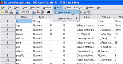
Technically, before conducting a correlation, one should always run a scatterplot to insure that the relationship between the two variables is linear. This is done in SPSS by clicking on “Graphs” → “Chart Builder”.

Once the Chart Builder window is open, click on Scatter Plot. Select the first display example of a scatter plot graph and drag the display into the large box located towards the right of the pop up window. Select your independent variable from the side scroll bar and drag it to the X-axis on the box to the right. Select your dependent variable from the side scroll bar and drag it to the Y-axis on the box to the right.

Once this is done, click “OK.”
You will get something similar to the graph below:

This scatter plot illustrates that there is something like a linear relationship between the two variables. Basically, no one who scores high on religiosity scores low on spirituality. However, there are some people who score low on religiosity but who score high on spirituality. Even so, the general trend is a linear relationship, which means these two variables are suitable for correlation and regression analysis.
Chapter contributed by Brittany Harder.