Usability for Nerds/Transparency
Transparency means that the user can easily find out what is going on behind the surface. A mechanical device may simply be designed so that the movements of important parts are visible or it may have a control panel showing the state of its internal parts in an intuitively understandable way.
In electronic devices there may not be any mechanical parts to show, so the state of internal actions must be visualized with text or drawings. It should be clear where a program stores its files so that the user can make backup copies or delete old files for security reasons.

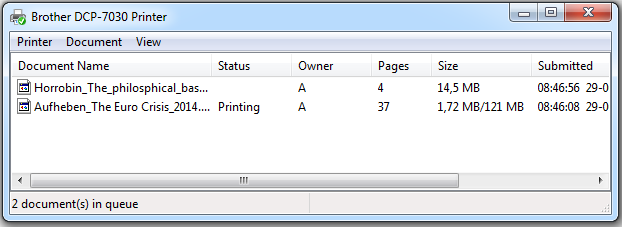
The picture above shows a queue for a printer. Whenever commands or jobs are queued, there should be a visual representation of the queue, and preferably a way to cancel jobs in the queue or change their priority.
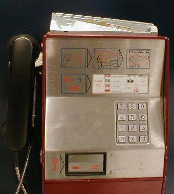
The payphone shown below is an elegant example of making a function visible. You simply place your coins in the slide on top before making a call. The coins then fall down, one by one, as they are needed. It is very clear to the user what is happening, and nobody can be in doubt how much money they have left to talk for. The user can even remove coins or change their order during the session.


This design is not perfect, though. Rejected coins are returned in a little compartment covered by a metal flap (at the drawing of a twisted coin). The user may be able to hear coins falling down in this compartment, but cannot see them. I would prefer that the coins fall down in an open basket so that they are easy to see and easy to pick up.