Usability for Nerds/Feedback to user
Whenever a user pushes a button, turns a switch, clicks with a mouse, writes a command, or in any other way issues a command to a machine, there must be a feedback telling the user that the command has been understood. The feedback can be a sound, a lamp lighting, a text on a screen, etc.
The ideal form of feedback is allowing the user to see things happen. If you turn on a motor you can hear the noise from the motor and see a wheel turning around. It may be a good idea to paint an asymmetric pattern on the wheel so that it is easy to see that it is turning. Then the user will never be in doubt whether the motor is turned on or off.
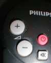
Mechanical switches, handles, etc. may provide feedback simply by the position you put them in. The fader on a mixer gives an excellent indication of its position by the very nature of its mechanical design. A rotary knob is cheaper, but the position can only be seen from the little marking or arrow that most potentiometer knobs have. The up/down buttons on a typical TV remote control have no feedback except the sound it is controlling.


If a device gives no feedback then the user will assume that the command has not been received and accepted. The user may press the button again or think that the device is not working or that they have done something wrong.
The response time is important here. Response times should be predictable and preferably small. I once made a computer program that made various mathematical calculations. Most calculations were fast, but one particular calculation took 30 seconds. My test person clicked the button, and as he didn't see anything happen immediately, he pushed the button again. He got frustrated and clicked the button again and again. After 30 seconds the result from the first click appeared on the screen. But since he had pushed the button twenty times and the system had a command queue, it executed the time-consuming command twenty times. The result was that the system was unable to do anything else for the next 10 minutes!
What we can learn from this story is that if a system cannot respond immediately to a command, then there should be an indication that the system has received the command and is working on it. For example, many systems show an hourglass icon to indicate that the user has to wait for an answer. The hourglass only gives a minimum of information. It tells that the system is working, but not what it is working on. A more informative feedback might include information on which command the system has received, what it is doing, and how long time it is going to take. The progress bar shown below is a good solution. It works well because the user understands intuitively that the process is finished when the bars reach the top. (It is a problem, though, that it is difficult to interpret the icons telling which task each bar indicates).

Let's return to the example with the motor. In most cases, no other feedback is needed because the user can hear and see when the motor is running. But there may be situations where the user would need feedback from the switch itself, namely if the motor is not working. A technician repairing the motor would certainly want to know whether the power switch is on or off. If the source of the problem is that the power is missing, then you would want to make sure the switch is off so that the motor doesn't suddenly start when the power is returning. Therefore, the state of the switch should be visible, even if this information is seldom needed.
There was a period in the early 1990'ies when silent computer keyboards were in fashion. Consumers in a buying situation were fascinated by these keyboard which reacted to the light touch of a key. But the problem arises when a busy user accidentally strikes a key lightly without pressing it all way down. The user doesn't know whether the system has interpreted this touch as a keystroke or not. This process interrupts the users in their line of thought because they suddenly have to focus on the trivial problem of whether a letter has been written or not. Therefore, all keyboards should have a click mechanism. You can not only hear the slight noise from the key, you can also feel the click. The click feeling comes from the fact that the mechanical resistance against your finger suddenly drops off when the key has passed a certain threshold. This is also called tactile feedback. The click feeling is very important for experienced typists because the tactile feedback is a very natural way of knowing whether you have done something right. It enables you to work faster and more relaxed than when you have to look at the screen all the time for feedback.
The strength of a feedback should reflect the importance of the situation. The trivial touch of a key should normally give only a light sound, while an action with big consequences, such as the starting of a big and dangerous machine, might produce a somewhat stronger sound and turn on a big indicator lamp. Some machines give a loud beep every time a key is pressed, which can be quite annoying for the user and particularly for other persons nearby.