Technical Analysis/Printable version
| This is the print version of Technical Analysis You won't see this message or any elements not part of the book's content when you print or preview this page. |
The current, editable version of this book is available in Wikibooks, the open-content textbooks collection, at
https://en.wikibooks.org/wiki/Technical_Analysis
Foreword

Technical analysis is a trading discipline employed to evaluate investments and identify trading opportunities by analyzing statistical trends found in charts gathered from trading activity, such as price movement and volume to determine future price behavior. Technical analysis is applicable to stocks, indices, commodities, futures or any trade-able instrument where the price is influenced by the forces of supply and demand.
The roots of modern-day technical analysis stem from the Dow Theory, developed around 1900 by Charles Dow. Stemming either directly or indirectly from the Dow Theory, these roots include such principles as the trending nature of prices, prices discounting all known information and volume mirroring changes in price.
Technical analysis assume the market to be 80% psychological and 20% logical. The psychological or logical part may be open for debate, but there is no questioning the current price of trading activities. After all, it is available for all to see and nobody doubts its legitimacy. The price set by the market reflects the sum knowledge of all participants. These participants have considered almost everything under the sun and settled on a price to buy or sell. These are the forces of supply and demand at work. By examining price action to determine which force is prevailing, technical analysis focuses directly on the bottom line:
(1) What is the price?
(2) Where has it been?
(3) Where is it going?
About

Note: The term "security" when referring to any trade-able financial instrument. This includes stocks, bonds, commodities, futures, indices, mutual funds, options, etc.

Technical analysis is the study of prices, with charts being the primary tool.
Technical analysis seeks to identify and exploit changes in the mood of financial markets over time and exploit irrational changes in value due to mood swings. The price of a security represents a consensus. It is the price at which one person agrees to buy and another agrees to sell.
Technical analysts argue that, provided the urge to resist following the market can be maintained, it is possible to systematically identify and predict swings in market moods.
If (s)he expects the security's price to rise, (s)he will buy it; if the investor expects the price to fall, (s)he will sell it. These simple statements are the cause of a major challenge in forecasting security prices, because they refer to human expectations.
To make readers understand Technical Analysis is practical and it is possible to use it for making predictions. This wikibook will contain some charts.
Psychology And Markets


At first blush technical analysis as applied to the stock market seems to be a bunch of voodoo. Interpreting chart patterns and attempting to predict future movement based on past behavior is considered by some to be no less rational than traditional fundamental analysis. One of the most succinct explanations of why many believe technical analysis works is that PSYCHOLOGY drives the markets. Buying and selling of stocks, futures, and derivatives sets a market in motion as participants negotiate a common price point. The exchange of goods is more or less driven by human psychology and future expectations.
The primal emotions upon which expectations are built are fear and greed, which in effect compels humans to repeat the mistakes and triumphs of the past. The watershed moment came as Charles Mackay published his 1841 book Extraordinary Popular Delusions and the Madness of Crowds in which he detailed the Dutch tulip mania of 1637, and 1720 meteoric rise in the stock prices of the Mississippi and South Seas Companies. The South Seas bubble was initially started as the company was given exclusive access to the South American trade and new world colonies. The frenzy that resulted as both peasants and lords feverishly snapped up shares inevitably resulted in credit defaults, bankruptcies, and economic hardship. When Sir Isaac Newton was asked about the continuance of the rising of South Sea stock.....He answered 'that he could not calculate the madness of people'. (Spence, Anecdotes, 1820, p368) Since then, history has only to reference the stock mania which gripped the United States in 1929, the 1989 Japanese Nikkei, the 2000 technology bubble, and the 2007 global real estate boom. History is littered with booms and busts - manias that lead to unsustainable price levels based purely in our primal emotions.
-
 Tulip price index from 1634 to 1637
 -
 South Sea Bubble from 1719 to 1720
 -
 Wall Street daily stock exchange since 1929 to 1932
 -
 Nikkei 225 Index shows downward trends from 1989 onwards to early 2000's
 -
 Bitcoin boom since 2013


The key to technical analysis is that human behavior is considered invariant. Humans act predictably and market technicians have developed descriptions of emotional patterns that are reflected in the price action. This applies to both rational as well as erratic market gyrations. In the rare events where a mania bubble is present, they point to asymptotic lifts to unsustainable levels. Indecision is described in terms of 'consolidation ranges and triangles'. A consensus amongst market participants is reflected in a 'trend'. Incorrect assumptions and disappointment is considered a 'breakout or breakdown'. Whatever the nomenclature, these patterns simply imply a set of expectations on behalf of those with an emotional stake in the outcome. Once the market behavior is classified in terms of a pattern and context, the technical trader can then form an opinion of future price action.
Basis of Technical Analysis

Price Forecasting
editPrice forecasting in general are grouped into Fundamental Analysis and Technical Analysis.
However, with the Technical Analysis , we will get two types of main trend analysis that are : Trend Following and Trend Predicting.
Of the listed, which we will get in touch some of them with later chapters.
| Trend Following | Trend Predicting |
|---|---|
| Moving Averages | Elliot Wave |
| N-Rule/Channel Breakout | Fibonacci |
| Oscillators (RSI,MAC,Stoc) | Gann Theory |
| Bollinger Bands | Chart Patterns |
| Candlestick Patterns | - |
Basis of Technical Analysis
editThe study is based on the interaction of the forces of demand and supply of stock. It mainly considers that the market is free and market forces will prevail to bring equilibrium.
The fundamental belief behind the technical analysis is that "The Price says it all". This means if a stock is available at $125 then this includes all the information as of today about the stock. Most of the technical analyst believe that the news which are important for the stock reflects on the chart by its movement. If there were any fundamental change in the financial health the imbalance is created by those who are aware of this change (also called operators) and the price will start movement to the new equilibrium point.
Price Movement
editBasic principle of price movement is Price of stock will move up only if there is demand for the stock. The price will move down if there is supply of the stock.
If on a particular day the price have moved up and closed it is concluded that the demand for the stock was more than the supply. The volume (ie number of stocks traded) indicates the strength in the movement. More the volume more is the strength (ie if the volume is more than average the strength is more).
Case Study
editThere are movements in the stock and they are based on various buying and selling in high quantities. Now we as a small investor might not be aware about such news. But the big news which we are aware about can be easily traced on the chart. Few of them are elaborated below.
Satyam Computer Scandal
editSatyam Computer Scandal is one of the big scandal which rocked Indian stock market. If we have a look at the chart of Satyam computer today we can clearly see the history recorded on this chart for ever.

As can be seen from the chart the stock of Satyam Computers fell from Rs.180 to Rs.5 in 2 trading sessions. Big events have big marks on the chart and small events have small marks on the chart. So even if the news are not known to the one looking at the chart he/she must be able to say the there was something wrong or something right with this company which made this stock stock move in such a direction on a particular day.
Type of Charts

Charts
editCharts are the heart and soul of technical analysis. Many experienced traders wax poetically about how 'charts talk to them' and make bold statements about the future direction of a stock based on examination of price history. Yet to the untrained eye, these same graphs are but squiggles across a page with no discernible order. Beneath the surface, it is actually an accumulated history of human behavior, a voting mechanism of sorts. The technician is able to see how individuals reacted to earnings reports, economic conditions, and political ramifications over time. There is no need to re-examine those events, since informed market participants have cast their votes as prices over time reflect different expectations.
The basic data on which the chart is drawn are
- Date
- Price Band (Open, High, Low & Close)
- Volume
Above data is published by the stock market on their websites and the data is also available on various other commercial portal like google and yahoo. To direct you to few of them following are the links to some of such websites:
A chart represents of the demand and supply of a stock or commodity. The horizontal axis represents time, with the price drawn as a line connecting consecutive closing values. More sophisticated charts will show more detail; bar charts also include the range from high to low, candlestick charts include the open price along with a color and fill which reflects change relative to the previous close. A chartist will examine clusters of these marks and categorize them into behavioral patterns. The nomenclature used depends on the chart style as well as the theory to describe price action. Candlestick charts have become very popular since Steve Nison published Profiting With Japanese Candlestick Charts in 1991. This approach was used to trade rice in late 1600s, and consists of such colorful descriptions such as 'spinning tops', 'evening doji star', '3 soldiers', 'dark cloud cover', or 'hammer'. There are also different ways of filtering out noise and reducing detail - Point and Figure, Renko and Kagi will combine several bars and ignore the time scale axis. What is key to any charting method and classification is the context in which the pattern appears. This is true for all sub-disciplines of technical analysis.
Types Of Charts
editThe basics of the technical analysis are chart itself, hence let us get to know some of the graphs involved in technical analysis.
1. Line Chart
A line chart is the simplest type of chart. The single line represents the security's closing price on each day.
Dates are displayed along the bottom of the chart and prices are displayed on the side(s).
A line chart's strength comes from its simplicity as it provides an uncluttered, easy to understand view of a security's price.
2. Barchart
A bar chart displays a security's open (if available), high, low, and closing prices.
Bar charts are the most popular type of security chart.
The top of each vertical bar represents the highest price that the security traded during the period, and the bottom of the bar represents the
lowest price that it traded. A closing tick (on right side bar) and an opening tick (on left side bar) designate the price that the security's trading.
3. Volume bar chart
Volume is usually displayed as a bar graph at the bottom of barchart.
Patterns

Technical analysis employs three approaches for identifying changes in market moods over time: trend, signal and resistance analysis. Trend analysis assumes that past market behavior can be extrapolated into the future and that the trends of the past will repeat or persist in the future. Signal analysis may supplement trend analysis by assisting analysts to identify when the market will break out of a trend that it has followed in the recent past by identifying price-movement patterns. Resistance analysis is similar to signal analysis, except that it views the break points in terms of price limits beyond which the market is unlikely to move.
Here are some of the downtrend and uptrend patterns that are popular in technical analysis of chart patterns
| Uptrends | Downtrends |
|---|---|
| Symmetrical Triangle | Symmetrical Triangle |
| Rectangle | Rectangle |
| Ascending Triangle | Minor Top |
| Falling Wedge | Double Top |
| Rising Wedge | Descending Triangle |
| Bullish Flag | Bearish Flag |
| Bullish Pennant | Bearish Pennant |
| Ascending Triangle | Descending Triangle |
| Ascending Scallop | Descending Scallop |
| 3 Raising Valleys | 3 Descending peaks |
| Cup With Handle | Inverted Cup With Handle |
Support and Resistance
editBefore we get started on trends, there are 2 terms that should be understood first that are: Support and Resistance
Support is the price level at which demand is thought to be strong enough to prevent the price from declining further. The logic dictates that as the price declines towards support and gets cheaper, buyers become more inclined to buy and sellers become less inclined to sell. By the time the price reaches the support level, it is believed that demand will overcome supply and prevent the price from falling below support.
Resistance is the price level at which selling is thought to be strong enough to prevent the price from rising further. The logic dictates that, as the price advances towards resistance, sellers become more inclined to sell and buyers become less inclined to buy. By the time the price reaches the resistance level, it is believed that supply will overcome demand and prevent the price from rising above resistance.

Trends
editNumerous types of trends can be identified in market price data including trends including increasing and decreasing price trends as well as range-bound or oscillating trends. As a general rule equity instruments tend to trend upwards over time, because of the preference of boards to retain earnings and grow the business rather paying out all the surpluses or profits produced to equity holders. Businesses that are continuously making losses will deplete their reserves and their instruments will tend to fall in value over the long term. Shorter term trends may indicate a shift in market expectations from one level of earnings to another of from a change in the level of confidence and a trend analysis may seek to identify this trend as something distinct from the overall trend caused by the fundamental performance of the business.
There is a vital piece of information that is revealed when confirming support or resistance. It is the notion of a trend. An uptrend is a situation in which we experience rising prices in the form of new highs and shallow pullbacks. Similarly, a downtrend has lower peaks and prices continue to make new lows. If the price oscillates without any clear direction, it is said to be range-bound or in consolidation. Decreasing ranges between highs are lows are considered triangle patterns.
- uptrend / downtrend / oscillating / triangle examples -
Up-Trend
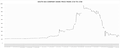
editThe chart below is a plot of the price movement of the Apple Inc which made very good stride during March 2009 to May 2011. Strong uptrend can be seen from the movement. The stock price moved from 100 to 350 in about 2 years period.

Range-bound / Oscillating
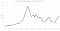
editThe chart below is a plot of the price movement of the Reliance Industries (India) which stayed very much in a range during March 2009 to February 2011. This stock remained in the range of 900 to 1200 during this period.

At certain junctures, prices seem to accelerate either up or down and go for long stretches without a pause. This is considered an impulse, and often lead to incredible gains or drops in price. These impulses cannot continue indefinitely, and at some point must pause or reverse direction. During these periods, it lacks clear direction and is considered in a consolidation sequence. Even though it seems that prices should continue forever, these pauses are in fact quite healthy. They serve a vital role in forecasting price targets once the trend continues or reverses.
- chart delineating impulse vs. consolidation -
Patterns
editMuch in the way that stars are strung together in different ways across the sky to create constellations, price spikes are examined to 'paint a picture' of a known configuration. Some of the most common patterns are channels and triangles. In both of these cases, a minimum of four points are required - two spike highs and two spike lows. The lines which connect the extremes are extended to the right (where no price history exists), so we have some notion of where prices should be at some time in the future. In some cases, the lines are almost horizontal, which implies a trading range. Parallel lines which slant up or down indicate a trend direction within a channel. If lines converge, it is considered a triangle, and there are special cases for each of the various slant directions - symmetrical, flat-topped or flat-bottomed, ascending or descending triangles, and rising or falling wedges.
- kiwi examples of theoretical stock movements -
If prices break above or below the bounds of either channels or triangles, then it can be said that one set of market participants have overwhelmed the other side. Traders call these breakouts and breakdowns. These breakouts or breakdowns are confirmed if there is more than usual volumes on that day. (Since at times due to some sporadic trades also give out small spikes on the charts.) These are particularly relevant if accompanied by an increase in volume. In essence, it gives credibility to the market direction and signifies that prices are ready to change their behavior. If prices are heading up, we say the price action is bullish. Tumbling lower is classified as bearish. In either case, the market is tipping its hat in a particular direction as investors, traders, and financial institutions pile onto the winning side. This behavior is the reason that trading desks chant 'the trend is your friend', in other words, don't get in the way of a mob rushing in either direction - join the winning side and trade in the direction of the trend.
These patterns can be classified in two types.
Continuation pattern.
editThere are continuation patterns which suggest that the stock will continue to do what it was doing earlier ie if it was moving up it would continue to move up. Various continuation patterns are
- Flag / pennant
- Triangle
- Channel
- Trenline
Reversal patterns
editThere are reversal patterns which suggest that the stock will now do the reverse of what it was doing earlier. If the stock price was moving moving up it would now move down.
When stock is in up trend:
- Double / Multiple top
- Head and shoulder
When the stock is in down trend:
- Double /Multiple bottom
- Inverted head and shoulder
Candlestick Pattern
editThere are patterns identified on candlestick charts which analyze the market forces getting balanced and can indicate start of reversal. There is good amount of information on wikipedia:candlestick pattern.
Support and Resistance
editWhat most often stands out are price extremes, both high and low. At those junctures, one set of market participants will succeed in driving the prices in the other direction. It is often the inflection point at which expectations change on the underlying asset. These levels present the technicians with the first level of information - support and resistance. In the simplest terms, support is a price level at which a asset experiences buying and downward motion is halted, whereas resistance is a level at which one would expect profit taking and selling pressure, halting upward momentum. These prices can be determined by a number of factors, but most often produce a price extreme visible on the chart.
- insert charts with ring high / low here -
Some of the most powerful pieces of trading information are revealed when a price spike is retested. This is a bold statement, since it implies that tops and bottoms aren't ever really formed in isolation, but instead an attempt is made to revisit a previous price level. Market technicians make careful observations of how traders behave around previous support and/or resistance levels. If the price fails to break below a previous spike low, we can say that the support level has been confirmed. The same principal applies to resistance if rising prices fail to penetrate above a previous spike high.
- charts with retest / support / resistance here -
Targets
editThe final step is to put all this information together and examine how the patterns interact with one another, to determine the price structure and context. If there is a clear impulse leading into a channel or triangle, we can start talking about pennants, bull flags and bear flags. This is considered good market structure, since participants need to pause for a bit before resuming an impulse. The amount of price movement leading into the consolidation can be considered a target to reach once there is a breakout (in case of rising prices) or breakdown (declines before pausing). This is known as a measured move and is probably the most common target known to traders. If a stock appreciates +5 before forming a triangle, when it breaks above the upper bounds a technical analyst will call for a price target +5 higher from the breakout point.
- examples of good market structure / price targets -
So when can a technician determine that markets are in a bubble scenario? When it exhibits poor market structure, most often in the form of prices that seem to defy gravity and logarithmic scale, with little or no pauses for consolidation. A true one-sided exhibition of delusional behavior that this trend will continue forever. Psychologically, this is complete lack of fear and greed at its best without any consideration of reasonable expectations. In the end, for each seller there must be a buyer, and once the final marginal buyer is in, there is nothing left to buoy prices. A technical trader will look for the first correction after the meteoric rise to get out; after a pullback the rebound cannot reach the lofty price experienced at the peak, the first lower-high. Prices collapse in the sheer panic that ensues as behavior shifts to fear of losing.
- examples of poor market structure / air lifts -
Technical Indicators
The basic data on which the chart is drawn are
- Date
- Price (Open, High, Low & Close)
- Volume
- Open Interest
While using this data there are many statistical values which are used to get more insight into the available data. Some of these indicators are
- Moving Average
- Exponential Moving Average
- On Balance Volume
- Bollinger bands
- Relative Strength Index (RSI)
- Moving average convergence divergence (MACD)
Each of these indicators have specific use. Moving averages are used to spot the direction of trend, while oscillators like RSI and MACD gives strength of trend.
Software
These days many portals provide online charts to do technical analysis. Many of these tools are quite advanced. There are also software available which can produce charts from trading data. These data can be pulled from server or can be made locally available.
Online Charts
editMost of the stock exchanges have their website where they host the software to plot charts. There are many portals including Yahoo and Google where you can find online charts. Since 2020 charts provided by tradingview.com are widely used.
Charting Software
editThere are many professional charting software available in market. Now a days there are even good open-source software available for creating charts. We will list these software in this section.
Open Source
edit- AIO Trade is available under BSD License is based on java.
- EclipseTrader is available under Common Public License 1.0 is based on java.
- Qtstalker is available under GNU General Public License (GPL) and works on Linux.
Trading Approaches

Trading Approaches
editTrading can be characterized as short-term decisions made in accordance with information gleaned from technical analysis. Traders usually move in and out of the market at a rapid pace in hopes of repeatedly extracting small profits. Trading is considered helpful by someone in that it serves the useful purpose of enhancing liquidity but it has been also considered a source of financial crisis affecting the real economy. Full-time traders often use multiple computer screens to monitor prices closely throughout the trading day. For people who cannot spend all day in front of a computer monitor, one option is to anticipate substantial price moves so that the associated risk of taking a position is justified by the upside profit potential. "( Source: Pattern Recognition and Trading decisions, SatchWell,Chris 2005).
Trading Terminology
editPosition
- Long - (Meaning the underlying stock is bought and one will profit if the price moves up)
- Short - (Meaning the underlying stock is sold and one will profit if the price moves down)
Market outlook
- Range-bound
- Bearish
- Bullish
- Volatile
Based on the outlook of the stock there are various strategies which have to be used by trader to take position in the stock.
| Outlook | Entry Strategy | Exit strategy | Remarks |
|---|---|---|---|
| Range bound | Buy Low | Sell High | Most of the individuals makes losses on following this when the market is trending |
| Bullish | Buy High | Sell Higher | |
| Bearish | Sell Low | Buy Lower |
Most of the novice in the stock market have a simple assumption that the market or the stock is range bound and hence try to use only one strategy. This does not lead to great profits.
Profit/Loss
Profit/Loss is calculated at the closer of the trade. Though people do keep track of marked to market profit or loss, but then unless the position is closed profit or loss must not be calculated as many of the profitable trades end up in loss if the position is not liquidated in time.
Trading Horizon
editThere are various type of trading time horizons.
- Hourly
- Daily
- Weekly
- Monthly
- Quarterly
- Yearly
Based on your time horizon, you the trader, will pick the size of history that needs to be studied. Usual practice is to use 5 times the trading horizon for your chart. That is, if you want to trade with Daily time horizon you must keep watch on the 5 day chart. This does not rule out the use of longer term charts, since there may be some longer term levels in place and need to be considered.
Trading and Risk
editTrading in stock market or for that mater any market involves risk. Hence there is a need for the mitigation/management of such risk.
One can quantify the risk in each trade as product of amount of money one may lose and probability of losing.
i.e. Risk = (money one can lose) x (Probability of losing)
Technical analysis is used to reduce risk by reducing the Probability. Though Technical analysis reduces the probability of losing the money, it do not make it ZERO. Meaning that all the predictions made based on Technical analysis might not come true. (This essentially happens because of person might have made some assumptions during technical analysis and that have gone wrong)
Importance of Selling
editIn trading your Profits or Losses are totally determined by when you buy, and, when you sell. These decisions are considered the most important decisions an independent trader can make. "Buy timing" and "Sell timing" are the two critical reasons so many investors decide to become "traders". They take their portfolios away from managing brokers and move to self-directed accounts at a retail broker(s). Many investors became traders after the 2000 DOTcom bubble burst, and reports of 80+% of stock or fund holders lost as much as 50% of their account value due to the poor decisions of managing brokers. Becoming an independent trader can be a profitable decision, if you learn TECHNICAL and FUNDAMENTAL analysis techniques, and chose the strongest stocks, using stock screeners.
Stop Loss
editStop Loss is the most important Risk Management Tool available with the trader in achieving the goal of making profit from the trades.
When doing technical analysis the prediction of the stock price movement is made with particular assumption is mind. Stop Loss is the particular price which if achieved, makes the assumption false. This gives indication to the analyst that the stock price is not moving as per his/her prediction. Also this is trigger to liquidate the trading position.
When using stop loss what one tries to do is to limit the loss so in the equation of risk you have restricted the amount you are willing to lose on the trade which you have entered in.
High level of discipline is needed in this. Once a Stop Loss level is decided one must not tempt to revise the stop loss to increase loss. Stop loss should only be revised in a direction where it can reduce the loss. Read about Trailing stop loss for more on the rules to revise your stop loss.
Trading Strategy System
editThere are various mathematical strategy tools developed which can be used to give the triggers about when to take trading position and when to come out of the position. One can even simulate the said strategy over long historic data of the stock prices to understand how the strategy will perform.
Trading Risk Management
editIn the long run the profit that you make in the stock market is function of following four parameters
- Average profit you make on the winning trade ( )
- Average loss that you make on the losing trade ( )
- Number of Profitable trade ( )
- Number of Losing trade ( )


If we dissect the above equation we can say that to improve your profit where one needs to focus.
- Increase average profit on winning trade.
- Reduce Average loss on your losing trade.
- Increase Number of profitable trades.
- Decrease Number of losing trades.
Now after looking at this equation you can clearly figure out that it is not important if you are right or wrong. It is important how much you lose when you are wrong and how much you gain when you are right.