Statistical Analysis: an Introduction using R/Chapter 1
Why statistics?
editFigure 1.1 shows one of the standard sets of data available in the R statistical package. In the 1920s, braking distances were recorded for cars travelling at different speeds. Analysing the relationship between speed and braking distance can influence the lives of a great number of people, via changes in speeding laws, car design, and the like. Other datasets, for example concerning medical or environmental information, have an even greater impact on humans and our understanding of the world. But real-world data are often "messy", as shown in the plot. Most people looking at the plot would be happy to conclude that speed and stopping distance are linked in some way. However, this cannot be the whole story because even at the same speed, different stopping distances were recorded.

This combination of intuitively sensible patterns and messiness is perhaps one of the most common scientific results. Statistical analysis can help us to clarify and judge the patterns we think we see, as well as revealing, out of the mess, effects that may be otherwise difficult to discern. It can be used as a tool to explain the world around us, and perhaps equally importantly, to convince others of the correctness of our explanations. This emphasis on informed judgement and convincing others is important: ideally, statistics should aid a clear explanation, rather than blind by force of argument.
A common misconception of statistical analysis is that it is necessarily technical and "hard to understand". Indeed "I don't understand statistics" is a cry frequently heard. But if an analysis can only be understood by statisticians, it has, to a great extent, failed. For an analysis to convince an audience, one or more reasonable explanations for a situation should carefully and comprehensibly lay down. Statistical analysis of data (which has, ideally, been collected to test these explanations) can then be used to justify a conclusion that can be generally agreed upon. As a rule, the simpler the explanation - the more parsimonious - the more it is to be preferred. Hence a good explanation is one which is sensible and comprehensible to an informed observer, which makes clear predictions, but is as simple as possible.
This book is intended to teach you how to formulate and test such "explanations" in a statistical manner. This is the basis of statistical analysis.
The statistical method
editAs with the "scientific method", to which it bears a number of similarities, it is open to debate whether or not there exists a universal "statistical method" [citation needed]. Nevertheless, most statistical analyses involve questioning some aspect of the world, coming up with potential answers to these questions and then formalising these explanations by proposing statistical models that may account for particular aspects of the data.
Hence the three major parts to an analysis are
- Deciding the questions you wish to tackle (or more generally, the aim of the analysis)
- Proposing some reasonable explanations which have the potential to answer these questions
- Formalise these explanations as statistical models
- Collecting appropriate data
- (Using more or less technical methods) test the models using the data.
For example ***
Hence the majority of analyses that you are likely to perform assume, either explicitly or implicitly, an underlying "statistical model". So understanding statistical models, and what they entail, is fundamental to understanding statistics.
Statistical models
editChapter 3 discusses statistical models in greater detail, but it is worth introducing some general concepts here. Models provide some predictive ***. What distinguishes a statistical model is that there is also an element of uncertainty in the process. Hence statistical models consist of two components: one which is fixed, and one which captures the uncertainty. This is
As an example, we can return to the situation depicted in Figure 1.1. A point to which we will return many times, is that a good understanding of the background, or context of the data is essential to any analysis. In this case, it is important to know that the data concerns speed and braking distances of cars. Our general knowledge about driving can then guide our choice of model. In particular, we can probably guess that it seems reasonable to model a situation in which speed has an effect on braking distance (rather than, for example, the other way around). It seems reasonable to treat speed as something that is determined by other factors, and outside the scope of our analysis ***.
Hence an initial, reasonable model might assume that the braking distance is determined by speed, plus some sort of random error. To model this precisely, to construct an imaginary set of braking distances given a set of speeds, we need to be more precise. In particular, we need to specify how a speed affects distance, and what the error looks like***.
Later on we'll see how to specify this mathematically. For the moment, we'll do it graphically and by simulation
Common to assume "Normal" error ****
e.g. maybe no effect at all: there is a fixed braking distance regardless of speed: the only reason why distance vary is due to chance error. => graphically show
we need to be more precise than this: we
one of the most important things to It is reasonable to 1.2(a-d). In each of the four figures, a different statistical model has been proposed: the predictive part of each model is shown as a red line, and the uncertainty (the fluctuations attributed to chance or error) shown as light blue lines. In all cases, the model has assumed that the uncertainty is all in the effect of braking distance (the light blue lines are all vertical).
To show the uncertainty on its own, the right hand plot in each figure shows the residuals ***.
- Figure 1.2: Various statistical models fit to the data in Fig 1.1
-
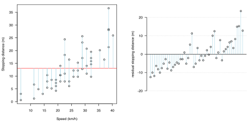 (a) No association
 -
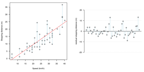 (b) Straight line
 -
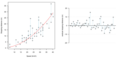 (c) Squared (simple quadratic) relationship
 -
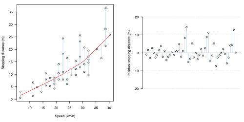 (d) Fit using local smoothing (LoWeSS)


* The straight (orange) line. A linear relationship is perhaps the simplest way that a relationship between , which is why ***. simplest explanation for the pattern is that stopping distance is directly proportional to speed, so that for every extra mile-per-hour, stopping distance increases by a fixed amount: graphically, this represents a straight line on the plot. It is common to .
- The curved (red) line. However, this has not taken into account any : perhaps . As remarked before, this is not enough to explain all the data: It may be less clear that lowess is a model ****.
The "cars" example highlights the importance of prior knowledge when doing statistics. Data should not be treated as pure "numbers", but considered in context. Here, because we know that the data are the outcome of a relatively well-understood physical system, we should be led to ask if a particular relationship is expected, which then encourages us to use a simple quadratic fit.
Thus in any analysis it is vital to understand the data: to know where they come from, how they relate to the real world, and — by plotting or other forms of “exploratory data analysis” — what they look like. Indeed, plotting data is one of the most fundamental skills in a statistical analysis: it is a powerful tool for revealing patterns and convincing others. If necessary this can then be backed up by more formal, mathematical techniques. The use of graphics in this book is twofold: not only can they be used to explore data, but formal statistical methods can often be understood and pictured graphically, rather than by heavy use of mathematics. This is one of the principal aims of this book.
Packages
Some packages should always be available within R, and a number of these are automatically loaded at the start of an R session. These include the "base" package (which is where the max() and sqrt() functions are defined), the "utils" package (which is where RSiteSearch() and citation() are defined), the "graphics" package (which allows plots to be generated), and the "stats" package (which provides a broad range of statistical functionality). In total, the default packages allow you to do a considerable amount of statistics.
library() function.library("datasets") #Load the already installed "datasets" package
cars #Having loaded "datasets", the "cars" object (containing a set of data) is now available
library("vioplot") #Try loading the "vioplot" package: will probably fail as it is not installed by default
install.packages("vioplot") #This is one way of installing the package. There are other ways too.
library("vioplot") #This should now work
example("vioplot") #produces some pretty graphics. Don't worry about what they mean for the time being> library(datasets) #Load the datasets package (actually, it has probably been loaded already) > cars #Display one of the datasets: see ?car for more information
speed dist
1 4 2 2 4 10 3 7 4 4 7 22 5 8 16 6 9 10 7 10 18 8 10 26 9 10 34 10 11 17 11 11 28 12 12 14 13 12 20 14 12 24 15 12 28 16 13 26 17 13 34 18 13 34 19 13 46 20 14 26 21 14 36 22 14 60 23 14 80 24 15 20 25 15 26 26 15 54 27 16 32 28 16 40 29 17 32 30 17 40 31 17 50 32 18 42 33 18 56 34 18 76 35 18 84 36 19 36 37 19 46 38 19 68 39 20 32 40 20 48 41 20 52 42 20 56 43 20 64 44 22 66 45 23 54 46 24 70 47 24 92 48 24 93 49 24 120 50 25 85 > library(vioplot) #Try loading the "vioplot" package: this will probably fail as it is not installed by default Error in library(vioplot) : there is no package called 'vioplot' > install.packages("vioplot") #This is one way of installing the package. There are other ways too. also installing the dependency ‘sm’
trying URL 'http://cran.uk.r-project.org/bin/macosx/universal/contrib/2.8/sm_2.2-3.tgz' Content type 'application/x-gzip' length 306188 bytes (299 Kb) opened URL
=======================
downloaded 299 Kb
trying URL 'http://cran.uk.r-project.org/bin/macosx/universal/contrib/2.8/vioplot_0.2.tgz' Content type 'application/x-gzip' length 9677 bytes opened URL
=======================
downloaded 9677 bytes
The downloaded packages are in
/tmp/RtmpR28hpQ/downloaded_packages
> library(vioplot) #This should now work
Loading required package: sm
Package `sm', version 2.2-3; Copyright (C) 1997, 2000, 2005, 2007 A.W.Bowman & A.Azzalini
type help(sm) for summary information
> example(vioplot) #produces some pretty graphics. Don't worry about what they mean for the time being
vioplt> # box- vs violin-plot vioplt> par(mfrow=c(2,1))
vioplt> mu<-2
vioplt> si<-0.6
vioplt> bimodal<-c(rnorm(1000,-mu,si),rnorm(1000,mu,si))
vioplt> uniform<-runif(2000,-4,4)
vioplt> normal<-rnorm(2000,0,3)
vioplt> vioplot(bimodal,uniform,normal) Hit <Return> to see next plot:
vioplt> boxplot(bimodal,uniform,normal)
vioplt> # add to an existing plot vioplt> x <- rnorm(100)
vioplt> y <- rnorm(100)
vioplt> plot(x, y, xlim=c(-5,5), ylim=c(-5,5)) Hit <Return> to see next plot:
vioplt> vioplot(x, col="tomato", horizontal=TRUE, at=-4, add=TRUE,lty=2, rectCol="gray")
vioplt> vioplot(y, col="cyan", horizontal=FALSE, at=-4, add=TRUE,lty=2)
install.packages(), should also install dependencies[1].
There are several other ways of installing packages. If you start R by typing "R" on a unix command-line, then you can install packages by running "R CMD INSTALL packagename" from the command-line instead (see ?INSTALL). If you are running R using a graphical user interface (e.g. under Macintosh or Windows), then you can often install packages by using on-screen menus. Note that these methods may not install other, dependent packages.
You only need to read the following if you are are having problems installing packages. If a package is not installed already, and you encounter problems when trying to install it (e.g. when calling install.packages("vioplot")), this may be for one of the following reasons:
|
Graphics
There are 2 major methods of producing plots in R:
- Traditional R graphics. This basic graphical framework is what we will describe in this topic. We will use it to produce similar plots to those in Figures 1.1 and 1.2.
- "Trellis" graphics. This is a more complicated framework, useful for producing multiple similar plots on a page. In R, this functionality is provided by the "lattice" package (type
help("Lattice", package=lattice)for details).
Details of how to produce specific types of plot are given in later chapters; this topic introduces only the very basic principles, of which there are 3 main ones to bear in mind:
- Plots in R are produced by typing specific graphical commands. These commands are of two types
- Commands which set up an entirely new plot. The most common function of this type is simply called
plot(). In the simplest case, this is likely to replace any previous plots with the new plot. - Commands which add graphics (lines, text, points etc) to an existing plot. A number of functions do this: the most useful are
lines(),abline(),points(), andtext().
- Commands which set up an entirely new plot. The most common function of this type is simply called
- R always outputs graphics to a device. Usually this is a window on the screen, but it can be to a pdf or other graphics file (a full list can be found by
?device). This is one way in which to save plots for incorporation into documents etc. To save graphics in (say) a pdf file, you need to activate a new pdf device usingpdf(), run your normal graphics commands, then close the device usingdev.off(). This is illustrated in the last example below. - Different functions are triggered depending on the first argument to
plot(). By default, these are intended to produce sensible output. For example, if it is given a function, say thesqrtfunction,plot()will produce a graph ofxagainstsqrt(x); if it is given a dataset it will attempt to plot points of data in a sensible manner (see?plot.functionand?plot.data.framefor more details). Graphical niceties such as the colour, style, and size of items, as well as axis labels, titles, etc, can mostly be controlled by further arguments to theplot()functions[3].
plot(sqrt)                              #Here we use plot() to plot a function

plot(cars)                              #Here a dataset (axis names are taken from column names)

###Adding to an existing plot usually requires us to specify where to add
abline(a=-17.6, b=3.9, col="red")       #abline() adds a straight line (a:intercept, b:slope)
lines(lowess(cars), col="blue")         #lines() adds a sequence of joined-up lines
text(15, 34, "Smoothed (lowess) line", srt=30, col="blue")  #text() adds text at the given location
text(15, 45, "Straight line (slope 3.9, intercept -17.6)", srt=32, col="red") #(srt rotates)
title("1920s car stopping distances (from the 'cars' dataset)")

###plot() takes lots of additional arguments (e.g. we can change to log axes), some examples here
plot(cars, main="Cars data", xlab="Speed (mph)", ylab="Distance (ft)", pch=4, col="blue", log="xy")
grid()                                  #Add dotted lines to the plot to form a background grid
lines(lowess(cars), col="red")          #Add a smoothed (lowess) line to the plot

###to plot to a pdf file, simply switch to a pdf device first, then issue the same commands
pdf("car_plot.pdf", width=8, height=8)  #Open a pdf device (creates a file)
plot(cars, main="Cars data", xlab="Speed (mph)", ylab="Distance (ft)", pch=4, col="blue", log="xy")
grid()                                  #Add dotted lines to the pdf to form a background grid
lines(lowess(cars), col="red")          #Add a smoothed (lowess) line to the plot
dev.off()                               #Close the pdf device


A simple R session
a ~ b + c, meaning a is predicted by b and c).plot(dist ~ speed, data=cars) #A common way of creating a specific plot is via a model formula
straight.line.model <- lm(dist~speed, data=cars) #This creates and stores a model ("lm" means "Linear Model").
abline(straight.line.model, col="red") #"abline" will also plot a straight line from a model
straight.line.model #Show model predictions (estimated slope & intercept of the line)plot(cars), the formula interface makes it clearer what is being plotted.
The Scientific Method
editThe statistician cannot excuse himself from the duty of getting his head clear on the principles of scientific inference, but equally no other thinking man can avoid a like obligation.—R. A. Fisher
This book focuses on the important role of statistics in the scientific method. Fundamentally, science involves carefully testing a number of rational explanations, or "hypotheses", that purport to explain observed phenomena. Usually, this is done by proposing plausible hypotheses and then trying to eliminate one or more of them by careful experimentation or data collection (this is known as the Hypothetico-deductive method). This means that a basic requirement for a scientific hypothesis is that it can be proved wrong: that it is, in Popper's words "falsifiable". In this chapter, we will see that it is logically impossible to "prove" that a hypothesis is correct; nevertheless, the more tests that a hypothesis passes, the more we should be inclined to believe it.
Ideally, scientific research involves a repeated process of generating hypotheses, eliminating as many as possible, and refining the remaining ones, in a process known as "strong inference" (cite Platt). There are two very different steps involved here: a rather speculative one in which hypotheses are produced or refined, and a strictly logical one in which they are eliminated.
These two steps have their counterparts in statistical analysis. The branch of statistics concerned with hypothesis testing is designed to identify which hypotheses seem improbable, and hence may be eliminated. The branch of statistics concerned with exploratory analysis is designed to identify plausible explanations for a set of data. While we will begin our discussion of these techniques separately, it should be emphasised that in practice, the distinction is not so clear-cut. These two branches of statistical practice are better seen as extremes of a continuum of techniques available to the researcher. For example, many hypotheses involve numerical parameters, such as the slope of a best fit line. Statistical estimation of such parameters may be seen as a test of a hypothesis, but may also be seen as a suggestion for a refined or even novel explanation of the facts.
Hypothesis testing
editTo properly test a hypothesis, the right sort of data need to be collected. In fact, the targeted collection of data and (where possible) the careful design of experiments, is probably the most important process in science. This need not be difficult. For example, imagine that our hypothesis is that (for genetic reasons) a person cannot have both blond hair and brown eyes. This hypothesis can be disproved by a single observation of a person with that combination of features.
Eye Hair Brown Blue Hazel Green Black 68 20 15 5 Brown 119 84 54 29 Red 26 17 14 14 Blond 7 94 10 16 |
Table 1.1 shows the results of a 1974 survey of students from the University of Delaware[4]. As with any test, we need to make a few assumptions about this data, for example that students with dyed hair have not been included, or are listed under their original hair colour. If this is the case, then we can see immediately that we can reject the blond&brown:impossible hypothesis: there were 7 students with brown eyes and blond hair[5].
Imagine, however, if the survey had not revealed any students with brown eyes and blond hair. Although this would be consistent with our hypothesis, it would not be enough to prove it correct. It could be that brown eyes and blond hair are merely very rare, it being pure chance that we did not see any. This is a general problem. It is impossible to be sure that a hypothesis is correct: there may always be another, very similar explanation for the same observations.
However, as seen in this example, it is possible to reject hypotheses. For this reason, science relies on eliminating hypotheses. Often, therefore, scientists construct one or more hypotheses which they believe not to be the case, purely in order to be rejected. If the aim of a study is to convince other people of one particular theory or hypothesis, then a good way to do so is to define hypotheses which encompass as many reasonable alternative explanations as can be envisaged. If all of these can be disproved, then the remaining, original hypothesis becomes much more convincing.
The null hypothesis
editIn most scientific observations, there is an element of chance[6], and so the most important hypothesis to try to eliminate – at least initially – is that the observed data are due to chance alone. This is usually known as the null hypothesis.
In our initial example, the null hypothesis is relatively obvious: it is that there is no association between hair and eye colour (any seeming associations are purely due to chance). But constructing an appropriate null hypothesis is not always so easy. Here are three examples which we will investigate later, ranging from the simple to the highly complex.
- The sex-ratio among children born in a hospital (e.g. on 18 December 1997 in the Mater Mother's Hospital in Brisbane, Australia, a record 44 children were born [7], of which 18 were female). A reasonable null hypothesis might be that males and females are equally probable, regardless of sex. Since it is known that humans usually have a male-biased sex ratio, a different null hypothesis (say 51% males) may be more reasonable.
- The relationship seen in Figure 1.1 between speeds and stopping distances in cars. A reasonable null hypothesis might be that there is no relationship between the speed of a car and its stopping distance. However, Car stopping distances (no ``association between x & y) - More difficult, because error distribution is unknown. here's one way of doing it: could e.g. take ranks of x & ranks of y. Or sample.
In both cases, we need to *model* the null hypothesis: what would we expect if
- Deaths and serious injuries in cars in the UK from 1969-1985. Figure 1.2 shows that Seatbelts **** More complex null models - e.g. seatbelt - if we fit a st. line, we need to make some assumption about variation from the line. Or we can take the actual values as representative of the variation Here is a more complex that has affected most of the population in the UK is the introduction of compulsory wearing of seatbelts in cars: a law that came into force on 31st January 1983. Null model involves other factors (e.g. petrol price)
We can model the null hypothesis as long as we have enough detail. **what do you need for different egs**. Because there is random error, we need to do this lots of times. We will see that a lot of statistics relies on rejecting the null hypothesis based on how often it gives results like those observed.
Other hypotheses
editThe same goes for others, e.g. seatbelt??? Comparing models
Types of error
edit

Estimation
editHypotheses may not be a simple yes/no matter, but more sophisticated, e.g.
what sex ratio is suggested by the data? (that's easy, but how confident are we about the accuracy of this estimate?)
cars: we are convinced that there is a straight-line relationship between speed & braking distance: what is the slope of the line (but maybe physics would suggest a different relationship - straight line is usually the default) - already here we are making some sort of choice of model.
MLE brief description ``if the model is correct, what is the most likely value for these parameters?
Exploratory analysis
editAn infinite number of models are out there. In combination with good understanding and /parsimony/, can be used to construct hypotheses & *models*. D.F?
E.g. are there better ideas than a straight line fit?
Is this at all sensible (e.g. if cannot go <0)
Anscombe
Outliers? ???residuals (probably not)
what about interactions? Titanic sex vs. class?
Use colours to pick out types
Human eye good at spotting patterns (but ... even if there are none) . E.g. time series
even if we have a prediction (model), how well does it fit the assumptions?
Which are important (as opposed to significant) factors?
Parsimony
editConclusion
editShould have enough background to describe picture from [[2]]
How wide can we throw conclusions
editIs each experiment only one data point, etc?
Notes
edit- ↑ Actually, the details are slightly more complex, depending on whether there is a default location to install the packages, see
?install.packages - ↑ Not enough of R has yet been introduced to explain fully the commands used for the plots in this chapter. Nevertheless, for those who are interested, for any plot, the commands used to generate it are listed in the image summaries (which can be seen by clicking on the image).
- ↑ Unfortunately, details of the bewildering array of arguments available, many of which are common to other graphics-producing routines) are scattered around a number of help files. For example, to see the options for
plot()when called on a dataset, see?plot,?plot.default, and?par. To see the options forplot()when called on a function, see?plot.function. The numbers given to thepchargument, specifying various plotting symbols, are listed in the help file forpoints()(the function for adding points to a plot): they can be seen viaexample(points). - ↑ from Snee (1974) The American Statistician, 28, 9–12. The full reference can be found within R by typing ?HairEyeColor. The table here has been aggregated over Sex as in
example(HairEyeColor)
- ↑ when the hypothesis is simple and there are only small amounts of data like this, presenting it in tabular form is often just as useful as plotting
- ↑ this could either be truly random, or due to factors about which we are ignorant
- ↑ see [[1]]