Using SPSS and PASW/Ordinary Least Squares Regression
Ordinary Least Squares (OLS) regression (or simply "regression") is a useful tool for examining the relationship between two or more interval/ratio variables. OLS regression assumes that there is a linear relationship between the two variables. If the relationship is not linear, OLS regression may not be the ideal tool for the analysis, or modifications to the variables/analysis may be required. The basic idea of linear regression is that, if there is a linear relationship between two variables, you can then use one variable to predict values on the other variable. For example, because there is a linear relationship between height and weight, if you know someone's height, you can better estimate their weight. Using a basic line formula, you can calculate predicted values of your dependent variable using your independent variable, allowing you to make better predictions.
To illustrate how to do regression analysis in SPSS, we will use two interval variables from the sample data set. These same variables were used in some of the other chapters. Genetic counselors were asked to rate how religious and spiritual they consider themselves on a 10 point scale - higher values indicate more religious or more spiritual. In the analysis below, we are going to see how well religiosity predicts spirituality.
Before we calculate the regression line for religiosity and spirituality for genetic counselors, the first thing we should do is examine a scatterplot for the two variables. A scatterplot will help us determine if the relationship between the two variables is linear or non-linear, which is a key assumption of regression analysis. This is done in SPSS by going to "Graphs" -> "Chart Builder":

Once you select on "Chart Builder," you'll get the "Chart Builder" window, which looks like this:

In the Chart Builder window, toward the middle of the screen make sure you've selected the "Gallery" tab, then select "Scatter/Dot" from the list of options. To the right of the options you'll see 8 boxes. If you hover over those, they will identify the type of scatterplot they will generate. Choose the one at the upper left of the choices, which is called "Simple Scatter." To choose it, you'll need to drag it up to the box above that says "Chart preview uses example data." You'll then be presented with two axes - a Y axis and an X axis. In our example, since we are using religiosity to predict spirituality, we drag relscale to the X axis and sprscale to the Y axis. We then select "OK" and get the following in our Output Window:

Scatterplots with lots of values are often hard to interpret. SPSS tries to make this a little easier by making the dots with lots of occurrences darker. In this case, what we can see in the scatterplot is that there appears to be a dark line run from the bottom left to the upper right, suggesting a positive relationship between religiosity and spirituality - as one increases, so does the other. The relationship also appears to be linear, which is good for regression analysis. Having checked the scatterplot, we can now proceed with the regression analysis.
To run a regression analysis in SPSS, select "Analyze" -> "Regression" -> "Linear":

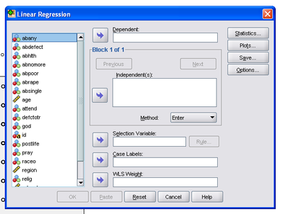
The "Linear Regression" window will open:

On the left is the list of variables. Find your dependent variable. In our example it is "sprscale." We move that over to the "Dependent" box with the arrow. Then find your independent variable. In our example it is "relscale." We move that over to the "Independent(s):" box:

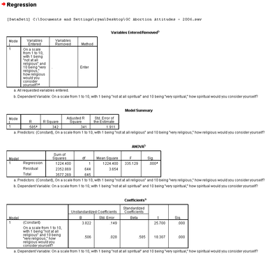
While there are a number of additional options that can be selected, the basic options are sufficient for example. Thus, choose "OK" and you'll get the following in the Output Window:

The first table simply tells you which variables are included in the analysis and how they are included (i.e., which is the independent and which is the dependent variable).
The second table provides a "Model Summary," which we'll return to in a moment. The third table is an ANOVA, which is useful for a variety of statistics, but we are going to skip it in this chapter at the present.
The fourth table provides the regression statistics of most interest to our present efforts. The first column, "B", in the second row (not the first row labeled "(Constant)") provides the slope coefficient for the independent variable. What this means is that, for every 1 unit change in our independent variable, there is an XX unit change in the dependent variable. In our example, every 1 point increase in the 10 point religiosity scale results in a .506 point increase in the spirituality scale. This tells us that the relationship between the two variables we noticed in the scatterplot was accurate - the relationship is positive.
The second column, labeled "Std. Error," provides a standard error for the slope coefficient. The third column, "Beta," provides a standardized version of the slope coefficient (in a bivariate regression, this is also the correlation coefficient or "r"). What this means is that for every 1 standard deviation unit change in the independent variable there is a corresponding XX standard deviation unit change in the dependent variable. This is less intuitive than the slope coefficient for most variables. The fourth column, "t," is the t statistic. The fifth column, "Sig.", provides the p-value for the slope coefficient of the independent variable. In our example, the p-value is .000, which is less than a standard alpha of .05, suggesting the odds of finding the linear relationship we did between religiosity and spirituality by chance, assuming there is not in fact a relationship, is less than 1 in 1,000. In other words, we can reject the null hypothesis that there is no relationship between the two variables and accept the alternative hypothesis that there is a significant relationship between religiosity and spirituality. In practical terms, more religious genetic counselors tend to be more spiritual as well.
The first row in the fourth table provides statistics for the constant, or y-intercept. Of greatest interest to us in this chapter is the value in column "B". That value is the y-intercept, or the point at which the regression line crosses the y-axis. In our example, it is 3.822. What that means, then, is that when religiosity is zero for genetic counselors, spirituality is predicted to be 3.822.
Returning to the second table, the astute reader will notice that the first column, "R", is identical to the Beta column in the fourth table. As noted, the standardized slope coefficient in a bi-variate regression is the equivalent of the correlation coefficient or "r". The second column is the R-square statistic, which is the proportion of variability in a data set that is accounted for by the statistical model. Basically, the R-square statistic can be interpreted as saying the following: Religiosity explains 34.2% of the variation in spirituality.
Finally, to illustrate the regression line as an actual line of best fit for the many cases in our dataset, we have included another scatterplot with the regression line:

This graph illustrates that the regression line tries to minimize the variation between all of the points in the scatterplot, providing a best estimate of the dependent variable (spirituality) for each value of the independent variable (religiosity). It also shows the regression line crossing the y-axis at the value noted above - 3.822.
The above explanation should provide individuals with sufficient information to run a regression analysis and interpret it in SPSS.