Data Science: An Introduction/Exploratory Analysis

Note to Contributors (remove this section when the chapter is complete) edit
First, please register yourself with Wikibooks (and list yourself below), so that we know who our co-contributors are. Also, please abide by the Wikibooks Editing Guidelines, Manual of Style, and Policies and Guidelines. Thank you.
Secondly, we only need basic, clear, straightforward information in each chapter. We are not trying to be exhaustive or complete—the value of this book is in the simple synthesis across subjects. There are other venues in which to wax eloquent on the deepness and complexities of a particular subject. Please place yourself in a "beginner's mind" as you make contributions. Please also scope each chapter so that it can be taught in a one-hour class period. If the chapter requires more than an hour to teach, it is probably too detailed.
- To the extent possible, please use terms and concepts in the way in which they are defined in the Wikipedia and Wiktionary. This way students can refer to the corresponding Wikipedia / Wiktionary page to get a deeper understanding of the concept.
Thirdly, this is a cross-disciplinary book. We want to help people apply data science to all fields. Therefore, we need a wide variety of simple examples and simple exercises.
Fourthly, please adhere to the simple structure of each chapter: Summary of Main Points, Discussion, More Reading, Exercises, and References. We want the More Reading section to link to on-line resources. The References section may contain off-line resources. To start a new page, you should use the wiki markup from this prototype page.
Fifthly, as with any Wikibook please feel free to make corrections, expand explanations, and make additions where necessary, even if it is not "your" chapter. Use the discussion page to explain changes that might be controversial.
Sixthly, some syntax rules:
- Please bold key terms and phrases the student should learn.
- Put the name of functions and code snippets using the 'code' tags:
<code>lm()</code> - Use in-line links
[[ ]]to the Wikipedia, Wiktionary, WikiCommons, Wikibooks, and other Wikimedia Foundation properties. - Use references (<ref> </ref>) to "external" sources—both on-line and off-line.
- Use the citations templates to make citations : Template:Cite book, Template:Cite web, Template:Cite journal
- If you want to add an image or graph, you should load it into the Commons rather than uploading into Wikibooks.
- If appropriate, add the tag
{{Created with R}}) when you upload the graph.
- If appropriate, add the tag
- If using a different package than R standard packages, put the name of the package in bold in parenthesis after each function : <code>MCMCprobit()</code> ('''MCMCpack''')
- You can use the third chapter Definitions of Data as an example of how to craft a chapter.
Finally, thank you so much for volunteering to be part of our our team!
Chapter Summary edit
Wikipedia defines Exploratory data analysis(EDA) as an approach to analyzing data sets to summarize their main characteristics, often with visual methods. During EDA the data scientist is looking for patterns in the data with an open mind and is often described as 'digging into the data' or 'getting your hands dirty'. The results of this analysis can lead to the formulation of new hypotheses and to further data collection activities. It can also highlight outliers in the data that can inform data cleansing activities or even demonstrate systemic flaws in the data that may make a data set unusable. This chapter describes some of the more common techniques used in EDA
Discussion edit
The American mathematician John Tukey coined the term EDA to the approach of analysing data for the purpose of formulating hypotheses worth testing as opposed to confirmatory data analysis where conventional statistical methods are used to test hypotheses. By getting insights from the data, EDA is able to suggest hypotheses about the causes of observed phenomena and allows the data scientist to assess their assumptions and select appropriate tools and techniques for further analysis. Essentially EDA is an approach to searching for patterns in the data with an open mind. Or as John Tukey put it: “If we need a short suggestion of what exploratory data analysis is, I would suggest that It is an attitude and a flexibility and some graph paper” (although these days a spreadsheet or R is an easier alternative)
With powerful computers and an arsenal of statistical tests it can be tempting to dive straight into a dataset and start crunching numbers without taking the time to pose the right question. An example of this was provided by the statistician Francis Anscombe (coincidentally the brother in- law of John Tukey) where 4 data sets (now known as Anscombe's quartet) have very nearly identical statistical properties yet appear very different when graphed:
-
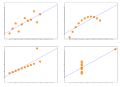 Anscombe's quartet

Since EDA is exploratory by definition, it is to a certain extent a method of trial and error, and the particular analyses that prove useful will depend on the specific data set being investigated. Wikipedia provides a list of useful graphical techniques for EDA including, some of the most commonly used are outlined below
A box plot shows the quartiles of a numeric data series. The spacing between these quartiles indicate the spread and skewness in the data. Plotting several series on the same chart shows differences between series without making any assumptions about their underlying statistical distribution.
-
 Boxplot vs PDF

A Histogram is a graphical representation of the distribution of data, obtained by placing each data point into a set of discrete intervals (or bins) of equal size and calculating the total number of data points in each bin. There is no “best” number of bins so the data scientist may have to experiment with each data set to find the most appropriate bin width.
-
 English letter frequency (frequency)
.svg)
A Scatter Plot is used to explore potential relationships between two variables by plotting one variable on the horizontal X-axis and the other on the vertical Y-axis. This can suggest correlation between the two variables. A pattern of dots sloping from lower left to upper right suggests a positive correlation, while a pattern sloping from upper left to lower right suggest a negative correlation. A line of best fit (or ‘trendline’) can be calculated to assess this correlation. For a linear correlation this is known as linear regression
-
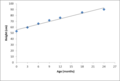 Baby height vs age

The Pareto Chart, named after the Italian economist Vilfredo Pareto, is a combined bar and line chart where individual values are shown in descending order by bars with the cumulative total overlaid as a line on top. It is used to identify the most important factors in the data
-
 Pareto Chart

Letting Data Speak for Themselves edit
Assignment/Exercise edit
More Reading edit
References edit
Copyright Notice edit

You are free:
- to Share — to copy, distribute, display, and perform the work (pages from this wiki)
- to Remix — to adapt or make derivative works
Under the following conditions:
- Attribution — You must attribute this work to Wikibooks. You may not suggest that Wikibooks, in any way, endorses you or your use of this work.
- Share Alike — If you alter, transform, or build upon this work, you may distribute the resulting work only under the same or similar license to this one.
- Waiver — Any of the above conditions can be waived if you get permission from the copyright holder.
- Public Domain — Where the work or any of its elements is in the public domain under applicable law, that status is in no way affected by the license.
- Other Rights — In no way are any of the following rights affected by the license:
- Your fair dealing or fair use rights, or other applicable copyright exceptions and limitations;
- The author's moral rights;
- Rights other persons may have either in the work itself or in how the work is used, such as publicity or privacy rights.
- Notice — For any reuse or distribution, you must make clear to others the license terms of this work.The best way to do this is with a link to the following web page.